cai-react-material-ui-keyboard
Virtual keyboard for TextFeild when needed.


You controll when to open it which allows cross platform App optimizations and code reusability for diferent platoforms such as Progressive Web Apps, Hybrid Apps, Electron Apps, Touch Devices, Smart TVs, Desktops, and all other Compatible JavaScript Enviroments.
You have the freedom to choose on which of them to open the Keyboard and on which to just use a textField!
Install
Install with npm:
$ npm install cai-react-material-ui-keyboard or yarn add cai-react-material-ui-keyboard
Changelog
Check Change log for changes.
Properties
| Name | Type | Default | Description |
|---|
| automatic | bool | | If true, keyboard will automaticlly: open when textField gets focused and close instead of firing onRequestClose. |
| disableEffects | bool | | If true, disables all effects (ripples, focus, hover) on all keyboardKeys |
| open | bool | | Controls whether the Keyboard is opened or not. |
| layouts* | string[][][] | | Keybaord layouts that can be changed when user clicks on 'Keyboard' key. |
| keyboardKeyWidth | number | this.context.muiThemet.button.minWidth | Override keyboard key's max width. |
| keyboardKeyHeight | number | this.context.muiThemet.button.height | Override keyboard key's max height. |
| keyboardKeySymbolSize | number | this.context.muiThemet.flatButton.fontSize | Override keyboard key's max symbol size. |
| textField* | element | | Input field used when keyboard is closed and cloned when it's opened. |
| onRequestClose | function | | Fired when keyboard recives 'Enter' or 'Escape' eighter from onKeyDown listener or keyboard key touch/click event. |
| onInput | function | | Fired when keyboard recives 'Enter' Signature: function(input: string) => void. |
| onInputValueChange | function | | Fired when keyboard's input chages value Signature: function(input: string) => void. |
| correctorName | string | | Name of the cloned textField prop to which to bind corrector. |
| corrector** | function | | Function which is bound to the the cloned textField at correctorName prop. this is bound to the Keyboard, public method makeCorrection can be used to apply a correction to the keyboard input. |
Props marked with * are required.
** corrector is required when correctorName is provided.
Requirements
textField must be a controlled input
Node passed to textField Prop must support the following props:
value* of type stringreadOnly* of type bool
Props marked with * must be passed down to the native input element.
Implementation
react-material-ui-keyboard is implemented using the followong Material-Ui Elements
- Dialog
- FlatButtton
- SVG Icons
and uses React.cloneElement to clone textFiled for the kyboard input field.
The used Dialog is modal which guaranties that only one keyboard can be opened which allows memory and performance optimizations.
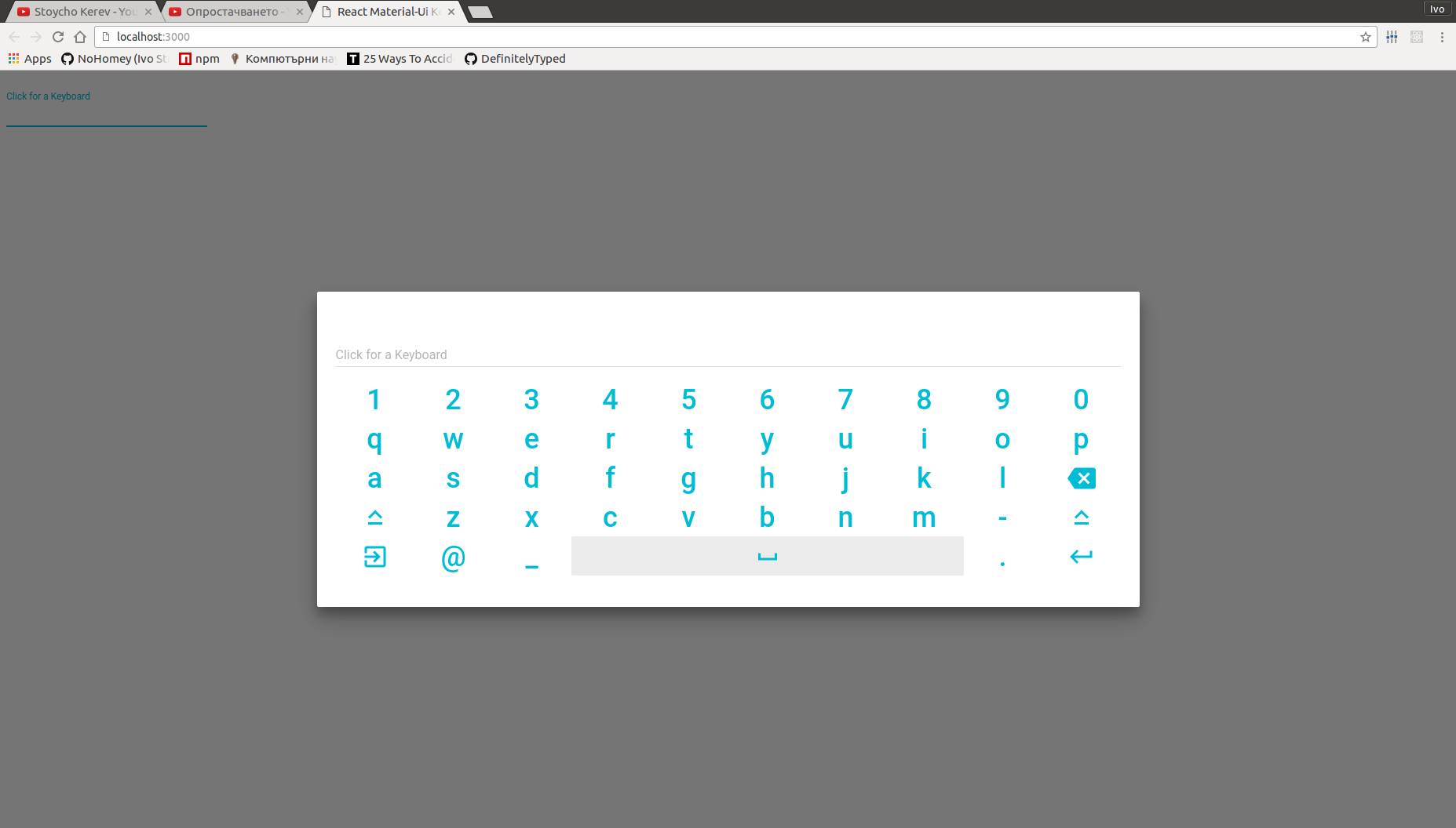
Keyboard Compoment uses MuiTheme, props, window.innerWidth and window.innerHeight information to calculate it's size and keyboard keys size (width x height) to ensure it always fits best on screen chech GALLERY.
Key Support
For supported keys read KEYSUPPORT
Included Layouts
The following keyboard layouts are exported from 'react-material-ui-keyboard/layouts'
numericKeyboard
const numericKeyboard = [
    ['Escape', '-', 'Backspace'],
    ['7',      '8',         '9'],
    ['4',      '5',         '6'],
    ['1',      '2',         '3'],
    ['0',      '.',     'Enter']
];
alphaNumericKeyboard
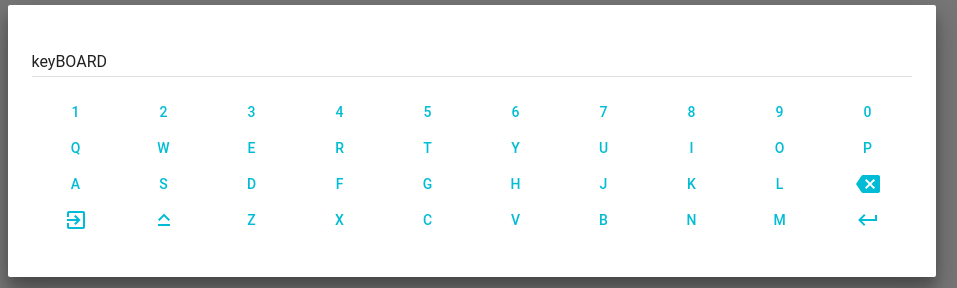
const alphaNumericKeyboard = [
    ['1',      '2',        '3', '4', '5', '6', '7', '8', '9',         '0'],
    ['q',      'w',        'e', 'r', 't', 'y', 'u', 'i', 'o',         'p'],
    ['a',      's',        'd', 'f', 'g', 'h', 'j', 'k', 'l', 'Backspace'],
    ['Escape', 'CapsLock', 'z', 'x', 'c', 'v', 'b', 'n', 'm',     'Enter']
];
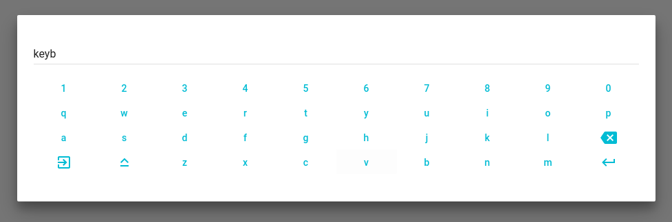
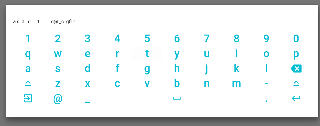
With CapsLock On
extendedKeyboard
const extendedKeyboard = [
    ['1',        '2', '3', '4', '5', '6', '7', '8', '9',         '0'],
    ['q',        'w', 'e', 'r', 't', 'y', 'u', 'i', 'o',         'p'],
    ['a',        's', 'd', 'f', 'g', 'h', 'j', 'k', 'l', 'Backspace'],
    ['CapsLock', 'z', 'x', 'c', 'v', 'b', 'n', 'm', '-',  'CapsLock'],
    ['Escape',   '@', '#',         '     ',         '.',     'Enter']
];
Demonstrating Spacebar and keyboard key size futers
Creating Custom Keyboard Layout
All spacial keys (none Symbol will have an Icon and support at some point)*
Check supported keys!
If a key you want to use is not supported open an Issue.
Public methods
Keyboard exposes public method makeCorrection which can be used to apply keyboard input value corrections when keyboard is opened or within correction handller.
Public members
Keyboard has one public static member which is designed to be overwritten: automaitcOpenPredicate it's signature is function() => boolean. It is called when automatic is true and the attached onFocus handler on textField gets fired to determinate should keyboard open and disable the native virtual keyboard by assigning readOnly at textField in the render. Default automaitcOpenPredicate behaviour is to always return true. You can override it to change when to automaticlly open keyboard onFocus.
Examples
import * as React from 'react';
import TextField from 'material-ui/TextField';
import Keyboard from 'cai-react-material-ui-keyboard';
import { extendedKeyboard } from 'cai-react-material-ui-keyboard/layouts';

class Demo extends React.Component {
    constructor(props) {
        super(props);
        this.state = {
            open: false,
            value: ''
        };
        this.onInput = this.handleInput.bind(this);
    }

    handleInput(input) {
        this.setState({ value: input });
    }

    render() {
      <Keyboard
        textField={
          <TextField
            id="text"
            value={this.state.value}
          />
        }
        automatic
        onInput={this.onInput}
        layouts={[extendedKeyboard]}
      />;
    }
};
Example using custom textField and controlling when to open the keyboard and when to prevent the native virtual keyboard
import * as React from 'react';
import NumberInput from 'material-ui-number-input';
import Keyboard from 'cai-react-material-ui-keyboard';
import { numericKeyboard } from 'cai-react-material-ui-keyboard/layouts';

function corrector(value) {
    console.log(`correction ${value}`);
    this.makeCorrection(value);
}

class Demo extends React.Component {
    constructor(props) {
        super(props);
        this.state = { open: false, value: '2' };
        this.onFocus = this.handleFocus.bind(this);
        this.onChange = this.handleChange.bind(this);
        this.onRequestClose = this.handleRequestClose.bind(this);
        this.onInput = this.handleInput.bind(this);
        this.onError = this.handleError.bind(this);
        this.onValid = this.handleValid.bind(this);
    }

    canOpenKeyboard() {
        return (this.state.value.length % 2) === 0;
    }

    handleFocus(event) {
        if(this.canOpenKeyboard()) {
            this.setState({ open: true });
        }
    }

    handleChange(event, value) {
        console.log(value);
        this.setState({ value: value });
    }

    handleRequestClose() {
        this.setState({ open: false });
    }

    handleInput(input) {
        console.log(input);
        this.setState({ value: input });
    }

    handleError(error) {
        let errorText;
        switch (error) {
            case 'required':
                errorText = 'This field is required';
                break;
            case 'invalidSymbol':
                errorText = 'You are tring to enter none number symbol';
                break;
            case 'incompleteNumber':
                errorText = 'Number is incomplete';
                break;
            case 'singleMinus':
                errorText = 'Minus can be use only for negativity';
                break;
            case 'singleFloatingPoint':
                errorText = 'There is already a floating point';
                break;
            case 'singleZero':
                errorText = 'Floating point is expected';
                break;
            case 'min':
                errorText = 'You are tring to enter number less than -10';
                break;
            case 'max':
                errorText = 'You are tring to enter number greater than 12';
                break;
        }
        this.setState({ errorText: errorText });
    }

    handleValid(value) {
        console.debug(`valid ${value}`);
    }

    componentDidMount() {
        setTimeout(() => this.setState({ value: '89' }), 1000);
    }

    render() {
        const { state, onFocus, onChange, onError, onValid, onInput } = this;
        const { value, errorText } = state;
        const textField = (
            <NumberInput
                id="num"
                required
                value={value}
                min={-10}
                max={12}
                strategy="warn"
                errorText={errorText}
                onFocus={onFocus}
                onChange={onChange}
                onError={onError}
                onValid={onValid}
                floatingLabelText="Click for a Keyboard" />
        );

        return (
            <Keyboard
                textField={textField}
                open={this.state.open}
                onRequestClose={this.onRequestClose}
                onInput={onInput}
                correctorName="onRequestValue"
                corrector={corrector}
                layouts={[numericKeyboard]}
                keyboardKeyHeight={50}
                keyboardKeyWidth={100}
                keyboardKeySymbolSize={36}
            />
        );
    }
}
Written in Typescript and Typescript Ready! (check examples)
Supports propTypes for regular JavaScript users
It is possible to use react-material-ui-keyboard in none material-ui project.
Limitations
If you need to change theme eg. gutter, spacing, colors or any other option you need to wrapp <Keyboard ... /> in MuiThemeProvider or to manually provide a muiTheme to parent's context.
Testing
-
npm install
-
npm test
Contributing
-
npm install
-
Make changes
-
If necessary add some tests to __tests__
-
npm test
-
Make a Pull Request
-
Fix keyboard click error


