Product
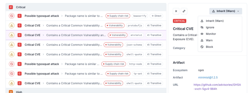
Introducing Enhanced Alert Actions and Triage Functionality
Socket now supports four distinct alert actions instead of the previous two, and alert triaging allows users to override the actions taken for all individual alerts.
chakra-react-select
Advanced tools
Package description
chakra-react-select is a package that integrates the popular react-select library with Chakra UI, providing a set of customizable and accessible select components that are styled using Chakra UI's design system.
Basic Select
This code demonstrates a basic select component using chakra-react-select. It provides a dropdown with options for Chocolate, Strawberry, and Vanilla.
import React from 'react';
import { ChakraProvider } from '@chakra-ui/react';
import { Select } from 'chakra-react-select';
const App = () => (
<ChakraProvider>
<Select
options={[
{ value: 'chocolate', label: 'Chocolate' },
{ value: 'strawberry', label: 'Strawberry' },
{ value: 'vanilla', label: 'Vanilla' }
]}
/>
</ChakraProvider>
);
export default App;Multi-Select
This code demonstrates a multi-select component using chakra-react-select. It allows users to select multiple options from the dropdown.
import React from 'react';
import { ChakraProvider } from '@chakra-ui/react';
import { Select } from 'chakra-react-select';

const App = () => (
  <ChakraProvider>
    <Select
      isMulti
      options={[
        { value: 'chocolate', label: 'Chocolate' },
        { value: 'strawberry', label: 'Strawberry' },
        { value: 'vanilla', label: 'Vanilla' }
      ]}
    />
  </ChakraProvider>
);

export default App;
Custom Styles
This code demonstrates how to apply custom styles to the select component using chakra-react-select. The control and options are styled with custom colors.
import React from 'react';
import { ChakraProvider } from '@chakra-ui/react';
import { Select } from 'chakra-react-select';

const customStyles = {
  control: (provided) => ({
    ...provided,
    backgroundColor: 'lightblue'
  }),
  option: (provided, state) => ({
    ...provided,
    color: state.isSelected ? 'white' : 'black',
    backgroundColor: state.isSelected ? 'blue' : 'white'
  })
};

const App = () => (
  <ChakraProvider>
    <Select
      styles={customStyles}
      options={[
        { value: 'chocolate', label: 'Chocolate' },
        { value: 'strawberry', label: 'Strawberry' },
        { value: 'vanilla', label: 'Vanilla' }
      ]}
    />
  </ChakraProvider>
);

export default App;react-select is a flexible and customizable select component for React applications. It provides a wide range of features including single and multi-select, async options, and custom styling. chakra-react-select builds on top of react-select by integrating it with Chakra UI's design system.
downshift is a library that provides primitives to build flexible and accessible autocomplete, combobox, and select components. Unlike chakra-react-select, downshift does not come with built-in styles and requires more manual setup for styling and configuration.
react-autosuggest is a library for building autocomplete and autosuggest components in React. It focuses on providing a robust and accessible autocomplete experience. While it offers similar functionality to chakra-react-select, it does not integrate with Chakra UI and requires custom styling.
Readme
This component is a wrapper for the popular react component react-select made using the UI library Chakra UI.

Check out the demo here: https://codesandbox.io/s/chakra-react-select-demo-65ohb?file=/example.js
In order to use this package, you'll need to have @chakra-ui/react set up like in the guide in their docs. Then install this package:
npm i chakra-react-select
Then you can import the base select package, the async select, the creatable select or the async creatable select:
import {
  Select,
  AsyncSelect,
  CreatableSelect,
  AsyncCreatableSelect,
} from "chakra-react-select";
In order to use this component, you can implement it and use it like you would normally use react-select. It should accept all of the props that the original takes, however customizing the theme or the components could break this implementation so change them at your own risk. There are also a few extra things you can do with this wrapper that pull from the chakra library.
size prop with either sm, md, or lg (default is md). These will reflect the sizes available on the Chakra <Input /> component (with the exception of xs because it's too small to work).return (
<Select size="sm" />
<Select size="md" /> // default
<Select size="lg" />
)
colorScheme prop to the select component to change all of the selected options tags' colors. You can view the whole list of available color schemes in the Chakra docs, or if you have a custom color palette, any of the custom color names in that will be available instead.
colorScheme key to any of your options objects and it will only style that option when selected.return (
<Select
{/* The global color scheme */}
colorScheme="purple"
options={[
{
label: "I am red",
value: "i-am-red",
colorScheme: "red", // The option color scheme overrides the global
},
{
label: "I fallback to purple",
value: "i-am-purple",
},
]}
/>
);
tagVariant prop with either subtle, solid, or outline (default is subtle). These will reflect the variant prop available on the Chakra <Tag /> component.
variant key to any of your options objects and it will only style that option when selected. This will override the tagVariant prop on the select if both are setreturn (
<Select
{/* The global variant */}
tagVariant="solid"
options={[
{
label: "I have the outline style",
value: "i-am-outlined",
variant: "outline", // The option variant overrides the global
},
{
label: "I fallback to the global `solid`",
value: "i-am-solid",
},
]}
/>
);
isInvalid to the select component to style it like the Chakra <Input /> is styled when it receives the same prop.
isInvalid or isDisabled to a <FormControl /> which surrounds this component and it will output their corresponding <Input /> styles.return (
<>
{/* This will show up with a red border */}
<Select isInvalid />
{/* This will show up with a red border, and grayed out */}
<FormControl isInvalid isDisabled>
<FormLabel>Invalid & Disabled Select</FormLabel>
<Select />
<FormErrorMessage>
This error message shows because of an invalid FormControl
</FormErrorMessage>
</FormControl>
</>
);
hasStickyGroupHeaders prop to the select component.return <Select hasStickyGroupHeaders />;

isFixed: true to emulate the example in the react-select docs. This will prevent the options which have this flag from having the remove button on its corresponding tag. This only applies when using isMulti is passed.return (
<Select
isMulti
options={[
{
label: "I can't be removed",
value: "fixed",
isFixed: true,
},
{
label: "I can be removed",
value: "not-fixed",
},
]}
/>
);
If you have any other questions or requests, leave it as an issue. I'm sure there are some features of react-select that I missed and I definitely want to make this wrapper as good as it can be!
FAQs
A Chakra UI wrapper for the popular library React Select
We found that chakra-react-select demonstrated a healthy version release cadence and project activity because the last version was released less than a year ago. It has 0 open source maintainers collaborating on the project.
Did you know?

Socket for GitHub automatically highlights issues in each pull request and monitors the health of all your open source dependencies. Discover the contents of your packages and block harmful activity before you install or update your dependencies.

Product
Socket now supports four distinct alert actions instead of the previous two, and alert triaging allows users to override the actions taken for all individual alerts.

Security News
Polyfill.io has been serving malware for months via its CDN, after the project's open source maintainer sold the service to a company based in China.

Security News
OpenSSF is warning open source maintainers to stay vigilant against reputation farming on GitHub, where users artificially inflate their status by manipulating interactions on closed issues and PRs.