Security News
GitHub Removes Malicious Pull Requests Targeting Open Source Repositories
GitHub removed 27 malicious pull requests attempting to inject harmful code across multiple open source repositories, in another round of low-effort attacks.
chronocraft-datepicker-vue
Advanced tools
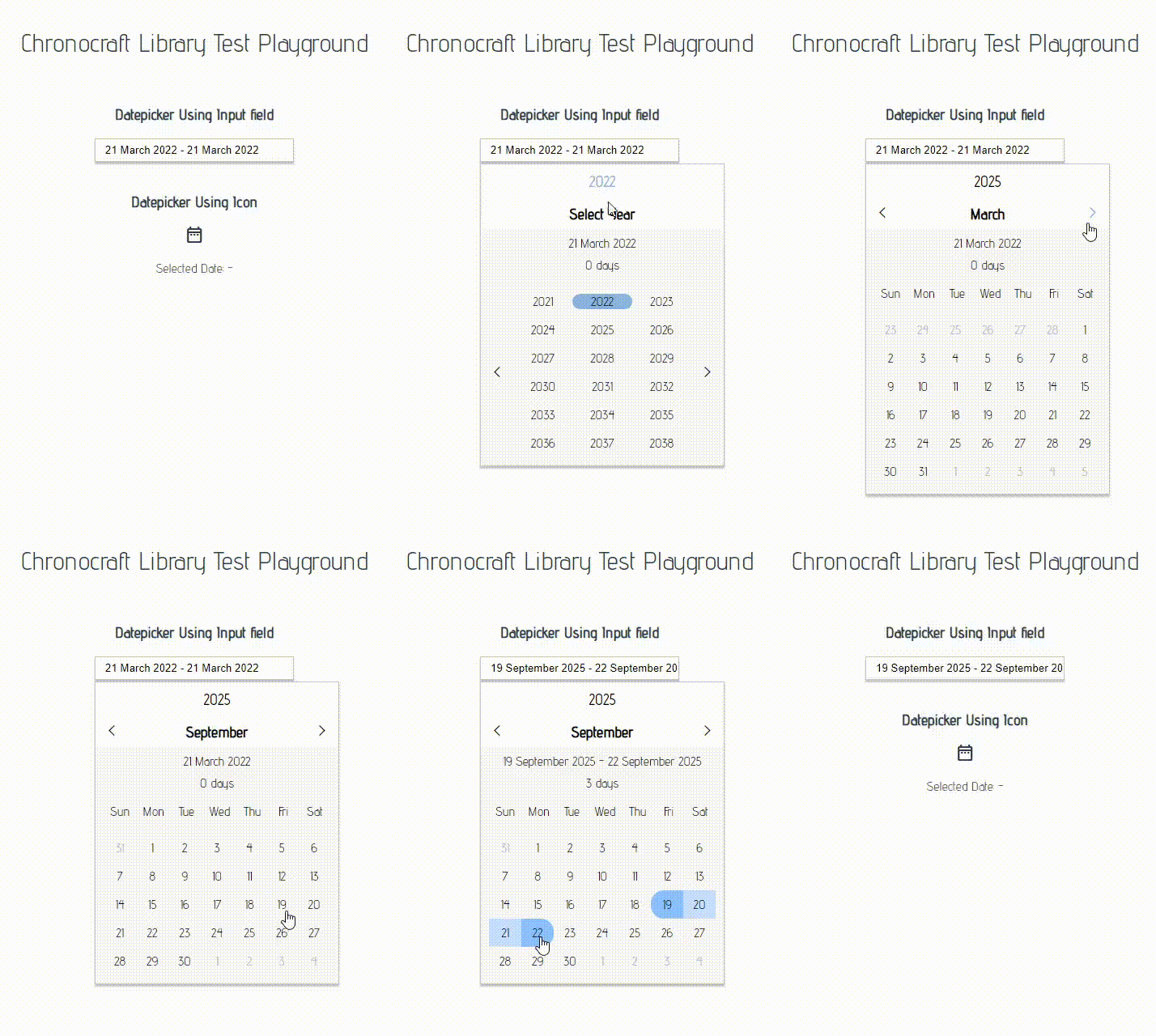
Chronocraft DatePicker - A VueJS 3.0 Efficient DatePicker Component
The Chronocraft DatePicker is a flexible datepicker component created for Vue3

import { ChronoCraftDatePicker } from 'chronocraft-datepicker-vue';
...
app.use(ChronoCraftDatePicker)
When you want to import a specific component from the library into a dedicated place inside your code
import { DatePicker } from 'chronocraft-datepicker-vue';
...
components:{
DatePicker
}
<DatePicker :rangepicker="false" :showselecteddate="true" style="margin: 0px auto;">
</DatePicker>
<DatePicker :rangepicker="true" :showselecteddate="true" style="margin: 0px auto;" @on-date-selected="OnDateSelected">
    <template v-slot:inputfield="slotProps">
        <span class="material-icons-outlined" style="cursor: pointer;">date_range</span>
    </template>
</DatePicker>
| Name | Type | Description |
|---|---|---|
| showselecteddate | Boolean | Show or Hides the Selected Day or Days inside the Picker |
| dateformat | String | Defines the output string format writen inside the input component |
| rangepicker | Boolean | Enables selection of a date range (from A date to B date) |
| autohide | Boolean | Turns on or off the auto hidding in the datepicker popup |
| @on-date-selected | Event Function | Event fired when the user selects a date or rnage of dates |
| Name | hasprops | Description |
|---|---|---|
| inputfield | no | Overrides the datepicker's input field and custom elements can be entered like a button or icon |
FAQs
Chronocraft DatePicker - A VueJS 3.0 Efficient DatePicker Component
We found that chronocraft-datepicker-vue demonstrated a not healthy version release cadence and project activity because the last version was released a year ago. It has 1 open source maintainer collaborating on the project.
Did you know?

Socket for GitHub automatically highlights issues in each pull request and monitors the health of all your open source dependencies. Discover the contents of your packages and block harmful activity before you install or update your dependencies.

Security News
GitHub removed 27 malicious pull requests attempting to inject harmful code across multiple open source repositories, in another round of low-effort attacks.

Security News
RubyGems.org has added a new "maintainer" role that allows for publishing new versions of gems. This new permission type is aimed at improving security for gem owners and the service overall.

Security News
Node.js will be enforcing stricter semver-major PR policies a month before major releases to enhance stability and ensure reliable release candidates.