command-line-usage
A simple template to create a usage guide. It was extracted from command-line-args to facilitate arbitrary use.
var getUsage = require('command-line-usage');
var usage = getUsage(definitions, options)
Inline ansi formatting can be used anywhere within the usage template using the formatting syntax described here.
Examples
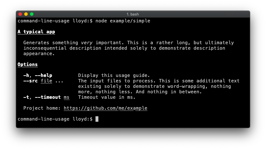
Simple
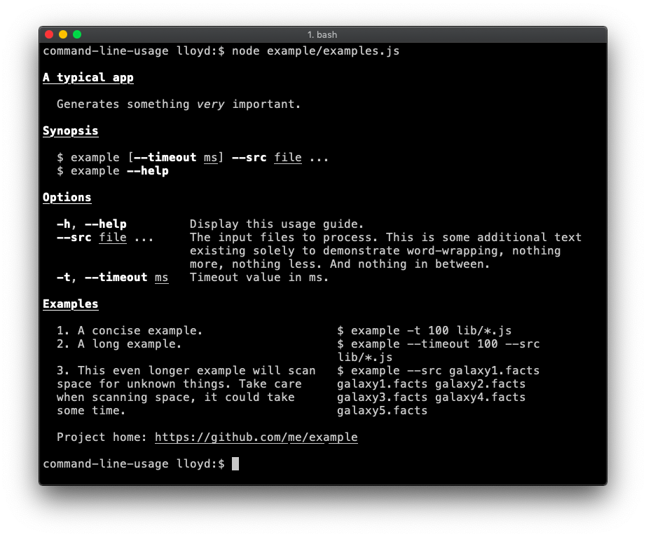
A description field is added to each option definition. A title, description and simple footer are set in the getUsage options. Code.
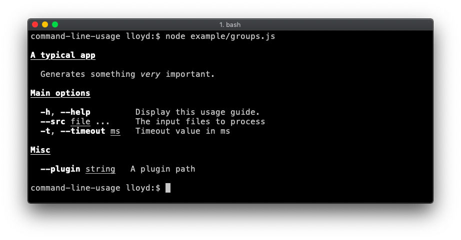
Groups
Demonstrates breaking the options up into groups. This example also sets a typeLabel on each option definition (e.g. a typeLabel value of files is more meaningful than the default string[]). Code.
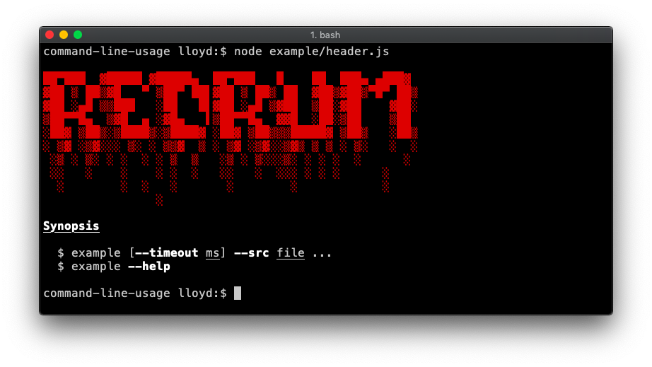
Here, the title is replaced with a header banner. This example also adds a synopsis list. Code.
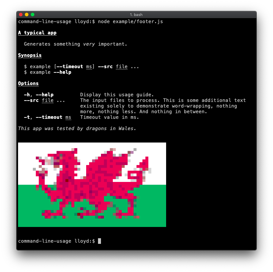
The footer is displayed at the end of the template. Code.
Examples (column layout)
A list of examples is added. In this case the example list is defined as an array of objects (each with consistently named properties) so will be formatted by column-layout. Code.
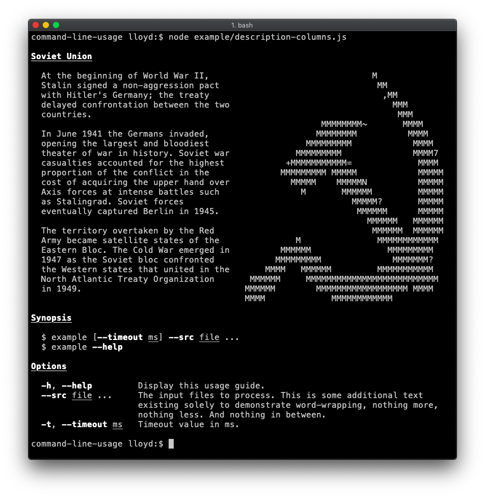
Description (column layout)
Demonstrates usage of custom column layout in the description. In this case the second column (containing the hammer and sickle) has nowrap enabled, as the input is already formatted as desired. Code.
Custom
Demonstrates a custom template. The getUsage.optionList() method exists for users that want the option list and nothing else. Code.

API Reference
getUsage(definitions, options) ⇒ string ⏏
Kind: Exported function
| Param | Type | Description |
|---|
| definitions | Array.<optionDefinition> | an array of option definition objects. In addition to the regular definition properties, command-line-usage will look for:
description - a string describing the option.typeLabel - a string to replace the default type string (e.g. <string>). It's often more useful to set a more descriptive type label, like <ms>, <files>, <command> etc.
|
| options | usage-options | see UsageOptions.
|
getUsage.optionList(definitions, [group]) ⇒ Array.<string>
A helper for getting a column-format list of options and descriptions. Useful for inserting into a custom usage template.
Kind: static method of getUsage
| Param | Type | Description |
|---|
| definitions | Array.<optionDefinition> | the definitions to Display
|
| [group] | string | if specified, will output the options in this group. The special group '_none' will return options without a group specified.
|
UsageOptions ⏏
The class describes all valid options for the getUsage function. Inline formatting can be used within any text string supplied using valid ansi-escape-sequences formatting syntax.
Kind: Exported class
Use this field to display a banner or header above the main body.
Kind: instance property of UsageOptions
options.title : string
The title line at the top of the usage, typically the name of the app. By default it is underlined but this formatting can be overridden by passing a module:usage-options~textObject.
Kind: instance property of UsageOptions
Example
{ title: "my-app" }
options.description : textBlock
A description to go underneath the title. For example, some words about what the app is for.
Kind: instance property of UsageOptions
options.synopsis : textBlock
An array of strings highlighting the main usage forms of the app.
Kind: instance property of UsageOptions
options.groups : object
Specify which groups to display in the output by supplying an object of key/value pairs, where the key is the name of the group to include and the value is a string or textObject. If the value is a string it is used as the group title. Alternatively supply an object containing a title and description string.
Kind: instance property of UsageOptions
Example
{
    main: {
        title: "Main options",
        description: "This group contains the most important options."
    },
    misc: "Miscellaneous"
}
options.examples : textBlock
Examples
Kind: instance property of UsageOptions
Displayed at the foot of the usage output.
Kind: instance property of UsageOptions
Example
{
    footer: "Project home: [underline]{https://github.com/me/my-app}"
}
options.hide : string | Array.<string>
If you want to hide certain options from the output, specify their names here. This is sometimes used to hide the defaultOption.
Kind: instance property of UsageOptions
Example
{
    hide: "files"
}
options~textBlock : string | Array.<string> | Array.<object> | Object
A text block can be a string:
{
  description: 'This is a single-line description.'
}
.. or multiple strings:
{
  description: [
    'This is a multi-line description.',
    'A new string in the array represents a new line.'
  ]
}
.. or an array of objects. In which case, it will be formatted by column-layout:
{
  description: {
    column1: 'This will go in column 1.',
    column2: 'Second column text.'
  }
}
If you want set specific column-layout options, pass an object with two properties: options and data.
{
  description: {
    options: {
      columns: [
        { name: 'two', width: 40, nowrap: true }
      ]
    },
    data: {
      column1: 'This will go in column 1.',
      column2: 'Second column text.'
    }
  }
}
Kind: inner typedef of UsageOptions
© 2015-16 Lloyd Brookes <75pound@gmail.com>. Documented by jsdoc-to-markdown.