command-line-usage
A simple module for creating a usage guide.
Synopis
A usage guide is built from an arbitrary number of sections, e.g. a description section, synopsis, option list, examples, footer etc. Each section has a bold, underlined header and some content (a paragraph, table, option list, banner etc.)
The commandLineUsage() function takes one or more section objects (content or optionList) as input.
Inline ansi formatting can be used anywhere within section content using the formatting syntax described here.
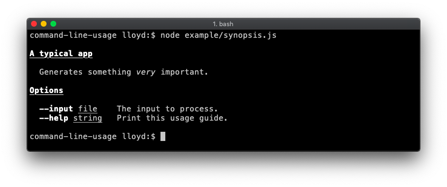
This script:
const getUsage = require('command-line-usage')

const sections = [
  {
    header: 'A typical app',
    content: 'Generates something [italic]{very} important.'
  },
  {
    header: 'Options',
    optionList: [
      {
        name: 'input',
        typeLabel: '[underline]{file}',
        description: 'The input to process.'
      },
      {
        name: 'help',
        description: 'Print this usage guide.'
      }
    ]
  }
]
const usage = getUsage(sections)
console.log(usage)
Outputs this guide:
Examples
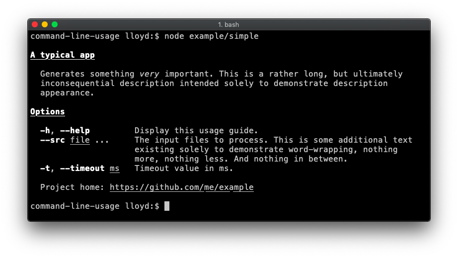
Simple
A fairly typical usage guide with three sections - description, option list and footer. Code.
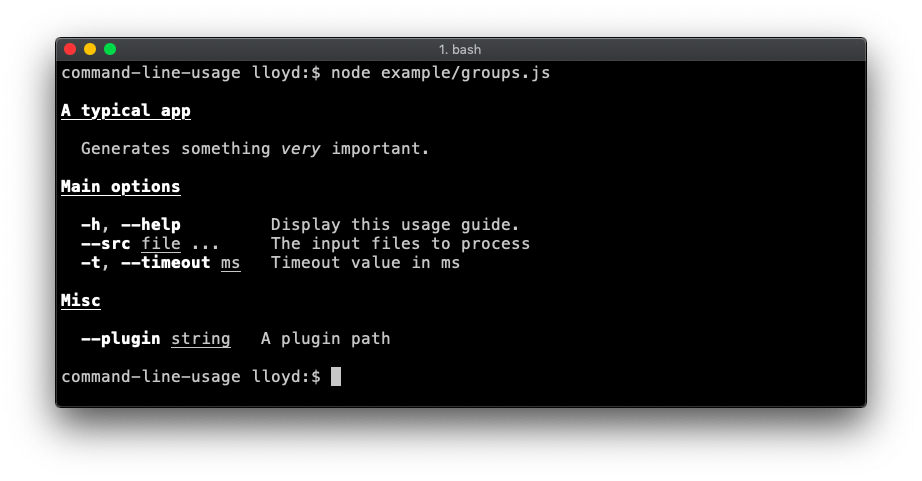
Option List groups
Demonstrates breaking the option list up into groups. Code.
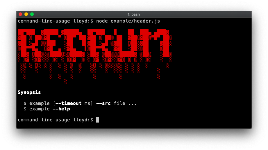
Banners
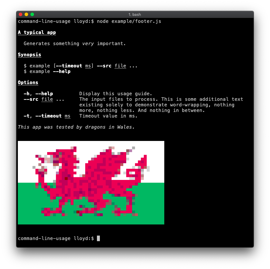
A banner is created by adding the raw: true property to your content. This flag disables any formatting on the content, displaying it raw as supplied.
Demonstrates a banner at the top. This example also adds a synopsis section. Code.
Demonstrates a footer banner. Code.
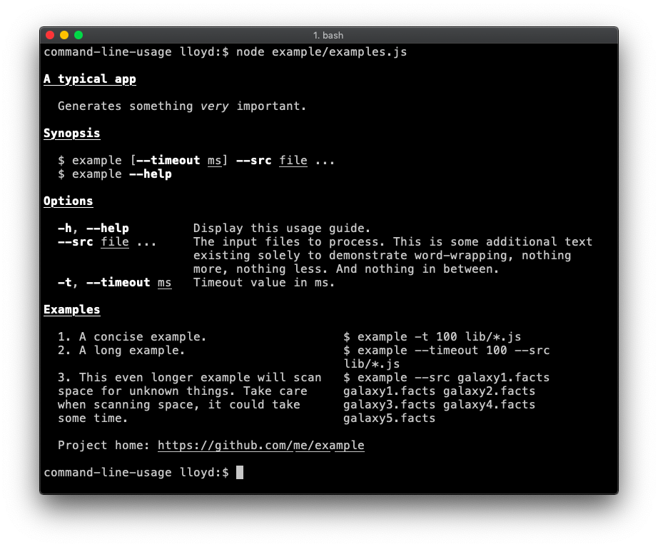
Examples section (table layout)
An examples section is added. To achieve this table layout, supply the content as an array of objects. The property names of each object are not important, so long as they are consistent throughout the array. Code.
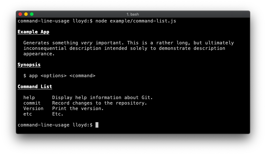
Command list
Useful if your app is command-driven, like git or npm. Code.
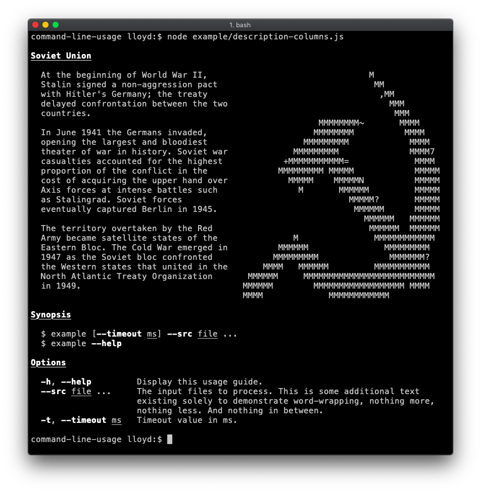
Description section (table layout)
Demonstrates use of table layout in the description. In this case the second column (containing the hammer and sickle) has nowrap enabled, as the input is already formatted as desired. Code.
API Reference
commandLineUsage(sections) ⇒ string ⏏
Generates a usage guide suitable for a command-line app.
Kind: Exported function
| Param | Type | Description |
|---|
| sections | Section | Array.<Section> | One of more section objects (content or optionList).
|
commandLineUsage~content
A Content section comprises a header and one or more lines of content.
Kind: inner typedef of commandLineUsage
Properties
| Name | Type | Description |
|---|
| header | string | The section header, always bold and underlined.
|
| content | string | Array.<string> | Array.<object> | One or more lines of text. For table layout, supply the content as an array of objects. The property names of each object are not important, so long as they are consistent throughout the array.
|
| raw | boolean | Set to true to avoid indentation and wrapping. Useful for banners.
|
Example
Simple string of content. The syntax for ansi formatting is documented here.
{
  header: 'A typical app',
  content: 'Generates something [italic]{very} important.'
}
An array of strings is interpreted as lines, to be joined by the system newline character.
{
  header: 'A typical app',
  content: [
    'First line.',
    'Second line.'
  ]
}
An array of recordset-style objects are rendered in table layout.
{
  header: 'A typical app',
  content: [
    { colA: 'First row, first column.', colB: 'First row, second column.'},
    { colA: 'Second row, first column.', colB: 'Second row, second column.'}
  ]
}
commandLineUsage~optionList
A OptionList section adds a table displaying details of the available options.
Kind: inner typedef of commandLineUsage
Properties
| Name | Type | Description |
|---|
| header | string | The section header, always bold and underlined.
|
| optionList | Array.<OptionDefinition> | an array of option definition objects. In addition to the regular definition properties, command-line-usage will look for:
description - a string describing the option.typeLabel - a string to replace the default type string (e.g. <string>). It's often more useful to set a more descriptive type label, like <ms>, <files>, <command> etc.
|
| group | string | Array.<string> | If specified, only options from this particular group will be printed. Example.
|
| hide | string | Array.<string> | The names of one of more option definitions to hide from the option list. Example.
|
Example
{
  header: 'Options',
  optionList: [
    {
      name: 'help', alias: 'h', description: 'Display this usage guide.'
    },
    {
      name: 'src', description: 'The input files to process',
      multiple: true, defaultOption: true, typeLabel: '[underline]{file} ...'
    },
    {
      name: 'timeout', description: 'Timeout value in ms. This description is needlessly long unless you count testing of the description column maxWidth useful.',
      alias: 't', typeLabel: '[underline]{ms}'
    }
  ]
}
© 2015-16 Lloyd Brookes <75pound@gmail.com>. Documented by jsdoc-to-markdown.