Product
Introducing License Enforcement in Socket
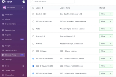
Ensure open-source compliance with Socket’s License Enforcement Beta. Set up your License Policy and secure your software!
create-react-provider
Advanced tools
Creating context provider with ease, can be used as HOC or renderChildren
Providers are a powerful tools in react, we all have used them by popular libraries such as redux, mobx, material-ui.
The thing is, providers can be created even for a smaller purpose than data management and UI library, you can create ModalManager, translations injections, NotificationManager and so much more!
This library creates a Provider for you to use, and a Hoc and a RenderChildrenComponent for you to use in your sub-components.
  npm install --save create-react-provider
  # or yarn
  yarn add create-react-provider
import createReactProvider from 'create-react-provider';
import PropTypes from 'prop-types';

const {
  Provider: ThemeProvider,
  Hoc: ThemeHoc,
  RenderChildren: ThemeRenderChildren,
} = createReactProvider({
  primaryColor: PropTypes.string,
  secondaryColor: PropTypes.string,
});

// ****************
// Use provider in top layer of your react app
// ****************
class App extends Component {
  render () {
    return (
      <ThemeProvider>
        <SomeComponent />
      </ThemeProvider>
    );
  }
}

// ****************
// Consume provided props in either way (Hoc or renderChildren)
// ****************

// renderChildren way
class SomeComponentUsingRenderChildren extends Component {
  render() {
    return (
      <ThemeRenderChildren
        render={({ primaryColor: backgroundColor, secondaryColor: titleColor }) => (
          <div style={{ backgroundColor }}>
            <h1 style={{ color: titleColor }}>
              I'm a title!
            </h1>
          </div>
        )}
      />
    );
  }
}

// Higher order component way
@ThemeHoc(ctx => ({
  titleColor: ctx.primaryColor,
  backgroundColor: ctx.secondaryColor,
}))
class SomeComponentUsingHoc extends Component {
  render() {
    const { titleColor, backgroundColor } = this.props;

    return (
      <div style={{ backgroundColor }}>
        <h1 style={{ color: titleColor }}>
          I'm a title!
        </h1>
      </div>
    );
  }
}

// You can override Hoc props
<SomeComponentUsingHoc /> // Will use titleColor from provider
<SomeComponentUsingHoc titleColor="red" /> // Will use from given prop
FAQs
Creating context provider with ease, can be used as HOC or renderChildren
The npm package create-react-provider receives a total of 2 weekly downloads. As such, create-react-provider popularity was classified as not popular.
We found that create-react-provider demonstrated a not healthy version release cadence and project activity because the last version was released a year ago. It has 1 open source maintainer collaborating on the project.
Did you know?

Socket for GitHub automatically highlights issues in each pull request and monitors the health of all your open source dependencies. Discover the contents of your packages and block harmful activity before you install or update your dependencies.

Product
Ensure open-source compliance with Socket’s License Enforcement Beta. Set up your License Policy and secure your software!

Product
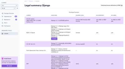
We're launching a new set of license analysis and compliance features for analyzing, managing, and complying with licenses across a range of supported languages and ecosystems.

Product
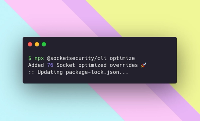
We're excited to introduce Socket Optimize, a powerful CLI command to secure open source dependencies with tested, optimized package overrides.