
Research
Security News
Malicious npm Package Targets Solana Developers and Hijacks Funds
A malicious npm package targets Solana developers, rerouting funds in 2% of transactions to a hardcoded address.
By Socket Research Team - Dec 02, 2024
css-in-js-media
Advanced tools
Minified and Simplified include-media with CSS-in-JS
when you style with css-in-js (emotion, styled-component) you can perfectly and easily deal with responsive design with this css-in-js-media which is similar with include-media and support type system(ts)
If you think this library is helpful, Support by give :star:
Migrate to Typescript at version V2 :tada:
Introduced at
npm install css-in-js-media
import media from "css-in-js-media";
code-sandbox-link : https://codesandbox.io/embed/k28q2nv2w7smallPhone: 320
phone: 375
tablet: 768
desktop: 1024
largeDesktop: 1440

with css-in-js library (ex: emotion.js , styled-component)
emotion.jsimport media from "css-in-js-media";
export const exampleClass = css`
color: red;
${media(">desktop")} {
font-size: 15px;
}
${media("<=desktop", ">tablet")} {
font-size: 20px;
}
${media("<=tablet", ">phone")} {
font-size: 25px;
}
${media("<=phone")} {
font-size: 30px;
}
`;
styled-componentimport media from "css-in-js-media";
const exampleClass = styled.h1`
color: red;
${media(">desktop")} {
font-size: 15px;
}
${media("<=desktop", ">tablet")} {
font-size: 20px;
}
${media("<=tablet", ">phone")} {
font-size: 25px;
}
${media("<=phone")} {
font-size: 30px;
}
`;
⚠️ You should set this in entry point file (root file)
import { setBreakPoints } from "css-in-js-media";
setBreakPoints({ desktop: 1440, largeDesktop: 1500 });

// or string size
setBreakPoints({ desktop: "140rem", largeDesktop: "calc(30 * 50px)" });
import { getBreakPoints } from "css-in-js-media";
getBreakPoints();
// default breakpoints
// {
//   smallPhone: 320;
//   phone: 375;
//   tablet: 768;
//   desktop: 1024;
//   largeDesktop: 1440;
// }
FAQs
easy code with css-in-js with mediaquery via css-in-js-media
We found that css-in-js-media demonstrated a not healthy version release cadence and project activity because the last version was released a year ago. It has 1 open source maintainer collaborating on the project.
Did you know?

Socket for GitHub automatically highlights issues in each pull request and monitors the health of all your open source dependencies. Discover the contents of your packages and block harmful activity before you install or update your dependencies.
Research
Security News
A malicious npm package targets Solana developers, rerouting funds in 2% of transactions to a hardcoded address.

Security News
Research
Socket researchers have discovered malicious npm packages targeting crypto developers, stealing credentials and wallet data using spyware delivered through typosquats of popular cryptographic libraries.
Security News
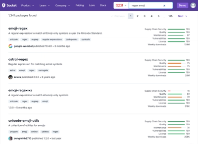
Socket's package search now displays weekly downloads for npm packages, helping developers quickly assess popularity and make more informed decisions.