CSS Grace
从今天起,写简单优雅面向未来的 CSS。
CSS Grace 是一个由 PostCSS 驱动,面向未来的 CSS 后处理工具。实现了大部分常用的 IE Hack,获取图片宽高等,position: center 等功能。同时可以配合 Sass/Less 等预处理工具使用,最重要的是它不改变 CSS 原生的语法,让 CSS 写起来更简单,更优雅。
- 向前 CSS Grace 可以作为一种 Polyfill 工具,让你可以提前使用一些 CSS3 的新特性。
- 向后 CSS Grace 可以实现各种旧浏览器的 Hack,让你无需担忧兼容性。
- 而你只用书写和关心标准的 CSS 属性或属性值。
例如,下面的语法糖用来解决闭合浮动的问题:
.clearfix {
*zoom: 1;
}
.clearfix:after {
clear: both;
}
.clearfix:before,
.clearfix:after {
content: '';
display: table;
}
这个语法糖虽然好用,兼容性良好,但在 HTML 中会出现非常多的 class="clearfix"。甚至有些地方已经闭合了浮动,有些人为了保险起见,还是随手加上了class="clearfix"。o(╯□╰)o
如此一来代码显得尤为冗余,而且加了很多无语意的 class。更进一步,我们知道如果触发了 BFC 的元素是自带闭合浮动特性的,clearfix 君略感尴尬。
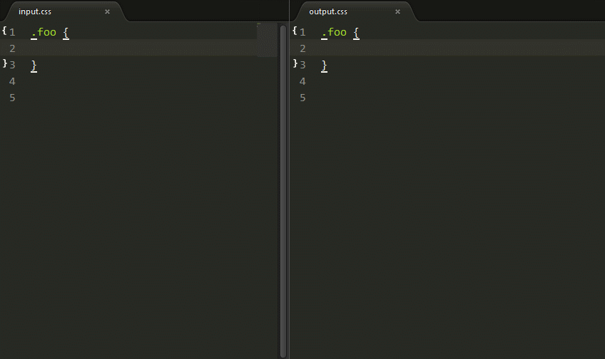
Q: 那么,CSS Grace 如何解决呢?
A: 直接使用 clear: fix 即可。
input:
.foo {
  clear: fix;
}
output:
.foo {
  *zoom: 1;
}
.foo:after {
  clear: both;
}
.foo:before,
.foo:after {
  content: '';
  display: table;
}
Q: 那么,如何解决冗余问题呢?
A: 还是直接使用 clear: fix 即可,(^o^)/~
智能识别,如果存在触发 BFC 的属性,不生成语法糖。
input:
.foo {
clear: fix;
overflow: hidden;
}
output:
.foo {
clear: fix;
overflow: hidden;
}
就是那么简单!
目前功能处于初步阶段,欢迎大家提出更多意见和想法。
快速开始
-
下载并安装 Node.js
-
新建一个目录,比如 test ,在命令行中切换到该目录,安装 cssgrace。
npm install cssgrace
-
在 test 目录新增一个 test.js,代码如下:
var fs       = require('fs')
var cssgrace = require('cssgrace')

var src = 'src/input.css'
console.info('Watching…\nModify the input.css and save.')

chokidar.watch(src, {
  ignored: /[\/\\]\./,
  persistent: true
}).on('all',
  function(event, path, stats) {
    var css = fs.readFileSync(src, 'utf8')
    fs.writeFileSync('build/output.css', cssgrace.pack(css))
  })
-
在 test 目录新增一个 input.css,注意编码要和 fs.readFileSync 中的保持一致。输入测试的CSS代码片段,比如:
.foo::after {
  position: center;
  width: 210px;
  height: 80px;
  background: rgba(112, 26, 0, .3);
}

.bar {
  display: inline-block;
  opacity: .5;
}
-
在命令行中执行 node test,快去看看 output.css 中发生了什么吧!
.foo:after {
  position: absolute;
  left: 50%;
  top: 50%;
  margin-left: -105px;
  margin-top: -40px;
  width: 210px;
  height: 80px;
  background: rgba(112, 26, 0, .3);
  filter: progid:DXImageTransform.Microsoft.gradient(startColorstr='#4c701a00', endColorstr='#4c701a00');
}

:root .foo:after {
  filter: none\9;
}

.bar {
  display: inline-block;
  *display: inline;
  *zoom: 1;
  opacity: .5;
  filter: alpha(opacity=50);
}
如何使用
Node Watch && 配合其他插件
使用 chokidar 模块实时监测 CSS 文件变动,同时可以加载其他插件,灵活扩展。
var fs = require('fs')
var chokidar = require('chokidar')
var postcss = require('postcss')
var cssgrace = require('cssgrace')
var nested = require('postcss-nested')
var minmax = require('postcss-media-minmax')
var selector = require('postcss-custom-selectors')
var src = 'src/input.css'
console.info('Watching…\nModify the input.css and save.')
chokidar.watch(src, {
ignored: /[\/\\]\./,
persistent: true
}).on('all',
function(event, path, stats) {
var css = fs.readFileSync(src, 'utf8')
var output = postcss()
.use(minmax())
.use(cssgrace)
.use(selector())
.use(nested)
.process(css)
.css;
fs.writeFileSync('build/output.css', output)
})
Grunt
module.exports = function(grunt) {
  grunt.initConfig({
    pkg: grunt.file.readJSON('package.json'),
    postcss: {
      options: {
        processors: [
          require('postcss-custom-selector')(),
          require('cssgrace'),
        ]
      },
      dist: {
        src: ['src/*.css'],
        dest: 'build/grunt.css'
      }
    }
  });

  grunt.loadNpmTasks('grunt-contrib-uglify');
  grunt.loadNpmTasks('grunt-postcss');

  grunt.registerTask('default', ['postcss']);
}
Gulp
var gulp = require('gulp');
var rename = require('gulp-rename');
var postcss = require('gulp-postcss');
var cssgrace = require('cssgrace');
var autoprefixer = require('autoprefixer-core')

gulp.task('default', function () {
    var processors = [
        require('cssgrace')
    ];
    gulp.src('src/input.css')
        .pipe(postcss(processors))
        .pipe(rename('gulp.css'))
        .pipe(gulp.dest('build'))
});
gulp.watch('src/*.css', ['default']);
更多功能
自动生成 2x 背景图兼容代码
只用使用标准的 image-set 属性即可。
input:
.foo {
  background-image: -webkit-image-set(
                    url(./test/img/yuxifan@1x.jpg) 1x,
                    url(./test/img/yuxifan@2x.jpg) 2x);
}
output:
.foo {
  background-image: url(./test/img/yuxifan@1x.jpg);
  background-image: -webkit-image-set(
                    url(./test/img/yuxifan@1x.jpg) 1x,
                    url(./test/img/yuxifan@2x.jpg) 2x);
}
@media
  only screen and (-o-min-device-pixel-ratio: 2/1),
  only screen and (min--moz-device-pixel-ratio: 2),
  only screen and (-moz-min-device-pixel-ratio: 2),
  only screen and (-webkit-min-device-pixel-ratio: 2),
  only screen and (min-resolution: 192dpi),
  only screen and (min-resolution: 2dppx) {
  .foo {
    background-image: url(./test/img/yuxifan@2x.jpg);
    background-size: 320px 427px;
}
}
获取背景图宽高
使用 image-width 和 image-height 可以直接在其他属性中灵活使用图片的宽高。
而且 url 和引号内的 image-width 和 image-height 不会被转换。
input:
.foo {
  background: url(./test/img/post-and-pre.png);
  width: image-width;
  height: image-height;
}

.foo {
  background: url(./test/img/post-and-pre.png);
  margin: image-width image-height -image-height;
  content: 'image-width';
}
output:
.foo {
  background: url(./test/img/post-and-pre.png);
  width: 720px;
  height: 719px;
}

.foo {
  background: url(./test/img/post-and-pre.png);
  margin: 720px 719px -719px;
  content: 'image-width';
}
position:center
已知宽高元素居中,自动计算 margin 取值,麻麻再也不用担心我数学不好了。
input:
.foo {
  position: center;
  width: 300px;
  height: 123px;
}
output:
.foo {
  position: absolute;
  left: 50%;
  top: 50%;
  margin-left: -150px;
  margin-top: -61.5px;
  width: 300px;
  height: 123px;
}
修复常见错误
浮动或绝对定位元素不用写 display: block
当存在 float: left|right 或者 position: absolute|fixed 时,会自动删除多余的 display: block/inline-block。
input:
.foo {
  position: absolute;
  display: block;
}

.foo {
  position: center;
  display: block;
}

.foo {
  float: left;
  display: block;
}
output:
.foo {
  position: absolute;
}

.foo {
  position: center;
}

.foo {
  float: left;
}
绝对定位元素浮动不生效
存在 position: absolute|fixed 时,会自动删除多余的 float: left/right。
input:
.foo {
  position: absolute;
  float: left;
}
output:
.foo {
  position: absolute;
}
自动补全漏写属性
自动修复 resize
resize 生效 overflow 必须不是默认的 visible。
input:
.foo {
  resize: vertical;
}

.foo {
  resize: both;
  overflow: hidden;
}
output:
.foo {
  resize: vertical;
  overflow: auto;
}

.foo {
  resize: both;
  overflow: hidden;
}
自动修复 text-overflow: ellipsis
input:
.foo {
  text-overflow: ellipsis;
}

.foo {
  text-overflow: ellipsis;
  overflow: auto;
  white-space: normal;
}
output:
.foo {
  text-overflow: ellipsis;
  white-space: nowrap;
  overflow: hidden;
}

.foo {
  text-overflow: ellipsis;
  overflow: hidden;
  white-space: nowrap;
}
IE Hack
IE opacity
自动生成 filter。
input:
.foo {
  opacity: .6;
}

.foo {
  opacity: 0.8293;
}
output:
.foo {
  opacity: .6;
  filter: alpha(opacity=60);
}

.foo {
  opacity: 0.8293;
  filter: alpha(opacity=83);
}
IE RGBA
自动生成 filter。
input:
.foo {
  background: rgba(153, 85, 102, 0.3);margin
}
output:
.foo {
  background: rgba(153, 85, 102, 0.3);
  filter: progid:DXImageTransform.Microsoft.gradient(startColorstr='#4c995566', endColorstr='#4c995566');
}

:root .foo {
  filter: none\9;
}
IE inline-block
input:
.foo {
  display: inline-block;
}
output:
.foo {
  display: inline-block;
  *display: inline;
  *zoom: 1;
}
贡献
$ git clone https://github.com/postcss/postcss-media-minmaxs.git
$ git checkout -b patch
$ npm install
$ npm test

## [Changelog](CHANGELOG.md)

## [License](LICENSE)