Security News
PyPI’s New Archival Feature Closes a Major Security Gap
PyPI now allows maintainers to archive projects, improving security and helping users make informed decisions about their dependencies.
[](https://github.com/pemrouz/vanilla/#vanilla) [](https://travis-ci.org/pemrouz/d3-chosen) [
options = []: An array of all options. The options can be strings or objects.
value = []: The current value of the component: this will be a subset of options.
placeholder = '': The placeholder label to display.
match: This function should return true or false for every option to determine whether the item should be visible or not. By default, it does case-insensitive fuzzy filtering. For example, "js" would match "JavaScript".
focused = false: The current focused state of the component
renderer: This function is used to render each individual option. By default, it underlines the parts of the text that match the fuzzy filter.
val =str: This function returns the value of an option. If your options are an array of objects, this is used by the default matching function and to determine the label to display for each option. For example:
{ options: [ { firstname: 'John', lastname: 'Smith' } , { firstname: 'Jane', lastname: 'Smith' } , { firstname: 'Jack', lastname: 'Smith' } ] , val: d => d.firstname + ' ' + d.lastname }
* **`suggestion`**: The index of the currently suggested option. This is used internally, you will rarely set this.

* **`query = ''`**: The text currently entered into the textfield

<br>
### Events

* **`change`**: Notifies of all changes to the value (select and deselect).

* **`select`**: Notifies when an option has been selected. `e.detail` is the selected option.

* **`deselect`**: Notifies when an option has been deselected. `e.detail` is the deselecte option.

---
# `lookup-single`

<img src="https://cloud.githubusercontent.com/assets/2184177/18619331/7b52c876-7df1-11e6-80ee-7275b5fa2280.gif" width="300">

### State

* **`options = []`**: An array of all options. The options can be strings or objects.

* **`value = []`**: The current value of the component: this will be an element in `options`.

* **`placeholder = ''`**: The placeholder label to display.

* **`query = ''`**: The text currently entered into the textfield.

* **`match`**: This function should return `true` or `false` for every option to determine whether the item should be visible or not. By default, it does case-insensitive fuzzy filtering. For example, "js" would match "JavaScript".

* **`focused = false`**: The current focused state of the component

* **`renderer`**: This function is used to render each individual option. By default, it underlines the parts of the text that match the fuzzy filter.

* **`val =`[`str`](https://github.com/utilise/utilise#--str)**: This function returns the value of an option. If your options are an array of objects, this is used by the default matching function and to determine the label to display for each option. For example:

  ```js
{
  options: [
    { firstname: 'John', lastname: 'Smith' }
  , { firstname: 'Jane', lastname: 'Smith' }
  , { firstname: 'Jack', lastname: 'Smith' }
  ]
, val: d => d.firstname + ' ' + d.lastname
}
suggestion: The index of the currently suggested option. This is used internally, you will rarely set this.change: Notifies of all changes to the value.
blur: Notifies components has lost focus.
select-multiple// TODO
select-single// TODO
FAQs
[](https://github.com/pemrouz/vanilla/#vanilla) [](https://travis-ci.org/pemrouz/d3-chosen) [
Socket for GitHub automatically highlights issues in each pull request and monitors the health of all your open source dependencies. Discover the contents of your packages and block harmful activity before you install or update your dependencies.

Security News
PyPI now allows maintainers to archive projects, improving security and helping users make informed decisions about their dependencies.

Research
Security News
Malicious npm package postcss-optimizer delivers BeaverTail malware, targeting developer systems; similarities to past campaigns suggest a North Korean connection.

Security News
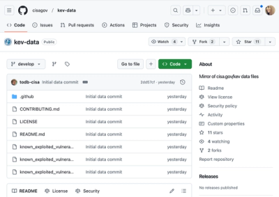
CISA's KEV data is now on GitHub, offering easier access, API integration, commit history tracking, and automated updates for security teams and researchers.