Product
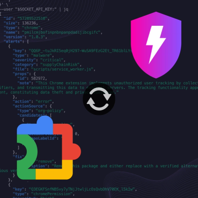
Socket Now Protects the Chrome Extension Ecosystem
Socket is launching experimental protection for Chrome extensions, scanning for malware and risky permissions to prevent silent supply chain attacks.
dialog-lite
Advanced tools
DialogLite is designed to control a dialog box (modal window) on a web page, providing the functionality to open, close and apply custom styles through a simple interface.
dialog-lite
DialogLite is designed to control a dialog box (modal window) on a web page, providing the functionality to open, close and apply custom styles through a simple interface.
1.5kB gzipped
➤ Install
yarn add dialog-lite
➤ Import
import DialogLite from 'dialog-lite';
CSS
import 'dialog-lite/dist/index.css';
or
@import "dialog-lite/dist/index.css";
➤ Usage
const dialogLite = new DialogLite({
  closingButton: true,
  closingBackdrop: true,
});

dialogLite.init();

button.addEventListener('click', () => {
  dialogLite.open({
    stylingClass: 'dialog-lite--first-window',
  });
});
➤ Options
| Option | Type | Default | Description |
|---|---|---|---|
closingButton | boolean | false | When set to true, enables the close button functionality in the dialog. The dialog can be closed by clicking the close button. |
closingBackdrop | boolean | false | When set to true, enables closing the dialog by clicking on the backdrop. |
➤ API
| Method | Parameters | Description |
|---|---|---|
init | None | Initializes the dialog, setting up event listeners for close button, backdrop click, and escape key based on the provided options. |
open | { stylingClass?: string }Default: { stylingClass: '' } | Opens the dialog, applying the specified styling class. Focuses on the first element inside the dialog with tabindex="0", and stores the previously focused element. |
close | None | Closes the dialog, restoring focus to the previously focused element. Adds the class for closing animation and optionally delays removal of the class. |
➤ Events
| Method | Description |
|---|---|
click (Close Button) | Triggered when the close button is clicked, closing the dialog if closingButton option is enabled. |
click (Backdrop) | Triggered when the backdrop is clicked, closing the dialog if closingBackdrop option is enabled. |
keydown (Escape key) | Triggered when the Escape key is pressed, closing the dialog. |
➤ License
dialog-lite is released under MIT license
FAQs
DialogLite is designed to control a dialog box (modal window) on a web page, providing the functionality to open, close and apply custom styles through a simple interface.
The npm package dialog-lite receives a total of 2 weekly downloads. As such, dialog-lite popularity was classified as not popular.
We found that dialog-lite demonstrated a healthy version release cadence and project activity because the last version was released less than a year ago. It has 0 open source maintainers collaborating on the project.
Did you know?

Socket for GitHub automatically highlights issues in each pull request and monitors the health of all your open source dependencies. Discover the contents of your packages and block harmful activity before you install or update your dependencies.

Product
Socket is launching experimental protection for Chrome extensions, scanning for malware and risky permissions to prevent silent supply chain attacks.

Product
Add secure dependency scanning to Claude Desktop with Socket MCP, a one-click extension that keeps your coding conversations safe from malicious packages.

Product
Socket now supports Scala and Kotlin, bringing AI-powered threat detection to JVM projects with easy manifest generation and fast, accurate scans.