Research
Security News
Malicious npm Package Targets Solana Developers and Hijacks Funds
A malicious npm package targets Solana developers, rerouting funds in 2% of transactions to a hardcoded address.
diva-mobile-numeric-input
Advanced tools
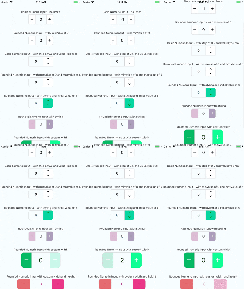
a cross platform stylish numeric input for react native

you can check out the very simple react native example app just click here and follow the instructions enjoy!
v1.0.1
yarn add diva-mobile-numeric-input
or with npm
npm install diva-mobile-numeric-input --save
yarn add diva-mobile-numeric-input react-native-vector-icons
react-native link
or with npm
npm install diva-mobile-numeric-input react-native-vector-icons --save
react-native link
if you're experiencing issues with react-native link which is used to install react-native-vector-icons
please refer to react-native-vector-icons to see manual installation steps
this component uses the react-native-pixel-perfect
and the defualt style is using base resolution for iphone7, in case you want to use the default design but, using a different base resolution, I added a function called updateBaseResolution(width,height) to use it you need to access it via a ref to the component.
since the component is dependant on react-native-pixel-perfect, when installing this package you install also react-native-pixel-perfect if it's not already installed.
so you can create your own responsive size function and use it to set your custom style.
import NumericInput from "diva-mobile-numeric-input";
<NumericInput onChange={(value) => console.log(value)} />
or basic up-down
<NumericInput type="up-down" onChange={(value) => console.log(value)} />
<NumericInput
  value={this.state.value}
  onChange={(value) => this.setState({ value })}
/>
<NumericInput
  value={this.state.value}
  timeBetweenPress={1000}
  onChange={(value) => this.setState({ value })}
  onLimitReached={(isMax, msg) => console.log(isMax, msg)}
  totalWidth={240}
  totalHeight={50}
  iconSize={25}
  step={1.5}
  valueType="real"
  rounded
  textColor="#B0228C"
  iconStyle={{ color: "white" }}
  rightButtonBackgroundColor="#EA3788"
  leftButtonBackgroundColor="#E56B70"
/>
| Name | Type | Default |
|---|---|---|
| value | number | none |
| timeBetweenPress | number | none |
| minValue | number | none |
| maxValue | number | none |
| step | number | 1 |
| valueType | 'integer' or 'real' | 'integer' |
| initValue | number | null if not used will start at 0 |
| iconSize | number | calcSize(30) |
| borderColor | string | '#d4d4d4' |
| iconStyle | object | none |
| totalWidth | number | calcSize(220) |
| separatorWidth | number | 1 |
| type | 'plus-minus' or 'up-down' | 'plus-minus' |
| rounded | boolean | false |
| textColor | string | 'black' |
| containerStyle | object | none |
| inputStyle | object | none |
| upDownButtonsBackgroundColor | string | 'white' |
| rightButtonBackgroundColor | string | 'white' |
| leftButtonBackgroundColor | string | 'white' |
| totalHeight | number | none |
| onChange | function | none - required prop |
| onLimitReached | function | none (empty function) |
| editable | boolean | true |
| validateOnBlur | boolean | true |
| reachMaxIncIconStyle | object | none |
| reachMaxDecIconStyle | object | none |
| reachMinIncIconStyle | object | none |
| reachMinDecIconStyle | object | none |
| extraTextInputProps | object | none |
We use SemVer for versioning. For the versions available, see the tags on this repository.
This project is licensed under the MIT License
FAQs
a stylish numeric input for react native
We found that diva-mobile-numeric-input demonstrated a healthy version release cadence and project activity because the last version was released less than a year ago. It has 1 open source maintainer collaborating on the project.
Did you know?

Socket for GitHub automatically highlights issues in each pull request and monitors the health of all your open source dependencies. Discover the contents of your packages and block harmful activity before you install or update your dependencies.

Research
Security News
A malicious npm package targets Solana developers, rerouting funds in 2% of transactions to a hardcoded address.

Security News
Research
Socket researchers have discovered malicious npm packages targeting crypto developers, stealing credentials and wallet data using spyware delivered through typosquats of popular cryptographic libraries.

Security News
Socket's package search now displays weekly downloads for npm packages, helping developers quickly assess popularity and make more informed decisions.