
Security News
Maven Central Adds Sigstore Signature Validation
Maven Central now validates Sigstore signatures, making it easier for developers to verify the provenance of Java packages.
By Sarah Gooding - Feb 06, 2025
documentation-hipster
Advanced tools
documentation.js Bootstrap Theme with TypeScript and React support

documentation-hipster is a react-styleguidist-inspired theme for documentation.js with support for TypeScript and React components
 Logo Style by Andre from NounProject.com
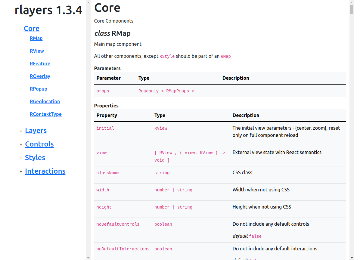
You can check an example documentation that uses it here: rlayers
Install
npm i --save-dev documentation-hipster
Run
documentation build ... --theme=node_modules/documentation-hipster/index.js
documentation-hipster supports the non-standard JSDoc tag @propsfor that allows to link the properties interface definition to the component.
(...in their next versions...stay tuned ...)
rlayers - React Component in TypeScript
gdal-async - Node.js addon in C++/JS with documentation-polyglot
documentation-hipster supports the following options in the documentation.yml configuration file:
documentation-hipster:
  # Disable the warning that multiple elements share the same base name
  # and cannot have their automatic cross links resolved
  crossLinksDupeWarning: false
  # An external function that must be the default export of the following file
  # Will get called every time a symbol is resolved to allow linking to external documentations
  # Check the rlayers project for an example
  externalCrossLinks: scripts/externalCrossLinks.js
  # If present every element will link to its source code
  srcLinkBase: https://github.com/mmomtchev/node-gdal-async/blob/master/
  # All CSS classes may be changed from these defaults
  classes:
    container: 'container d-flex flex-row',
    nav: 'position-sticky nav-section list',
    main: 'main-section ps-3',
    title: 'mt-2 mb-3 me-2',
    examples: 'ms-4',
    mainItem: 'me-1',
    navItem: 'd-flex flex-row align-items-center',
    navCollapse: 'btn btn-collapse m-0 me-2 p-0 align-items-center',
    navList: 'list-group',
    navListItem: 'list-group-item border-0',
    navLink: 'text-decoration-none',
    navText: 'm-0',
    paramsTable: 'table table-light',
    paramsParameterHeader: 'col-2',
    paramsTypeHeader: 'col-4',
    paramsDescriptionHeader: 'col-6',
    paramsParameterData: '',
    paramsTypeData: '',
    paramsDescriptionData: '',
    returns: 'me-1',
    source: 'ms-auto fs-6 fw-lighter'
  # Completely replace the built-in CSS
  css: my.css
  # Add some classes to the built-in CSS
  extraCss: scripts/gdal-doc.css
documentation-hipster uses Bootstrap and Handlebars. Simply copy the documentation-hipster directory to your project and edit the templates in ./hbs.
FAQs
documentation.js Bootstrap Theme with TypeScript and React support
The npm package documentation-hipster receives a total of 0 weekly downloads. As such, documentation-hipster popularity was classified as not popular.
We found that documentation-hipster demonstrated a not healthy version release cadence and project activity because the last version was released a year ago. It has 1 open source maintainer collaborating on the project.
Did you know?

Socket for GitHub automatically highlights issues in each pull request and monitors the health of all your open source dependencies. Discover the contents of your packages and block harmful activity before you install or update your dependencies.
Security News
Maven Central now validates Sigstore signatures, making it easier for developers to verify the provenance of Java packages.

Security News
CISOs are racing to adopt AI for cybersecurity, but hurdles in budgets and governance may leave some falling behind in the fight against cyber threats.

Research
Security News
Socket researchers uncovered a backdoored typosquat of BoltDB in the Go ecosystem, exploiting Go Module Proxy caching to persist undetected for years.