Security News
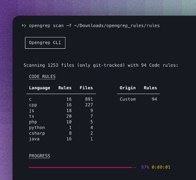
Opengrep Emerges as Open Source Alternative Amid Semgrep Licensing Controversy
Opengrep forks Semgrep to preserve open source SAST in response to controversial licensing changes.
Keep your styles on the beat with this vertical rhythm Stylus library. By establishing baseline units, you can easily keep a consistent flow for all of your layouts using these handy mixins. Also includes modular scale functions and variables in case you want to use them.
It is a best web practice to not set a pixel value for the html element as this can disrupt user disability preferences. This library will set your html font-size to 100% so don't override it.
We also use rems so polyfill if you need to go below IE9. Rems are the most convenient and reliable way to set vertical spacing.
npm install --save downbeat
This library is currently dependent on also using Rupture so that we sync up with the rupture.desktop-cutoff value. It's a lovely library for media queries. Check it out!
Like other Stylus libraries you need to use() it when calling Stylus. Here's an example Gulp config using three other awesome Stylus libraries: Happy Grid, Rupture and Axis.
var stylus = require('gulp-stylus');
var downbeat = require('downbeat');
var grid = require('happy-grid');
var rupture = require('rupture');
var axis = require('axis');

gulp.task('style', function() {
  gulp.src('styles/main.styl')
    .pipe(stylus({use: [downbeat(), rupture(), axis(), grid()]}))
    .pipe(gulp.dest('./compiled/css'))
});
Then in your main.styl just @import 'vertical-rhythm' and optionally @import 'modular-scale'.
There are no rendered classes. Just use the mixins. Some of these mixins are very simple but save time and help you to be more consistent.
We start out by definining variables for bod y-font-size and a body-line-height. Use a unitless number for the line-height and a rem unit for the font-size. The product of these two variables gives us our base unit which we can use for consistent rhythm.
This libary is set up to give a boost to the size of the type on larger screens. This is a common and useful design pattern.
body-font-size ?= 1rem
body-line-height ?= 1.5
desktop-ratio ?= 1.07
gutter ?= 3%
These are the calculated values based on your settings.
large-body-font-size = body-font-size * desktop-ratio
large-body-line-height = body-line-height * desktop-ratio
base = body-font-size * body-line-height
large-base = base-large = desktop-base = large-body-font-size * large-body-line-height
half-base = base-half = (base / 2)
third-base = base-third = (base / 3)
quarter-base = base-quarter = (base / 4)
This is useful for helping you use consitent margin on elements. Adds margin-bottom and/or margin-top in increments of the baseline-grid. You can use floated numbers like .5, etc. It also includes a media query for using the larger baseline on large screens.
Pass no arguments to use the default of 1 base unit to the bottom. Pass one argument to set the margin-bottom only. Pass two arguments to set the top (first) and bottom (second) margins. Nnote that it is top first when passing two args. This follows the CSS order for margin.
Also aliased as margin-rhythm() and rhythm-margin()
Example:
header
  rhythm .5
This example will give you a .75rem margin-bottom and a .8025rem margin-bottom for desktop.
Same as Rhythm mixin but for padding. Note that it defers in that it adds padding to top and bottom. Adds padding-top and padding-bottom in increments of the baseline-grid. You can use floated numbers like .5. Includes a media query for using the larger baseline on large screens.
Pass no args for .5 units on top and bottom padding. Pass one arg to set top and bottom padding to the same number of base units. Pass two args to set top (first) and bottom (second) padding.
Example:
header
  padding-rhythm()
These mixins are more for convenience but they do help you remember to be consistent with your spacing. Also it's nice not to have to write padding-top, padding-bottom when you don't want to mess up your left/right values by using just padding.
Example:
.content
  padding-sides()

.element
  padding-vertical 3rem

.spaced
  margin-sides()
  margin-vertical()
Another handy shortcut is pad(). This gives you the left/right padding set to the gutter and the padding-rhythm() mixin called to set the top/bottom padding including a media query for the large-base.
Here's the source for these mixins so you can see there is no sourcery going on...
padding-sides(left = gutter, right = left)
  padding-left left
  padding-right right

// aliases
sides-padding = side-padding = sides = padding-sides

padding-vertical(top = (base / 2), bottom = top)
  padding-top top
  padding-bottom bottom

// pad sides by gutter, top/bottom by base and mq for large-base
pad()
  padding-sides()
  padding-rhythm()

margin-sides(left = gutter, right = left)
  margin-left left
  margin-right right

margin-vertical(top = (base / 2), bottom = top)
  margin-top top
  margin-bottom bottom
I don't usually use these mixins but if you want to be hard-core about your vertical rhythm and maintaining a precise baseline they are definitely the tools you need.
Calculates the margin-bottom for an image of specified height to line-up with your baseline. Includes a media query for the large-base. You must pass the image height in pixels (with our without the px unit is fine). Make sure you don't set a margin-bottom aftewards or you will undo the mixin.
Example:
.example
  image-rhythm(300)
This calculates the line-height needed to maintain a consistent baseline based on the font-size that is already set for the element. Includes a media query for the large-base.
Accepts no arguments but you must set the font-size on the element like in this example.
Example:
h1
  font-size 2rem
  line-height-rhythm()
This is for when you want to set the line-height differently than what line-height-rhythm() gave you but still maintain your strict baseline rhythm. It calculates the padding needed to maintain vertical rhythm using the element's existing font-size and line-height.
If the text stacks to multiple lines we need to know how many in order to calculate the correct padding. Make top is true if you want top and bottom padding, otherwise you just get bottom.
Example:
h1
  font-size 1rem
  line-height 1.7
  find-padding(lines: 2, top: true)
This is a helper to render lines across your page useful in debugging and setting up your baseline alignment. Just apply it in the root of your stylesheet.
render-baseline()
While not strictly vertical rhythm related, modular scale can be a useful partner in setting up the rhythm of your site. So we have some variables and a couple of handy functions. Note that these are functions, not mixins. Use them to calculate a value.
These ratios have been proven to be pleasing throughout human history. We also include the Fibonacci sequence which is an array of numbers. Some people like to use that to setup up their h1, h2, h3, etc.
golden = 1.618
minor-second = 1.067
major-second = 1.125
minor-third = 1.2
major-third = 1.25
perfect-fourth = 1.333
augmented-fourth = 1.414
perfect-fifth = 1.5
minor-sixth = 1.6
major-sixth = 1.667
minor-seventh = 1.778
major-seventh = 1.875
octave = 2
major-tenth = 2.5
major-eleventh = 2.667
major-twelfth = 3
double-octave = 4
fibonacci = fib = 1 2 3 5 8 13 21 34 55 89 144
Pass a scale, ratio and a baseline. The default for the ratio is golden and the default for the baseline is base. When you use base or large-base you'll end up with rems. Feel free to use px or whatever value/unit you want for the baseline.
Example:
h1
  font-size: modular-scale(3, major-third)
Modular scale is a simple equation. Here's the source for the mixin...
modular-scale(scale, ratio = golden, baseline = base)
  baseline * (ratio ** scale)
Shortcut for using pefect fifths as the ratio. That's 1.5.
Example:
h1
  font-size: fifth(4)
FAQs
Vertical rhythm and modular scale library for Stylus.
The npm package downbeat receives a total of 14 weekly downloads. As such, downbeat popularity was classified as not popular.
We found that downbeat demonstrated a not healthy version release cadence and project activity because the last version was released a year ago. It has 1 open source maintainer collaborating on the project.
Did you know?

Socket for GitHub automatically highlights issues in each pull request and monitors the health of all your open source dependencies. Discover the contents of your packages and block harmful activity before you install or update your dependencies.

Security News
Opengrep forks Semgrep to preserve open source SAST in response to controversial licensing changes.

Security News
Critics call the Node.js EOL CVE a misuse of the system, sparking debate over CVE standards and the growing noise in vulnerability databases.

Security News
cURL and Go security teams are publicly rejecting CVSS as flawed for assessing vulnerabilities and are calling for more accurate, context-aware approaches.