Huge News!Announcing our $40M Series B led by Abstract Ventures.Learn More
Socket
Sign inDemoInstall
Socket

dt-rc-calendar

Package Overview
Dependencies
Maintainers
1
Versions
2
Alerts
File Explorer

Advanced tools

Socket logo

Install Socket

Detect and block malicious and high-risk dependencies

Install

dt-rc-calendar

React Calendar

  • 9.0.6
  • latest
  • Source
  • npm
  • Socket score

Version published
Maintainers
1
Created
Source

rc-calendar


React Calendar

NPM version build status Test coverage gemnasium deps npm download

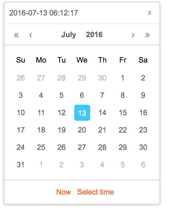
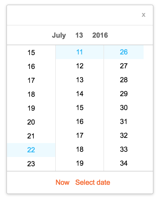
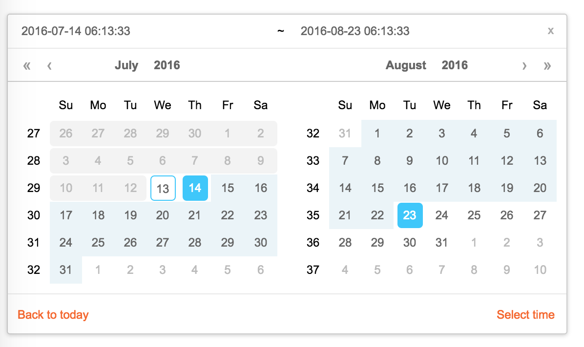
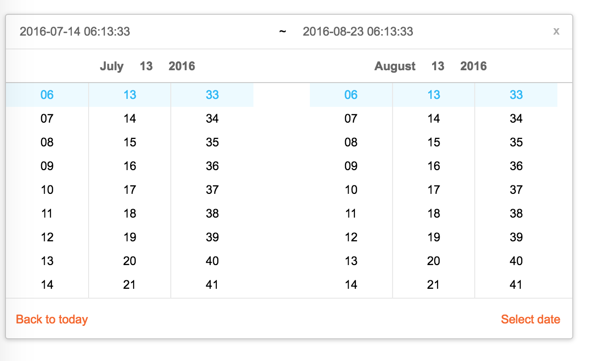
Screenshots

Feature

  • support ie9,ie9+,chrome,firefox,safari
  • support date, month, year, decade select panel
  • support week number
  • support en_US and zh_CN locale(UI), use moment.utcOffset to set timezone
  • support aria and keyboard accessibility

Keyboard

  • Previous month (PageUp)
  • Next month (PageDown)
  • tab into hour input: Last hour(Up), Next hour(Down)
  • tab into hour input: Last minute(Up), Next minute(Down)
  • tab into hour input: Last second(Up), Next second(Down)
  • Last year (Control + left)
  • Next year (Control + right)

install

rc-calendar

Usage

import Calendar from 'rc-calendar';
import React from 'react';
import ReactDOM from 'react-dom';
ReactDOM.render(<Calendar />, container);

Development

npm install
npm start

Example

http://localhost:8002/examples/

online example:

http://react-component.github.io/calendar/examples/index.html

API

rc-calendar props

nametypedefaultdescription
prefixClsStringprefixCls of this component
classNameStringadditional css class of root dom node
styleObjectadditional style of root dom node
dateRender(current, value) => React.Nodedate cell
renderSidebar() => React.Nodeside bar
renderFooter() => React.Nodeextra footer
valuemomentcurrent value like input's value
defaultValuemomentdefaultValue like input's defaultValue
localeObjectimport from 'rc-calendar/lib/locale/en_US'calendar locale
formatStringdepends on whether you set timePicker and your localeuse to format/parse date(without time) value to/from input
disabledDateFunction(current:moment):Booleanwhether to disable select of current date
disabledTimeFunction(current:moment):Objecta function which return a object with member of disabledHours/disabledMinutes/disabledSeconds according to rc-time-picker
showDateInputBooleantruewhether to show input on top of calendar panel
showWeekNumberBooleanfalsewhether to show week number of year
showTodayBooleantruewhether to show today button
showOkBooleanautowhether has ok button in footer
timePickerReact Elementrc-timer-picker/lib/module/panel element
onSelectFunction(date: moment)called when a date is selected from calendar
onChangeFunction(date: moment)called when a date is changed inside calendar (next year/next month/keyboard)
dateInputPlaceholderStringdate input's placeholder

rc-calendar/lib/RangeCalendar props

nametypedefaultdescription
prefixClsStringprefixCls of this component
classNameStringadditional css class of root dom node
styleObjectadditional style of root dom node
renderSidebar() => React.Nodeside bar
renderFooter() => React.Nodeextra footer
selectedValuemoment[]current selected value range. with two elements.
defaultSelectedValuemoment[]default selected value range
localeObjectimport from 'rc-calendar/lib/locale/en_US'calendar locale
formatStringdepends on whether you set timePicker and your localeuse to format/parse date(without time) value to/from input
disabledDateFunction(current:moment):Booleanwhether to disable select of current date
showWeekNumberBooleanfalsewhether to show week number of year
showTodayBooleantruewhether to show today button
showOkBooleanautowhether has ok button in footer
showClearBooleanfalsewhether has clear button in header
timePickerReact Elementrc-timer-picker/lib/module/panel element
onSelectFunction(date: moment[])called when a date range is selected from calendar
onChangeFunction(date: moment[])called when a date range is changed inside calendar (next year/next month/keyboard)
dateInputPlaceholderString[]range date input's placeholders
disabledTimeFunction(current: moment[], type:'start'|'end'):Objecta function which return a object with member of disabledHours/disabledMinutes/disabledSeconds according to rc-time-picker
typeenum('both','start', 'end')bothwhether fix start or end selected value. check start-end-range example

rc-calendar/lib/MonthCalendar props

nametypedefaultdescription
prefixClsStringprefixCls of this component
classNameStringadditional css class of root dom node
styleObjectadditional style of root dom node
valuemomentcurrent value like input's value
defaultValuemomentdefaultValue like input's defaultValue
localeObjectimport from 'rc-calendar/lib/locale/en_US'calendar locale
disabledDateFunction(current:moment):Booleanwhether to disable select of current month
onSelectFunction(date: moment)called when a date is selected from calendar
monthCellRenderfunctionCustom month cell render method
dateCellRenderfunctionCustom date cell render method
monthCellContentRenderfunctionCustom month cell content render method,the content will be appended to the cell.
onChangeFunction(date: moment)called when a date is changed inside calendar (next year/next month/keyboard)

rc-calendar/lib/Picker props

nametypedefaultdescription
prefixClsStringprefixCls of this component
calendarCalendar React Element
disabledBooleanwhether picker is disabled
placementString|Objectone of ['left','right','top','bottom', 'topLeft', 'topRight', 'bottomLeft', 'bottomRight']
alignObject: alignConfig of [dom-align](https://github.com/yiminghe/dom-align)value will be merged into placement's align config.
animationStringindex.css support 'slide-up'
transitionNameStringcss class for animation
valuemoment|moment[]current value like input's value
defaultValuemoment|moment[]defaultValue like input's defaultValue
onChangeFunctioncalled when select a different value
onOpenChange(open:boolean) => voidcalled when open/close picker
openBooleancurrent open state of picker. controlled prop
getCalendarContainer() => HTMLElement() => {return document.body;}dom node where calendar to be rendered into

rc-calendar/lib/FullCalendar props

nametypedefaultdescription
prefixClsStringprefixCls of this component
SelectReact Component Classrc-select Component Class
valuemomentcurrent value like input's value
defaultValuemomentdefaultValue like input's defaultValue
defaultTypestringdatedefault panel type: date/month
typestringpanel type: date/month
onTypeChangefunction(type)called when panel type change
fullscreenboolfalse
monthCellRenderfunctionCustom month cell render method
dateCellRenderfunctionCustom date cell render method
monthCellContentRenderfunctionCustom month cell content render method,the content will be appended to the cell.
dateCellContentRenderfunctionCustom date cell content render method,the content will be appended to the cell.
onSelectFunction(date: moment)called when a date is selected from calendar

Test Case

npm test
npm run chrome-test

Coverage

npm run coverage

open coverage/ dir

License

rc-calendar is released under the MIT license.

Keywords

FAQs

Package last updated on 05 Nov 2018

Did you know?

Socket

Socket for GitHub automatically highlights issues in each pull request and monitors the health of all your open source dependencies. Discover the contents of your packages and block harmful activity before you install or update your dependencies.

Install

Related posts

SocketSocket SOC 2 Logo

Product

  • Package Alerts
  • Integrations
  • Docs
  • Pricing
  • FAQ
  • Roadmap
  • Changelog

Packages

npm

Stay in touch

Get open source security insights delivered straight into your inbox.


  • Terms
  • Privacy
  • Security

Made with ⚡️ by Socket Inc