Security News
Maven Central Adds Sigstore Signature Validation
Maven Central now validates Sigstore signatures, making it easier for developers to verify the provenance of Java packages.
flexible-tabs
Advanced tools
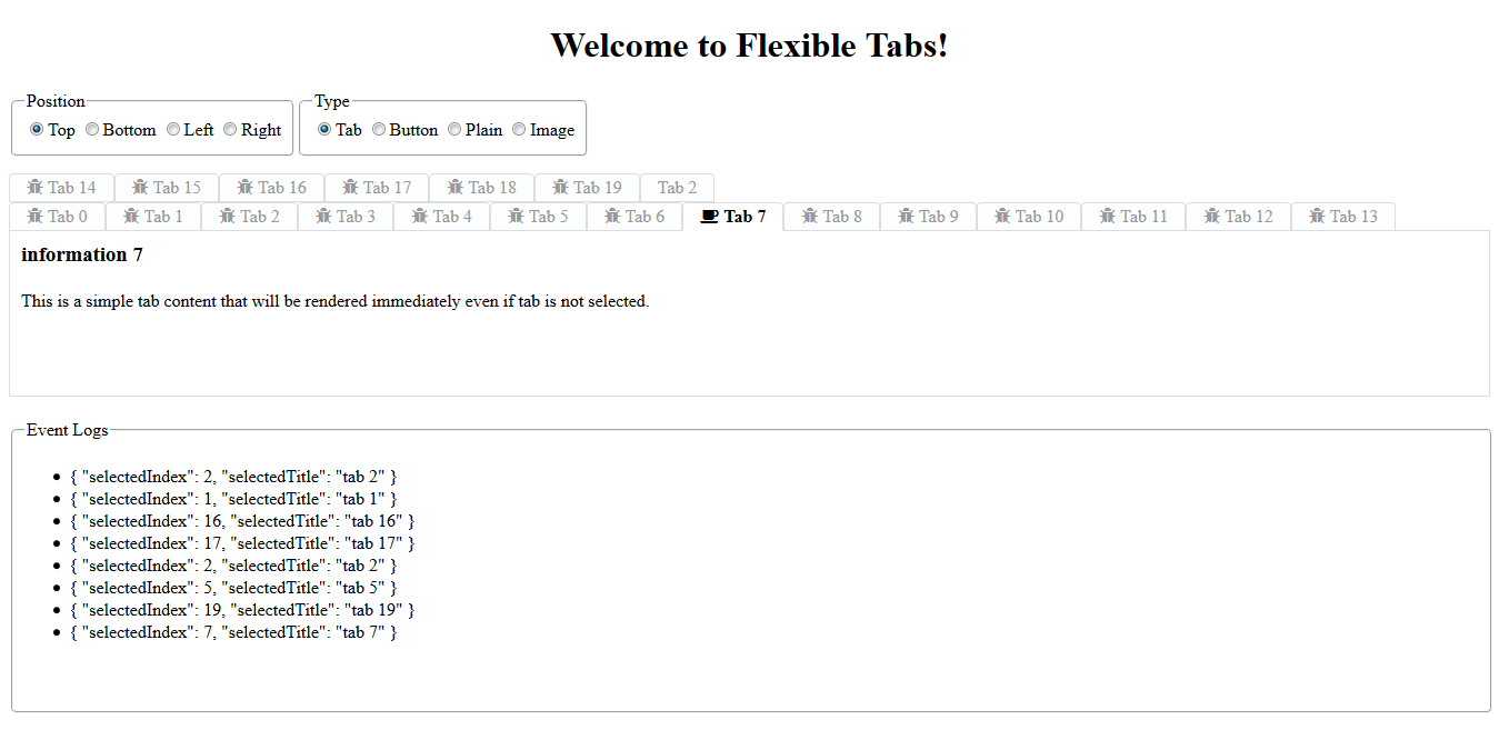
Have you ever wanted to have a simple way of creating robust tabs in your components? Have you thought of what it takes to get there? With flexible tabs, you can configure position of tabs and how they should be displayed. You can feed icons to the tabs
Have you ever wanted to have a simple way of creating robust tabs in your components? Have you thought of what it takes to get there? With flexible tabs, you can configure position of tabs and how they should be displayed. You can feed icons to the tabs and have a view area for displaying images.. You can have the view area to be rendered only if selected and watch for tab selection events to perform additional tasks.
NOTE: Starting with version 1.1.0 this library is compatible with Angular 6+.
NOTE: Starting with version 1.2.1 you need to import this library through @sedeh/flexible-tabs.
Please send your requests or comments through the link provided below:
Live Demo | Source code | Comments/Requests
MODULE:
FlexibleTabsModule
EXPORTS:
FlexibleTabComponent
FlexibleTabsComponent
| Attribute | Options | Default | Description |
|---|---|---|---|
| position | top, left, right, bottom | top | Tabs displaying position with respect to view port. |
| type | tab, button, plain, icon, radio | tab | Presentation of each tab. |
| pophover | true/false | false | If act like a menu and if tab content should be hidden and should pop on hover. |
| message | any string | "click to select tab " | ADA compliant message on each tab to be used by screen reader. |
| Attribute | Options | Default | Description |
|---|---|---|---|
| selected | true/false | false | By default the first tab will be selected. |
| template | ng-template | none | Template to be used at runtime to display content for selected tab. |
| data | JSON | none | Data to be sent to the template for selected tab. |
| title | any string | "" | tab to be used by screen readername to be displayed. |
| tabicon | any string | null | icon to be displayed on tab. |
| tabalticon | any string | null | icon to be displayed on selected tab or on tab hover. |
You will need to set the tabs in your HTML content:
In this example:
1) first tab is static and Angular will render it immediately.
2) second tab is template and angular will render it only if respective tab for it is selected.

<flexible-tabs
  [position]="myPosition"
  [type]="myType"
  message="click to select tab "
  (onchange)="ontabselection($event)">

  <flexible-tab title="tab 1" tabicon="fa fa-bug" tabalticon="fa fa-coffee">
    <h3> information</h3>
    This is a simple tab content that will be rendered immediately even if tab is not selected.
  </flexible-tab>
  <flexible-tab title="tab 2" [template]="tab2" [data]="data" selected="true"></flexible-tab>
</flexible-tabs>

<ng-template #tab2 let-detail="data">
  <h3>Detail information about {{detail.name}}</h3>
  This is a simple tab content that will be rendered only if tab is selected.
</ng-template>
You will also need to implement a few functions
  ontabselection(event) {
    // decide on what to do with the evet
  }
If you want to overide any parts of default look, you can use ::ng-deep and do the following:
CSS Example:

::ng-deep .tab-title {
    text-transform: capitalize;
}
| Version | Description |
|---|---|
| 1.2.1 | Updated dependencies. |
| 1.2.0 | It was brought to my attention that some users have trouble using my components in their angular 6 environment. Since I had only updated few dependencies when moved to Angular 6, I am thinking dependencies are causing issues. So, for this release, I am updating all dependencies to what Angular 6 applications are expecting to have. Please let me know if this is fixing or not fixing any issues you are facing. |
| 1.1.0 | Updated libraries to become compatible with Angular 6+. |
| 1.0.2 | set defaults for some attributes. |
| 1.0.0 | Compiled with AOT option and resolved issues. |
| 0.0.1 | Initial release. |

In your project root folder, find and open the file 'angular-cli.json' in any editor Locate the styles[] array and add font-awesome references directory. like:
"apps":
	[
        {
            ....
            "styles": [
              "../node_modules/font-awesome/css/font-awesome.css"
              "styles.css"
            ],
            ...
        }
    ]
FAQs
Have you ever wanted to have a simple way of creating robust tabs in your components? Have you thought of what it takes to get there? With flexible tabs, you can configure position of tabs and how they should be displayed. You can feed icons to the tabs
We found that flexible-tabs demonstrated a not healthy version release cadence and project activity because the last version was released a year ago. It has 1 open source maintainer collaborating on the project.
Did you know?

Socket for GitHub automatically highlights issues in each pull request and monitors the health of all your open source dependencies. Discover the contents of your packages and block harmful activity before you install or update your dependencies.

Security News
Maven Central now validates Sigstore signatures, making it easier for developers to verify the provenance of Java packages.

Security News
CISOs are racing to adopt AI for cybersecurity, but hurdles in budgets and governance may leave some falling behind in the fight against cyber threats.

Research
Security News
Socket researchers uncovered a backdoored typosquat of BoltDB in the Go ecosystem, exploiting Go Module Proxy caching to persist undetected for years.