Security News
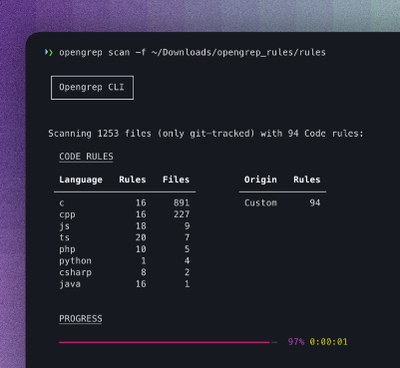
Opengrep Emerges as Open Source Alternative Amid Semgrep Licensing Controversy
Opengrep forks Semgrep to preserve open source SAST in response to controversial licensing changes.
A grid system should be simple and make your inner designer happy. Create rows, make columns, offset them, and change their source ordering. Easy-to-use Stylus mixin library. Forked and simplified from Cory Simmon's Lost grid before it was converted to PostCSS. Thanks to Cory Simmons for sorting out the grid math.
This is intentionally stripped down to the basics. If you want more features, check out https://github.com/corysimmons/lost.
Uses CSS calc so it supports modernish browsers, IE9+. To support IE8, you can use a calc polyfill, like this one: https://github.com/closingtag/calc-polyfill.
With this markup...
<section>
  <div><h2>Top Level Grid 1</h2></div>
  <div>
    <h2>Top Level Grid 2</h2>
    <div><h3>Nested Grid 1</h3></div>
    <div><h3>Nested Grid 2</h3></div>
  </div>
</section>
And this style...
section
  clearfix()

  div
    column('1/2')
Gives you a perfect nested grid. And makes you happy!
npm install --save happy-grid
Like other Stylus libraries you need to use() it when calling Stylus. Here's an example Gulp config using two other awesome Stylus libraries: Rupture and Axis.
var stylus = require('gulp-stylus');
var grid = require('happy-grid');
var rupture = require('rupture');
var axis = require('axis');

gulp.task('style', function() {
  gulp.src('styles/main.styl')
    .pipe(stylus({use: [rupture(), axis(), grid()]}))
    .pipe(gulp.dest('./compiled/css'))
});
Then in your main.styl just @import 'grid'.
There are no rendered classes. Just use the mixins.
Gutter is used to set padding on rows and margin-right on columns. The max-site-width gives you a default for the center() mixin width. Typically you would set it to the max-width of your site.
gutter = 3%
max-site-width = 60em
Used on a parent container to clear floated children elements. Based on Nicolas Gallagher's micro clearfix. If you use the center() mixin it's already applied for you. Takes no arguments.
Aliased as cf() and the more semanitcally named, group() as well.
.parent
  group()
Horizontally center a container element and apply a clearfix and optional padding to it. Pass any unit for the max-width and padding. It uses the default max-site-width from settings if called without any arguments.
Aliased as row() as well.
section
  center 30em
Here's the star of the show. Creates a column that is a fraction of the size of it's containing element with a gutter. You don't need to pass any additional ratios (fractions) as the grid system will make use of CSS calc(). Note that the ratio must always be a fraction wrapped in quotes... i.e. column('1/2'), NOT column(1/2) and NOT column(.5).
Margin: The margin on the right side of the element used to create a gutter. Typically this is left alone and the global gutter setting will be used, but you can override it here if you want certain elements to have a particularly large or small gutter (pass 0 for no gutter at all).
Cycle: The grid works by assigning a margin-right to all elements except the last in the row. It does this by default by using the denominator of the fraction you pick. To override this default pass a cycle parameter. e.g. column('2/4', cycle: 2).
Aliased as col() also.
.element
  column '1/3'

.gutter-override
  column '1/3' 2%

.cycle-override
  column('2/6', cycle: 3)

.gutter-and-cycle-override
  column('2/6', margin: 2em, cycle: 3)
Margin to the left or right of an element depending on if the fraction passed is positive or negative.
.two-elements
  column '1/3'

  &:first-child
    offset '1/3'
Source ordering. Shift elements left or right by passing a positive or negative fraction. Aliased as shift() also.
.reversed-order
  column '1/2'

  &:first-child
    move '1/2'

  &:last-child
    move '-1/2'
FAQs
Stylus fractional grid system built with calc().
The npm package happy-grid receives a total of 4 weekly downloads. As such, happy-grid popularity was classified as not popular.
We found that happy-grid demonstrated a not healthy version release cadence and project activity because the last version was released a year ago. It has 1 open source maintainer collaborating on the project.
Did you know?

Socket for GitHub automatically highlights issues in each pull request and monitors the health of all your open source dependencies. Discover the contents of your packages and block harmful activity before you install or update your dependencies.

Security News
Opengrep forks Semgrep to preserve open source SAST in response to controversial licensing changes.

Security News
Critics call the Node.js EOL CVE a misuse of the system, sparking debate over CVE standards and the growing noise in vulnerability databases.

Security News
cURL and Go security teams are publicly rejecting CVSS as flawed for assessing vulnerabilities and are calling for more accurate, context-aware approaches.