Interactive Hepatic Safety Explorer graphic
This interactive chart allows users to evaluate participant liver function in clinical trials. A live demo using sample data is available here and shown below.
Background
Standard properties and workflows for evaluation of hepatic data using static eDish plots are well documented by Watkins et al., Merz et al. and others.
This library contains a web-based implementation of these workflows that allows a user to interactively explore participant data in ways that are not possible in static plots.
Interactive Functionality
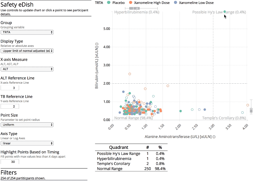
Just like the standard eDish plot, the default view for this chart shows one point per participant with maximal alanine transaminase (ALT) and total bilirubin (TB) over the course of the study plotted on the x- and y-axes, respectively (see "Population View" below).
Clicking on a participant's circle displays additional details for that individual (see "Details View").
Population View

Feature List
- Interactive Hy's law quadrants + summary table
- Points filled based on time between maximal values
- Marginal distribution box plots (coming soon)
- Click a point to view a hysteresis plot of the selected participant as well as a summary their demographic and medical signs data
- Interactive grouping
- Toggle between results relative to the upper limit of normal and to baseline result
- Size points with a third measure
- Toggle between linear and log axes
- Interactive data filtering
Details View

Feature List
- Hysteresis plot ("snake plot") showing participant's lab values over time
- Participant details section
- Demographic summary
- Spaghetti plot of selected measures
- Lab summary table with spark lines