Security News
PyPI Now Supports iOS and Android Wheels for Mobile Python Development
PyPI now supports iOS and Android wheels, making it easier for Python developers to distribute mobile packages.
ionic-tooltips-dst-optimised
Advanced tools
Tooltips module for apps built with Ionic Framework.
This module is designed to work with ionic-angular@^3.5.0 but it should work with any version above 2.0.0 as it doesn't heavily depend on the Ionic Framework.
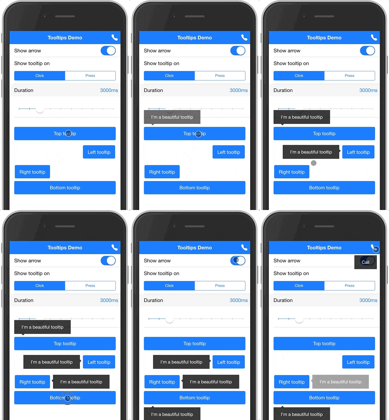
Below is a gif showing the module in action, you can also clone the example project here: https://github.com/zyra/ionic-tooltips-example

The module can be used to display tooltips for any element in your app. It also provides a special treatment for buttons in the header navigation (inspired by Google's apps).
Here's a quick example to show a tooltip below a button:
<!-- positionV specifies where the tooltip should be displayed vertically, can be either top or bottom -->
<!-- arrow tells the tooltip directive to show an arrow above the tooltip box -->
<button ion-button tooltip="I'm a tooltip below a button" positionV="bottom" arrow>
  Press me to see a tooltip
</button>
And here's another example to show a tooltip below a nav button:
<ion-header>
  <ion-navbar>
    <ion-title>Page title</ion-title>
    <ion-buttons end>
      <!-- navTooltip tells the tooltip directive that this is a nav button -->
      <ion-button icon-only tooltip="Call" navTooltip>
        <ion-icon name="call"></ion-icon>
      </ion-button>
    </ion-buttons>
  </ion-navbar>
</ion-header>
@angular/animations installed. If you don't have it, run the following command to install it:npm i --save --save-exact @angular/animations@4.1.3
npm i --save ionic-tooltips
TooltipsModule in your @NgModule. If you are using lazy module loading, then you need to import it in the modules where it's used.import { TooltipsModule } from 'ionic-tooltips';
@NgModule({
...
imports: [
...
TooltipsModule
]
})
export class MyModule { ... }
BrowserAnimationsModule in your app's main @NgModule.import { BrowserAnimationsModule } from '@angular/platform-browser/animations';
@NgModule({
...
imports: [
...
BrowserAnimationsModule
]
})
Now you're ready to use this module. See information below for usage.
The tooltip directive takes a string, which will be used as the tooltip text. When using the tooltip directive, you can also use the following inputs:
navTooltip(boolean) add this attribute or set it's value to true to specify that the tooltip belongs to a nav button. Defaults to false.
positionV(string) specifies the vertical position of the tooltip. Can be either 'top' or 'bottom'.
positionH(string) specifies the horizontal position of the tooltip. Can be either 'right' or 'left'.
event(string) the event to show the tooltip on. Can be either 'hover', 'click' or 'press'. Defaults to 'press'.
Note: 'hover' only works on desktop.
arrow(boolean) add this attribute or set it's value to true to show an arrow attached to the tooltip. Defaults to false.
duration(number) number of milliseconds to show the tooltip for. Defaults to 3000.
active(boolean) add this attribute or set it's value to true to display the tooltip. Defaults to false.
If you find this project useful, please star the repo to let people know that it's reliable. Also, share it with friends and colleagues that might find this useful as well. Thank you :smile:
FAQs
Tooltips module for Ionic apps
The npm package ionic-tooltips-dst-optimised receives a total of 2 weekly downloads. As such, ionic-tooltips-dst-optimised popularity was classified as not popular.
We found that ionic-tooltips-dst-optimised demonstrated a not healthy version release cadence and project activity because the last version was released a year ago. It has 1 open source maintainer collaborating on the project.
Did you know?

Socket for GitHub automatically highlights issues in each pull request and monitors the health of all your open source dependencies. Discover the contents of your packages and block harmful activity before you install or update your dependencies.

Security News
PyPI now supports iOS and Android wheels, making it easier for Python developers to distribute mobile packages.

Security News
Create React App is officially deprecated due to React 19 issues and lack of maintenance—developers should switch to Vite or other modern alternatives.

Security News
Oracle seeks to dismiss fraud claims in the JavaScript trademark dispute, delaying the case and avoiding questions about its right to the name.