react-trello
Pluggable components to add a trello-like kanban board to your application


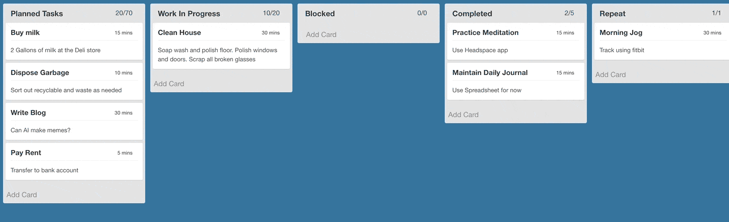
Demo
Features
- responsive and extensible
- easily pluggable into existing application
- supports pagination when scrolling individual lanes
- drag-and-drop cards and lanes (compatible with touch devices)
- event bus for triggering events externally (e.g.: adding or removing cards based on events coming from backend)
- edit functionality to add/delete cards
- Parameterised templates to customize lane and card appearance
Getting Started
Install using npm or yarn
$ npm install --save react-trello
or
$ yarn add react-trello
Usage
The Board component takes a prop called data that contains all the details related to rendering the board. A sample data json is given here to illustrate the contract:
const data = {
  lanes: [
    {
      id: 'lane1',
      title: 'Planned Tasks',
      label: '2/2',
      cards: [
        {id: 'Card1', title: 'Write Blog', description: 'Can AI make memes', label: '30 mins'},
        {id: 'Card2', title: 'Pay Rent', description: 'Transfer via NEFT', label: '5 mins', metadata: {sha: 'be312a1'}}
      ]
    },
    {
      id: 'lane2',
      title: 'Completed',
      label: '0/0',
      cards: []
    }
  ]
}
The data is passed to the board component and that's it.
import React from 'react'
import Board from 'react-trello'

export default class App extends React.Component {
  render() {
    return <Board data={data} />
  }
}
Refer to storybook for detailed examples: https://rcdexta.github.io/react-trello/
Also refer to the sample project that uses react-trello as illustration: https://github.com/rcdexta/react-trello-example
Documentation
Board
This is the container component that encapsulates the lanes and cards
| draggable | boolean | Makes all cards and lanes draggable. Default: false |
| laneDraggable | boolean | Set to false to disable lane dragging. Default: true |
| cardDraggable | boolean | Set to false to disable card dragging. Default: true |
| collapsibleLanes | boolean | Make the lanes with cards collapsible. Default: false |
| editable | boolean | Makes the entire board editable. Allow cards to be added or deleted Default: false |
| handleDragStart | function | Callback function triggered when card drag is started: handleDragStart(cardId, laneId) |
| handleDragEnd | function | Callback function triggered when card drag ends: handleDragEnd(cardId, sourceLaneId, targetLaneId, position, cardDetails) |
| handleLaneDragStart | function | Callback function triggered when lane drag is started: handleLaneDragStart(laneId) |
| handleLaneDragEnd | function | Callback function triggered when lane drag ends: handleLaneDragEnd(laneId, newPosition) |
| cardDragClass | string | CSS class to be applied to Card when being dragged |
| laneDragClass | string | CSS class to be applied to Lane when being dragged |
| onLaneScroll | function | Called when a lane is scrolled to the end: onLaneScroll(requestedPage, laneId) |
| onCardClick | function | Called when a card is clicked: onCardClick(cardId, metadata, laneId) |
| onCardAdd | function | Called when a new card is added: onCardAdd(card, laneId) |
| addCardLink | node | Pass custom element to replace the Add Card link at the end of the lane (when board is editable) |
| newCardTemplate | node | Pass a custom new card template to add new cards to a lane (when board is editable) |
| hideCardDeleteIcon | boolean | Disable showing the delete icon to the top right corner of the card (when board is editable) |
| onCardDelete | function | Called when a card is deleted: onCardDelete(cardId, laneId) |
| onLaneClick | function | Called when a lane is clicked: onLaneClick(laneId). Card clicks are not propagated to lane click event |
| laneSortFunction | function | Used to specify the logic to sort cards on a lane: laneSortFunction(card1, card2) |
| eventBusHandle | function | This is a special function that providers a publishHook to pass new events to the board. See details in Publish Events section |
| onDataChange | function | Called everytime the data changes due to user interaction or event bus: onDataChange(newData) |
| style | object | Pass css style props to board container |
| customCardLayout | function | Boolean to indicate a custom card template will be specified. Add the card component as child to Board |
| customLaneHeader | element | Pass custom lane header as react component to modify appearance |
| data | object | Actual board data in the form of json |
| tagStyle | object | If cards have tags, use this prop to modify their style |
Refer to stories folder for examples on many more options for customization.
Publish Events
When defining the board, it is possible to obtain a event hook to the component to publish new events later after the board has been rendered. Refer the example below:
let eventBus = undefined
const setEventBus = (handle) => {
eventBus = handle
}
eventBus.publish({type: 'ADD_CARD', laneId: 'COMPLETED', card: {id: "M1", title: "Buy Milk", label: "15 mins", description: "Also set reminder"}})
eventBus.publish({type: 'REMOVE_CARD', laneId: 'PLANNED', cardId: "M1"})
eventBus.publish({type: 'MOVE_CARD', fromLaneId: 'PLANNED', toLaneId: 'WIP', cardId: 'Plan3', index: 0})
eventBus.publish({type: 'UPDATE_LANES', lanes: newLaneData})
<Board data={data} eventBusHandle={setEventBus}/>
The first event in the above example will move the card Buy Milk from the planned lane to completed lane. We expect that this library can be wired to a backend push api that can alter the state of the board in realtime.
Custom Card Styling
You can completely customize the look-and-feel of each card in any lane by passing in a custom component as child to the Board as seen below:
<Board data={data} customCardLayout>
  <CustomCard />
</Board>
customCardLayout prop must be set to true for the custom card to be rendered
The json content for the card and the card template must agree on the props:
const CustomCard = props => {
  return (
    <div>
      <header
        style={{
          borderBottom: '1px solid #eee',
          paddingBottom: 6,
          marginBottom: 10,
          display: 'flex',
          flexDirection: 'row',
          justifyContent: 'space-between',
          color: props.cardColor
        }}>
        <div style={{fontSize: 14, fontWeight: 'bold'}}>{props.name}</div>
        <div style={{fontSize: 11}}>{props.dueOn}</div>
      </header>
      <div style={{fontSize: 12, color: '#BD3B36'}}>
        <div style={{color: '#4C4C4C', fontWeight: 'bold'}}>{props.subTitle}</div>
        <div style={{padding: '5px 0px'}}>
          <i>{props.body}</i>
        </div>
        <div style={{marginTop: 10, textAlign: 'center', color: props.cardColor, fontSize: 15, fontWeight: 'bold'}}>
          {props.escalationText}
        </div>
      </div>
    </div>
  )
}

const data = {
  lanes: [
    {
      id: 'lane1',
      title: 'Planned Tasks',
      cards: [
        {
          id: 'Card1',
          name: 'John Smith',
          dueOn: 'due in a day',
          subTitle: 'SMS received at 12:13pm today',
          body: 'Thanks. Please schedule me for an estimate on Monday.',
          escalationText: 'Escalated to OPS-ESCALATIONS!',
          cardColor: '#BD3B36',
          cardStyle: {borderRadius: 6, boxShadow: '0 0 6px 1px #BD3B36', marginBottom: 15}
        },
        {
          id: 'Card2',
          name: 'Card Weathers',
          dueOn: 'due now',
          subTitle: 'Email received at 1:14pm',
          body: 'Is the estimate free, and can someone call me soon?',
          escalationText: 'Escalated to Admin',
          cardColor: '#E08521',
          cardStyle: {borderRadius: 6, boxShadow: '0 0 6px 1px #E08521', marginBottom: 15}
        }
      ]
    }
  ]
}
Editable Board
It is possible to make the entire board editable by setting the editable prop to true. This switch prop will enable existing cards to be deleted and show a Add Card link at the bottom of each lane, clicking which will show an inline editable new card.
Check out the editable board story and its corresponding source code for more details.
Compatible Browsers
Tested to work with following browsers using Browserling:
- Chrome 60 or above
- Firefox 52 or above
- Opera 51 or above
- Safari 4.0 or above
- Microsoft Edge 15 or above
Feature Wishlist
- the prop
onDataChange is a catch all callback that returns the entire board data when anything changes on the board. Micro-events like when a card is added or re-arranged should be possible too
Check the Milestones for this project to track when the above features will be implemented.
Development
cd react-trello/
yarn install
yarn run storybook
Scripts
npm run lint : Lint all js filesnpm run lintfix : fix linting errors of all js filesnpm run semantic-release : make a release. Leave it for CI to do.npm run storybook: Start developing by using storybooknpm run test : Run tests. tests file should be written as *.test.js and using ES2015npm run test:watch : Watch tests while writingnpm run test:cover : Show coverage report of your testsnpm run test:report : Report test coverage to codecov.io. Leave this for CInpm run build: transpile all ES6 component files into ES5(commonjs) and put it in dist directorynpm run docs: create static build of storybook in docs directory that can be used for github pages
Learn how to write stories here
License
MIT


