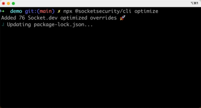
Product
Introducing Socket Optimize
We're excited to introduce Socket Optimize, a powerful CLI command to secure open source dependencies with tested, optimized package overrides.
By John-David Dalton - Oct 16, 2024
markdown-to-jsx
Advanced tools
Convert markdown to JSX with ease for React and React-like projects. Super lightweight and highly configurable.
The markdown-to-jsx package is an npm package that allows you to parse and render Markdown content as React components. It is lightweight and customizable, making it a good choice for projects that need to convert Markdown to JSX without heavy dependencies.
Basic Markdown Parsing
This feature allows you to render basic Markdown text as React components. The example code shows how to import the Markdown component from the package and use it to render a simple Markdown string.
import Markdown from 'markdown-to-jsx';
const markdownInput = '# Hello World!';
function App() {
return <Markdown>{markdownInput}</Markdown>;
}Custom Components
This feature allows you to use custom components to render specific parts of the Markdown content. In the example, a custom anchor component is used to replace the default rendering of links.
import Markdown from 'markdown-to-jsx';
import MyCustomComponent from './MyCustomComponent';

const markdownInput = '[Click me](#custom)';

const options = {
  overrides: {
    a: {
      component: MyCustomComponent,
      props: {
        className: 'my-custom-class'
      }
    }
  }
};

function App() {
  return <Markdown options={options}>{markdownInput}</Markdown>;
}
Markdown Options
This feature allows you to customize the parsing and rendering behavior of the Markdown content. The example demonstrates how to use options to modify the default behavior, such as forcing block-level rendering or customizing the slugify function.
import Markdown from 'markdown-to-jsx';

const markdownInput = 'Hello, *world*!';

const options = {
  forceBlock: true,
  forceInline: false,
  slugify: (text) => text.toLowerCase().replace(/\s/g, '-')
};

function App() {
  return <Markdown options={options}>{markdownInput}</Markdown>;
}react-markdown is a popular Markdown renderer for React that uses remark to parse Markdown. It is similar to markdown-to-jsx but offers a more extensive plugin system, which allows for more customization and extensibility at the cost of a larger bundle size.
marked is a low-level Markdown compiler for parsing Markdown without caching or blocking for long periods of time. It is not specifically designed for React like markdown-to-jsx, but it can be used in a React project with additional setup. It is known for its speed and extensibility.
remarkable is another Markdown parser that can be configured extensively with plugins. It is not React-specific and provides a full-featured Markdown to HTML converter. Compared to markdown-to-jsx, it might require additional integration steps for use within React applications.
markdown-to-jsx
The most lightweight, customizable React markdown component.


markdown-to-jsx uses a heavily-modified fork of simple-markdown as its parsing engine and extends it in a number of ways to make your life easier. Notably, this package offers the following additional benefits:
Arbitrary HTML is supported and parsed into the appropriate JSX representation
without dangerouslySetInnerHTML
Any HTML tags rendered by the compiler and/or <Markdown> component can be overridden to include additional
props or even a different HTML representation entirely.
GFM task list support.
Fenced code blocks with highlight.js support.
All this clocks in at around 5 kB gzipped, which is a fraction of the size of most other React markdown components.
Requires React >= 0.14.
Install markdown-to-jsx with your favorite package manager.
npm i markdown-to-jsx
markdown-to-jsx exports a React component by default for easy JSX composition:
ES6-style usage*:
import Markdown from 'markdown-to-jsx';
import React from 'react';
import { render } from 'react-dom';

render(<Markdown># Hello world!</Markdown>, document.body);

/*
    renders:

    <h1>Hello world!</h1>
 */
* NOTE: JSX does not natively preserve newlines in multiline text. In general, writing markdown directly in JSX is discouraged and it's a better idea to keep your content in separate .md files and require them, perhaps using webpack's raw-loader.
By default, the compiler will try to make an intelligent guess about the content passed and wrap it in a <div>, <p>, or <span> as needed to satisfy the "inline"-ness of the markdown. For instance, this string would be considered "inline":
Hello. _Beautiful_ day isn't it?
But this string would be considered "block" due to the existence of a header tag, which is a block-level HTML element:
# Whaddup?
However, if you really want all input strings to be treated as "block" layout, simply pass options.forceBlock = true like this:
<Markdown options={{ forceBlock: true }}>Hello there old chap!</Markdown>;

// or

compiler('Hello there old chap!', { forceBlock: true });

// renders

<p>Hello there old chap!</p>;
The inverse is also available by passing options.forceInline = true:
<Markdown options={{ forceInline: true }}># You got it babe!</Markdown>;

// or

compiler('# You got it babe!', { forceInline: true });

// renders

<span># You got it babe!</span>;
Pass the options.overrides prop to the compiler or <Markdown> component to seamlessly revise the rendered representation of any HTML tag. You can choose to change the component itself, add/change props, or both.
import Markdown from 'markdown-to-jsx';
import React from 'react';
import { render } from 'react-dom';

// surprise, it's a div instead!
const MyParagraph = ({ children, ...props }) => (
    <div {...props}>{children}</div>
);

render(
    <Markdown
        options={{
            overrides: {
                h1: {
                    component: MyParagraph,
                    props: {
                        className: 'foo',
                    },
                },
            },
        }}
    >
        # Hello world!
    </Markdown>,
    document.body
);

/*
    renders:

    <div class="foo">
        Hello World
    </div>
 */
If you only wish to provide a component override, a simplified syntax is available:
{
    overrides: {
        h1: MyParagraph,
    },
}
Depending on the type of element, there are some props that must be preserved to ensure the markdown is converted as intended. They are:
a: title, hrefimg: title, alt, srcinput[type="checkbox"]: checked, readonly (specifically, the one rendered by a GFM task list)ol: starttd: styleth: styleAny conflicts between passed props and the specific properties above will be resolved in favor of markdown-to-jsx's code.
One of the most interesting use cases enabled by the HTML syntax processing in markdown-to-jsx is the ability to use any kind of element, even ones that aren't real HTML tags like React component classes.
By adding an override for the components you plan to use in markdown documents, it's possible to dynamically render almost anything. One possible scenario could be writing documentation:
import Markdown from 'markdown-to-jsx';
import React from 'react';
import { render } from 'react-dom';

import DatePicker from './date-picker';

const md = `
# DatePicker

The DatePicker works by supplying a date to bias towards,
as well as a default timezone.

<DatePicker biasTowardDateTime="2017-12-05T07:39:36.091Z" timezone="UTC+5" />
`;

render(
    <Markdown
        children={md}
        options={{
            overrides: {
                DatePicker: {
                    component: DatePicker,
                },
            },
        }}
    />,
    document.body
);
markdown-to-jsx also handles JSX interpolation syntax, but in a minimal way to not introduce a potential attack vector. Interpolations are sent to the component as their raw string, which the consumer can then eval() or process as desired to their security needs.
In the following case, DatePicker could simply run parseInt() on the passed startTime for example:
import Markdown from 'markdown-to-jsx';
import React from 'react';
import { render } from 'react-dom';

import DatePicker from './date-picker';

const md = `
# DatePicker

The DatePicker works by supplying a date to bias towards,
as well as a default timezone.

<DatePicker
  biasTowardDateTime="2017-12-05T07:39:36.091Z"
  timezone="UTC+5"
  startTime={1514579720511}
/>
`;

render(
    <Markdown
        children={md}
        options={{
            overrides: {
                DatePicker: {
                    component: DatePicker,
                },
            },
        }}
    />,
    document.body
);
Another possibility is to use something like recompose's withProps() HOC to create various pregenerated scenarios and then reference them by name in the markdown:
import Markdown from 'markdown-to-jsx';
import React from 'react';
import { render } from 'react-dom';
import withProps from 'recompose/withProps';

import DatePicker from './date-picker';

const DecemberDatePicker = withProps({
    range: {
        start: new Date('2017-12-01'),
        end: new Date('2017-12-31'),
    },
    timezone: 'UTC+5',
})(DatePicker);

const md = `
# DatePicker

The DatePicker works by supplying a date to bias towards,
as well as a default timezone.

<DatePicker
  biasTowardDateTime="2017-12-05T07:39:36.091Z"
  timezone="UTC+5"
  startTime={1514579720511}
/>

Here's an example of a DatePicker pre-set to only the month of December:

<DecemberDatePicker />
`;

render(
    <Markdown
        children={md}
        options={{
            overrides: {
                DatePicker,
                DecemberDatePicker,
            },
        }}
    />,
    document.body
);
Sometimes, you might want to override the React.createElement default behavior to hook into the rendering process before the JSX gets rendered. This might be useful to add extra children or modify some props based on runtime conditions. The function mirrors the React.createElement function, so the params are type, [props], [...children]:
import Markdown from 'markdown-to-jsx';
import React from 'react';
import { render } from 'react-dom';

const md = `
# Hello world
`;

render(
    <Markdown
        children={md}
        options={{
            createElement(type, props, children) {
                return (
                    <div className="parent">
                        {React.createElement(type, props, children)}
                    </div>
                );
            },
        }}
    />,
    document.body
);
By default, a lightweight deburring function is used to generate an HTML id from headings. You can override this by passing a function to options.slugify. This is helpful when you are using non-alphanumeric characters (e.g. Chinese or Japanese characters) in headings. For example:
<Markdown options={{ slugify: str => str }}># 中文</Markdown>;

// or

compiler('# 中文', { slugify: str => str });

// renders:

<h1 id="中文">中文</h1>
Many development conveniences are placed behind process.env.NODE_ENV !== "production" conditionals. When bundling your app, it's a good idea to replace these code snippets such that a minifier (like uglify) can sweep them away and leave a smaller overall bundle.
Here are instructions for some of the popular bundlers:
Everything will work just fine! Simply Alias react to preact-compat like you probably already are doing.
People usually write HTML like this:
<div>
    Hey, how are you?
</div>
Note the leading spaces before the inner content. This sort of thing unfortunately clashes with existing markdown syntaxes since 4 spaces === a code block and other similar collisions.
To get around this, markdown-to-jsx strips leading and trailing whitespace inside of arbitrary HTML within markdown. This means that certain syntaxes that use significant whitespace won't work in this edge case.
NOTE! These syntaxes work just fine when you aren't writing arbitrary HTML wrappers inside your markdown. This is very much an edge case of an edge case. 🙃
✅
<div>
```js
var some = code();
```
</div>
⛔️
<div>
    var some = code();
</div>
This won't work at all at the moment. Trying to figure out a solution that will coexist peacefully with all the syntax permutations.
⛔️
<div>
* something
  * something related
* something else
</div>
If desired, the compiler function is a "named" export on the markdown-to-jsx module:
import { compiler } from 'markdown-to-jsx';
import React from 'react';
import { render } from 'react-dom';

render(compiler('# Hello world!'), document.body);

/*
    renders:

    <h1>Hello world!</h1>
 */
It accepts the following arguments:
compiler(markdown: string, options: object?)
See Github Releases.
Like this library? It's developed entirely on a volunteer basis; chip in a few bucks if you can at the OpenCollective.
This project exists thanks to all the people who contribute. [Contribute].

Thank you to all our backers! 🙏 [Become a backer]

Support this project by becoming a sponsor. Your logo will show up here with a link to your website. [Become a sponsor]
MIT
FAQs
Convert markdown to JSX with ease for React and React-like projects. Super lightweight and highly configurable.
The npm package markdown-to-jsx receives a total of 4,531,258 weekly downloads. As such, markdown-to-jsx popularity was classified as popular.
We found that markdown-to-jsx demonstrated a healthy version release cadence and project activity because the last version was released less than a year ago. It has 2 open source maintainers collaborating on the project.
Did you know?

Socket for GitHub automatically highlights issues in each pull request and monitors the health of all your open source dependencies. Discover the contents of your packages and block harmful activity before you install or update your dependencies.
Product
We're excited to introduce Socket Optimize, a powerful CLI command to secure open source dependencies with tested, optimized package overrides.

Product
We're excited to announce that Socket now supports the Java programming language.

Security News
Socket detected a malicious Python package impersonating a popular browser cookie library to steal passwords, screenshots, webcam images, and Discord tokens.