Security News
pnpm 10.0.0 Blocks Lifecycle Scripts by Default
pnpm 10 blocks lifecycle scripts by default to improve security, addressing supply chain attack risks but sparking debate over compatibility and workflow changes.
md-color-picker
Advanced tools
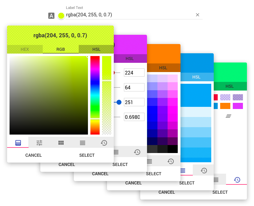
Angular-Material based color picker with no jQuery or other DOM/utility library dependencies.

Try out the demo here: GitHub Page
md-color-picker.npm install md-color-picker
bower install md-color-picker
The only other dependency is tinycolor.js which is an exceptional color manipulation library.
<link href="path/to/md-color-picker/dist/mdColorPicker.min.css" rel="stylesheet" />
<script src="path/to/tinycolor/dist/tinycolor-min.js"></script>
<script src="path/to/md-color-picker/dist/mdColorPicker.min.js"></script>
var app = angular.module('myApp', ['ngMaterial','ngCookies', 'mdColorPicker']);
<div md-color-picker ng-model="valueObj"></div>
Options may be set either by an options object on the md-color-picker attribute and/or using attributes. If an option is present on both the options object and as an attribute, the attribute will take precedence.
Setting options by scope object
// Controller
$scope.scopeVariable.options = {
    label: "Choose a color",
    icon: "brush",
    default: "#f00",
    genericPalette: false,
    history: false
};
<div md-color-picker="scopeVariable.options" ng-model="scopeVariable.color"></div>
Setting options by attribute
<div
    md-color-picker
    ng-model="scopeVariable.color"
    label="Choose a color"
    icon="brush"
    default="#f00"
    md-color-generic-palette="false"
    md-color-history="false"
></div>
| Option Object name | Attribute Option name | Type | Default | Description |
|---|---|---|---|---|
| type | type | Int | 0 | Default output type. 0: hex, 1: rgb, 2: hsl |
| label | label | String | "" | The lable for the input. |
| icon | icon | String | "" | Material Icon name. https://design.google.com/icons/ |
| random | random | Boolean | false | Select a random color on open |
| default | default | Color | "rgb(255,255,255)" | Default color |
| openOnInput | open-on-input | Boolean | true | Open color picker when user clicks on the input field. If disabled, color picker will only open when clicking on the preview. |
| hasBackdrop | has-backdrop | Boolean | true | Dialog Backdrop. https://material.angularjs.org/latest/api/service/$mdDialog |
| clickOutsideToClose | click-outside-to-close | Boolean | true | Dialog click outside to close. https://material.angularjs.org/latest/api/service/$mdDialog |
| skipHide | skip-hide | Boolean | true | Allows for opening multiple dialogs. https://github.com/angular/material/issues/7262 |
| preserveScope | preserve-scope | Boolean | true | Dialog preserveScope. https://material.angularjs.org/latest/api/service/$mdDialog |
| clearButton | md-color-clear-button | Boolean | true | Show the "clear" button inside of the input. |
| preview | md-color-preview | Boolean | true | Show the color preview circle next to the input. |
| alphaChannel | md-color-alpha-channel | Boolean | true | Enable alpha channel. |
| spectrum | md-color-spectrum | Boolean | true | Show the spectrum tab. |
| sliders | md-color-sliders | Boolean | true | Show the sliders tab. |
| genericPalette | md-color-generic-palette | Boolean | true | Show the generic palette tab. |
| materialPalette | md-color-material-palette | Boolean | true | Show the material colors palette tab. |
| history | md-color-history | Boolean | true | Show the history tab. |
| defaultTab | md-color-default-tab | String, Int | "spectrum" | Which tab should be selected when opening. Can either be a string or index. If the value is an index, do not count hidden/disabled tabs.
|
This is still in a very early beta, and is rapidly changing (3 versions before initial commit). I am open to any and all help anyone is willing to put in. Will update as we go.
FAQs
Angular-Material inspired color picker.
The npm package md-color-picker receives a total of 621 weekly downloads. As such, md-color-picker popularity was classified as not popular.
We found that md-color-picker demonstrated a not healthy version release cadence and project activity because the last version was released a year ago. It has 1 open source maintainer collaborating on the project.
Did you know?

Socket for GitHub automatically highlights issues in each pull request and monitors the health of all your open source dependencies. Discover the contents of your packages and block harmful activity before you install or update your dependencies.

Security News
pnpm 10 blocks lifecycle scripts by default to improve security, addressing supply chain attack risks but sparking debate over compatibility and workflow changes.

Product
Socket now supports uv.lock files to ensure consistent, secure dependency resolution for Python projects and enhance supply chain security.

Research
Security News
Socket researchers have discovered multiple malicious npm packages targeting Solana private keys, abusing Gmail to exfiltrate the data and drain Solana wallets.