Product
Introducing Socket Firewall Enterprise: Flexible, Configurable Protection for Modern Package Ecosystems
Socket Firewall Enterprise is now available with flexible deployment, configurable policies, and expanded language support.


Award-winning React MDX-based presentation decks
npm i -D mdx-deck
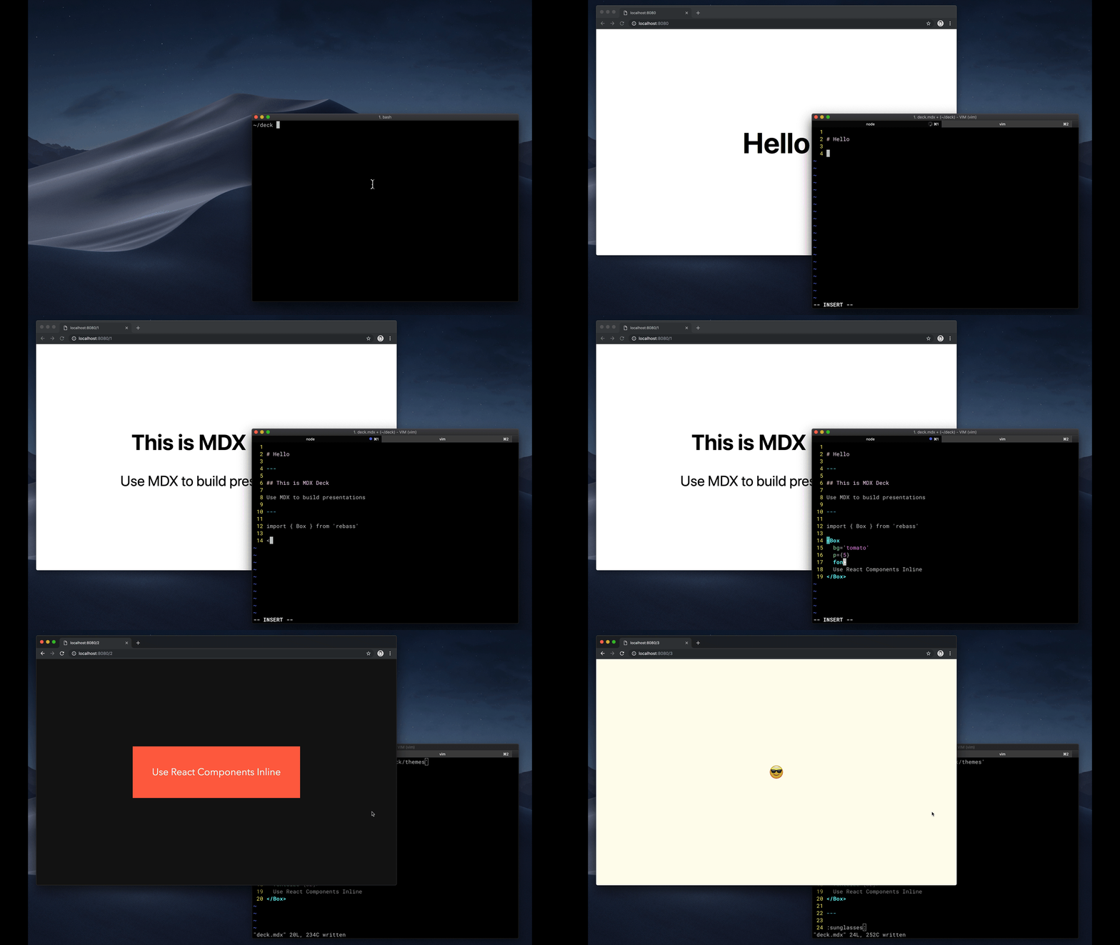
Create an MDX file and separate each slide with ---.
# Hello

---

## This is my deck

---

## The End
Add a run script to your package.json with the MDX Deck CLI
pointing to the .mdx file to start the development server:
"scripts": {
  "start": "mdx-deck deck.mdx"
}
Start the development server:
npm start
Use the left and right arrow keys to navigate through the presentation.
MDX uses Markdown syntax and can render React components inline with JSX.
To import components, use ES import syntax separated with empty lines between any markdown or JSX syntax.
import { Box } from 'theme-ui'

<Box color="tomato">Hello</Box>
Read more about MDX syntax in the MDX Docs.


MDX Deck uses Theme UI and Emotion for styling, making practically any part of the presentation themeable. It also includes several built-in themes to change the look and feel of the presentation.
MDX Deck includes built-in components to help with creating presentations,
a Notes component for adding speaker notes,
a Head component for the document head,
Header and Footer components for persistent header and footer content,
and a Steps component for adding multiple intermediate steps in a single slide.
Read more in the Components docs.
These optional libraries are intended for use with MDX Deck.
Note: please check with version compatibility when using these libraries.
Each slide can include a custom layout around its content, which can be used as a template for visually differentiating slides.
// example Layout.js
import React from 'react'

export default ({ children }) => (
  <div
    style={{
      width: '100vw',
      height: '100vh',
      backgroundColor: 'tomato',
    }}>
    {children}
  </div>
)
import Layout from './Layout'

# No Layout

---

<Layout>

# Custom Layout

</Layout>
The layout component will wrap the MDX elements within that slide, which means you can add custom layout styles or style child elements with CSS-in-JS.
Press Option + P to toggle Presenter Mode,
which will show a preview of the next slide, a timer, and speaker notes.

The presentation can be opened in two separate windows at the same time, and it will stay in sync with the other window.
| Key | Description |
|---|---|
| Left Arrow, Page Up, Shift + Space | Go to previous slide (or step in Steps) |
| Right Arrow, Page Down, Space | Go to next slide (or step in Steps) |
| Option + P | Toggle Presenter Mode |
| Option + O | Toggle Overview Mode |
| Option + G | Toggle Grid Mode |
-p --port     Dev server port
-h --host     Host the dev server listens to
--no-open     Prevent from opening in default browser
See how others have used MDX Deck for their presentations.
The following examples will open in CodeSandbox.
FAQs
MDX-based presentation decks
The npm package mdx-deck receives a total of 633 weekly downloads. As such, mdx-deck popularity was classified as not popular.
We found that mdx-deck demonstrated a not healthy version release cadence and project activity because the last version was released a year ago. It has 1 open source maintainer collaborating on the project.
Did you know?

Socket for GitHub automatically highlights issues in each pull request and monitors the health of all your open source dependencies. Discover the contents of your packages and block harmful activity before you install or update your dependencies.

Product
Socket Firewall Enterprise is now available with flexible deployment, configurable policies, and expanded language support.

Security News
Open source dashboard CNAPulse tracks CVE Numbering Authorities’ publishing activity, highlighting trends and transparency across the CVE ecosystem.

Product
Detect malware, unsafe data flows, and license issues in GitHub Actions with Socket’s new workflow scanning support.