
Security News
PyPI Now Supports iOS and Android Wheels for Mobile Python Development
PyPI now supports iOS and Android wheels, making it easier for Python developers to distribute mobile packages.
By Sarah Gooding - Feb 12, 2025
month-range-picker-damon
Advanced tools
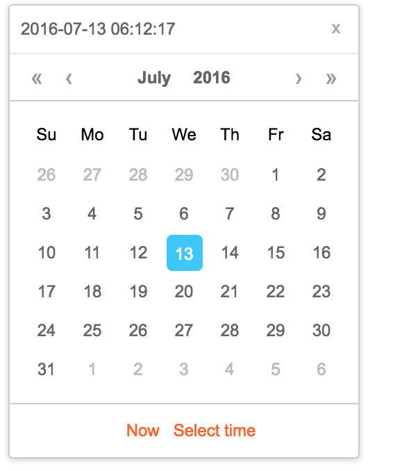
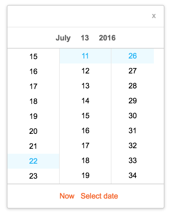
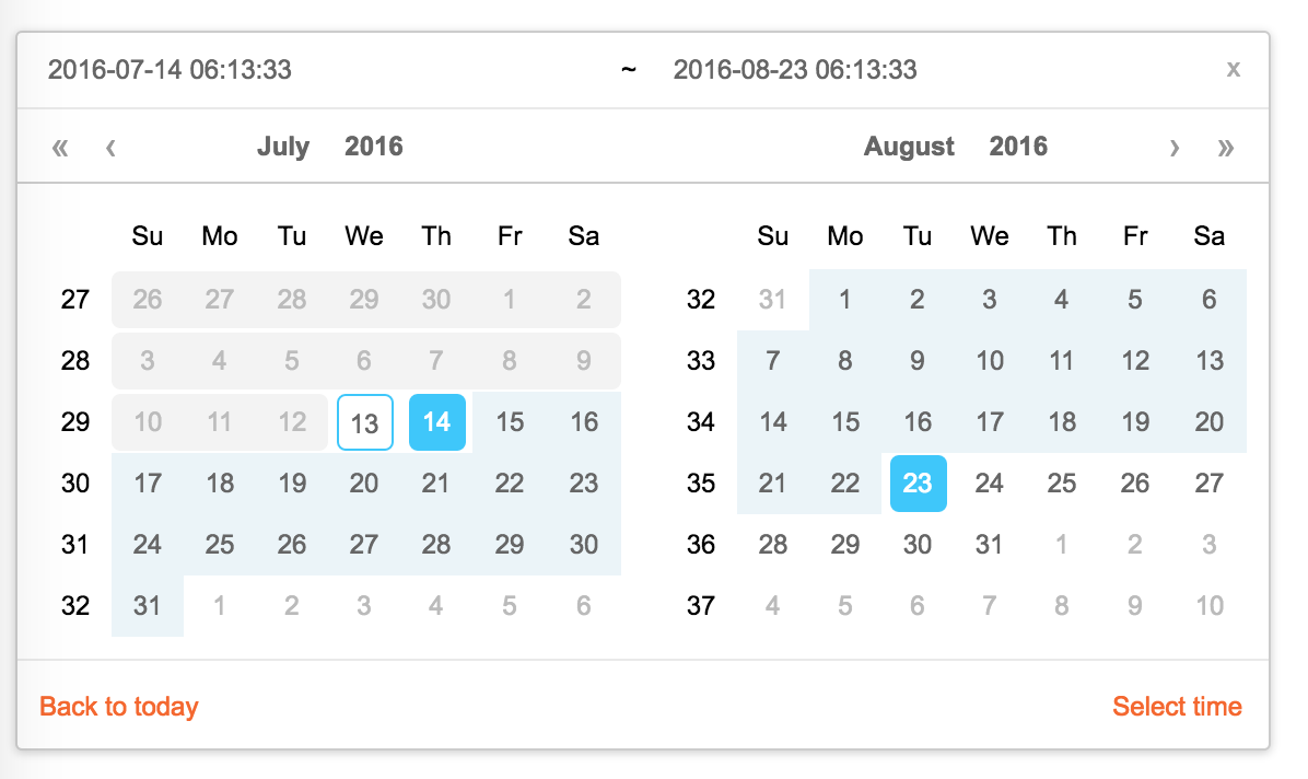
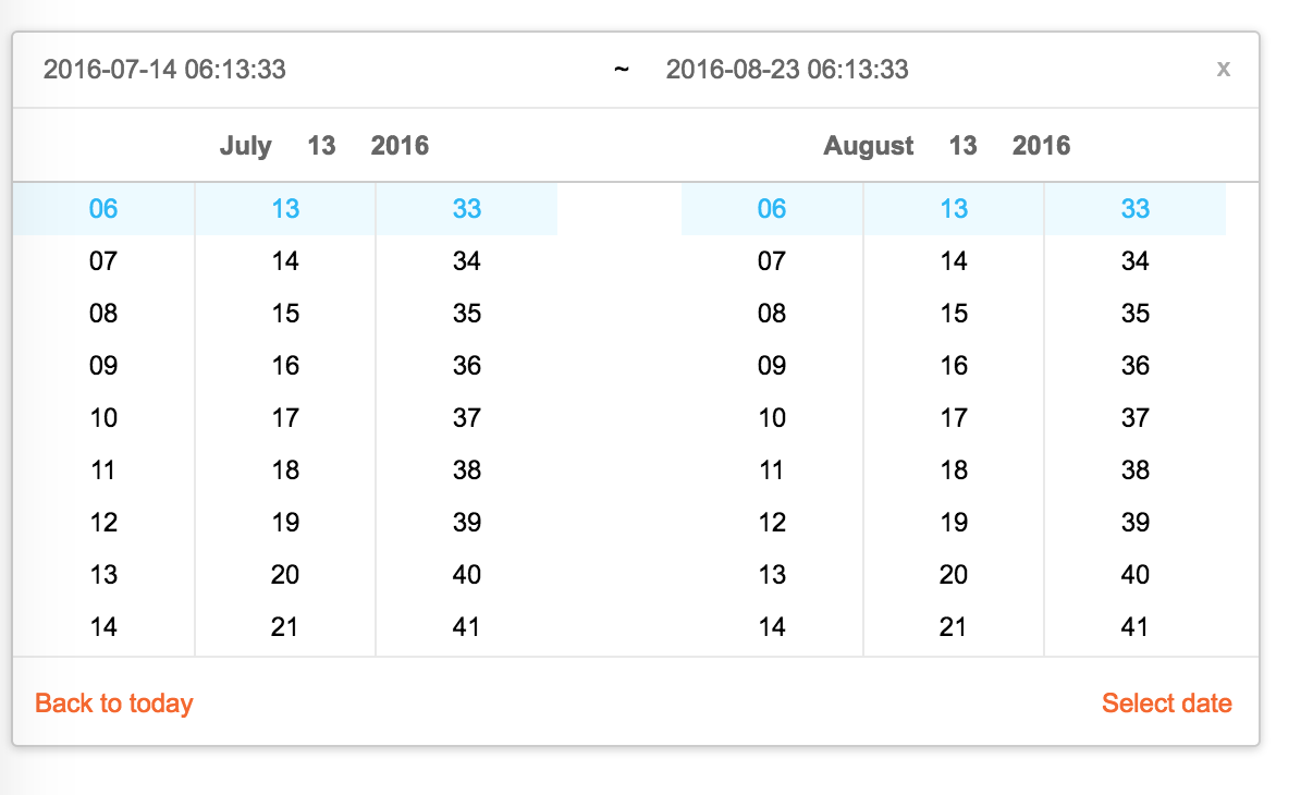
React Calendar


import Calendar from 'rc-calendar';
import React from 'react';
import ReactDOM from 'react-dom';
ReactDOM.render(<Calendar />, container);
npm install
npm start
http://localhost:8002/examples/
online example:
http://react-component.github.io/calendar/examples/index.html
| name | type | default | description |
|---|---|---|---|
| prefixCls | String | prefixCls of this component | |
| className | String | additional css class of root dom node | |
| style | Object | additional style of root dom node | |
| dateRender | (current, value) => React.Node | date cell | |
| renderSidebar | () => React.Node | side bar | |
| renderFooter | () => React.Node | extra footer | |
| value | moment | current value like input's value | |
| defaultValue | moment | defaultValue like input's defaultValue | |
| locale | Object | import from 'rc-calendar/lib/locale/en_US' | calendar locale |
| format | String | String[] | depends on whether you set timePicker and your locale | use to format/parse date(without time) value to/from input. When an array is provided, all values are used for parsing and first value for display. |
| disabledDate | Function(current:moment):Boolean | whether to disable select of current date | |
| disabledTime | Function(current:moment):Object | a function which return a object with member of disabledHours/disabledMinutes/disabledSeconds according to rc-time-picker | |
| showDateInput | Boolean | true | whether to show input on top of calendar panel |
| showWeekNumber | Boolean | false | whether to show week number of year |
| showToday | Boolean | true | whether to show today button |
| showOk | Boolean | auto | whether has ok button in footer |
| timePicker | React Element | rc-timer-picker/lib/module/panel element | |
| onSelect | Function(date: moment) | called when a date is selected from calendar | |
| onClear | Function() | called when a date is cleared from calendar | |
| onChange | Function(date: moment) | called when a date is changed inside calendar (next year/next month/keyboard) | |
| onOk | Function(date: moment) | called when ok button is pressed, only if it's visible | |
| dateInputPlaceholder | String | date input's placeholder | |
| mode | enum('time', 'date', 'month', 'year', 'decade') | 'date' | control which kind of panel should be shown |
| onPanelChange | Function(date: moment, mode) | called when panel changed | |
| clearIcon | ReactNode | specific the clear icon. |
| name | type | default | description |
|---|---|---|---|
| prefixCls | String | prefixCls of this component | |
| className | String | additional css class of root dom node | |
| style | Object | additional style of root dom node | |
| renderSidebar | () => React.Node | side bar | |
| renderFooter | () => React.Node | extra footer | |
| selectedValue | moment[] | current selected value range. with two elements. | |
| defaultSelectedValue | moment[] | default selected value range | |
| locale | Object | import from 'rc-calendar/lib/locale/en_US' | calendar locale |
| format | String | depends on whether you set timePicker and your locale | use to format/parse date(without time) value to/from input |
| disabledDate | Function(current:moment):Boolean | whether to disable select of current date | |
| showWeekNumber | Boolean | false | whether to show week number of year |
| showToday | Boolean | true | whether to show today button |
| showOk | Boolean | auto | whether has ok button in footer |
| showClear | Boolean | false | whether has clear button in header |
| timePicker | React Element | rc-timer-picker/lib/module/panel element | |
| onSelect | Function(date: moment[]) | called when a date range is selected from calendar | |
| onInputSelect | Function(date: moment[]) | called when a valid date entered in input | |
| onClear | Function() | called when a date range is cleared from calendar | |
| onChange | Function(date: moment[]) | called when a date range is changed inside calendar (next year/next month/keyboard) | |
| onOk | Function(date: moment) | called when ok button is pressed, only if it's visible | |
| dateInputPlaceholder | String[] | range date input's placeholders | |
| disabledTime | Function(current: moment[], type:'start'|'end'):Object | a function which return a object with member of disabledHours/disabledMinutes/disabledSeconds according to rc-time-picker | |
| showDateInput | Boolean | true | whether to show date inputs on top of calendar panels |
| type | enum('both','start', 'end') | both | whether fix start or end selected value. check start-end-range example |
| mode | enum('date', 'month', 'year', 'decade')[] | ['date', 'date'] | control which kind of panels should be shown |
| onPanelChange | Function(date: moment[], mode) | called when panels changed | |
| hoverValue | moment[] | control hover value | |
| onHoverChange | Function(hoverValue: moment[]) | called when hover value change | |
| clearIcon | ReactNode | specific the clear icon. |
| name | type | default | description |
|---|---|---|---|
| prefixCls | String | prefixCls of this component | |
| className | String | additional css class of root dom node | |
| style | Object | additional style of root dom node | |
| value | moment | current value like input's value | |
| defaultValue | moment | defaultValue like input's defaultValue | |
| locale | Object | import from 'rc-calendar/lib/locale/en_US' | calendar locale |
| disabledDate | Function(current:moment):Boolean | whether to disable select of current month | |
| onSelect | Function(date: moment) | called when a date is selected from calendar | |
| monthCellRender | function | Custom month cell render method | |
| dateCellRender | function | Custom date cell render method | |
| monthCellContentRender | function | Custom month cell content render method,the content will be appended to the cell. | |
| onChange | Function(date: moment) | called when a date is changed inside calendar (next year/next month/keyboard) | |
| renderFooter | () => React.Node | extra footer |
| name | type | default | description |
|---|---|---|---|
| prefixCls | String | prefixCls of this component | |
| calendar | Calendar React Element | ||
| disabled | Boolean | whether picker is disabled | |
| placement | String|Object | one of ['left','right','top','bottom', 'topLeft', 'topRight', 'bottomLeft', 'bottomRight'] | |
| align | Object: alignConfig of [dom-align](https://github.com/yiminghe/dom-align) | value will be merged into placement's align config. | |
| animation | String | index.css support 'slide-up' | |
| transitionName | String | css class for animation | |
| value | moment|moment[] | current value like input's value | |
| defaultValue | moment|moment[] | defaultValue like input's defaultValue | |
| onChange | Function | called when select a different value | |
| onOpenChange | (open:boolean) => void | called when open/close picker | |
| open | Boolean | current open state of picker. controlled prop | |
| getCalendarContainer | () => HTMLElement | () => {return document.body;} | dom node where calendar to be rendered into |
| dropdownClassName | string | additional className applied to dropdown |
| name | type | default | description |
|---|---|---|---|
| prefixCls | String | prefixCls of this component | |
| Select | React Component Class | rc-select Component Class | |
| value | moment | current value like input's value | |
| defaultValue | moment | defaultValue like input's defaultValue | |
| defaultType | string | date | default panel type: date/month |
| type | string | panel type: date/month | |
| onTypeChange | function(type) | called when panel type change | |
| fullscreen | bool | false | |
| monthCellRender | function | Custom month cell render method | |
| dateCellRender | function | Custom date cell render method | |
| monthCellContentRender | function | Custom month cell content render method,the content will be appended to the cell. | |
| dateCellContentRender | function | Custom date cell content render method,the content will be appended to the cell. | |
| onSelect | Function(date: moment) | called when a date is selected from calendar |
npm test
npm run chrome-test
npm run coverage
open coverage/ dir
rc-calendar is released under the MIT license.
FAQs
Unknown package
The npm package month-range-picker-damon receives a total of 1 weekly downloads. As such, month-range-picker-damon popularity was classified as not popular.
We found that month-range-picker-damon demonstrated a not healthy version release cadence and project activity because the last version was released a year ago. It has 1 open source maintainer collaborating on the project.
Did you know?

Socket for GitHub automatically highlights issues in each pull request and monitors the health of all your open source dependencies. Discover the contents of your packages and block harmful activity before you install or update your dependencies.
Security News
PyPI now supports iOS and Android wheels, making it easier for Python developers to distribute mobile packages.

Security News
Create React App is officially deprecated due to React 19 issues and lack of maintenance—developers should switch to Vite or other modern alternatives.

Security News
Oracle seeks to dismiss fraud claims in the JavaScript trademark dispute, delaying the case and avoiding questions about its right to the name.