mui-elapsing-bars

mui-elapsing-bars is a React component for displaying an animated progress-bar list which gets changed by time-elapsing. It is made with the flavour of our popular framework: material-ui 😋

Installation
npm install mui-elapsing-bars
OR
yarn add mui-elapsing-bars
Quick Start
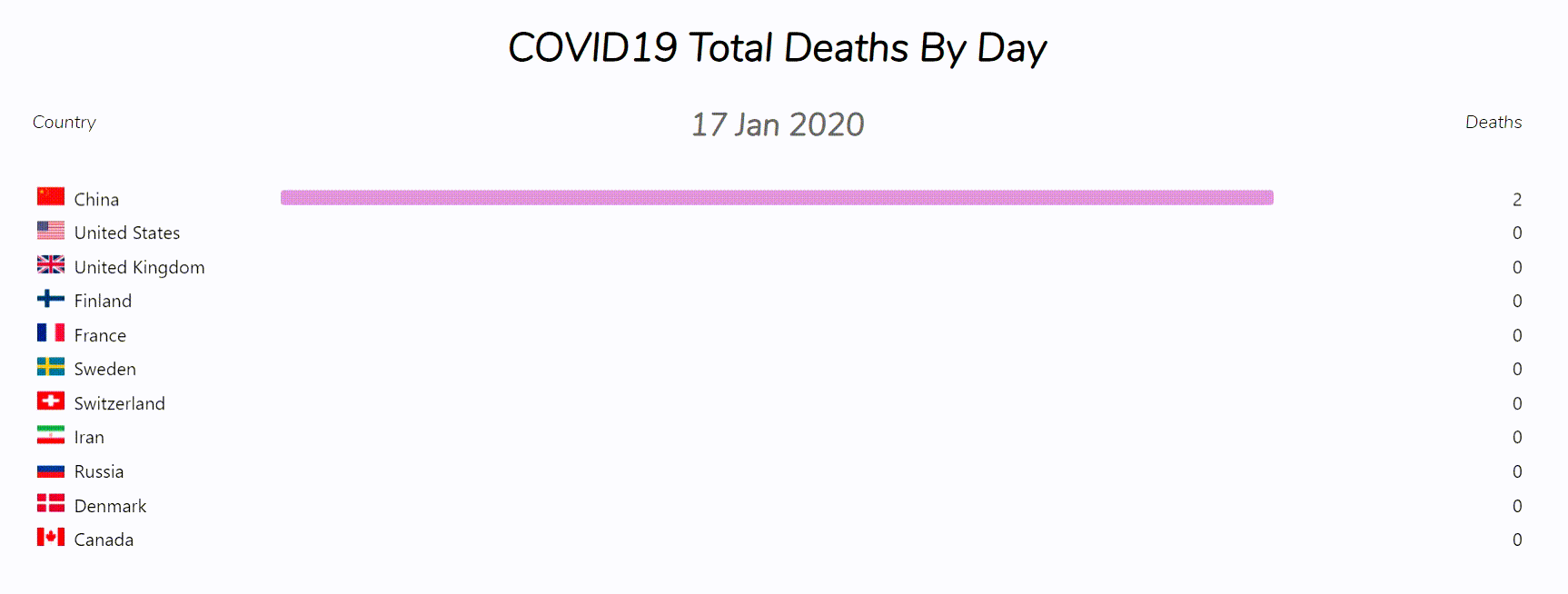
You can see the live examples here: The Demo
import { ElapBars } from 'mui-elapsing-bars';
const data = [
{
key: {text: "EURUSD"},
value: 1.2,
date: "2018",
},
{
key: {text: "GBPJPY"},
value: 147.19,
date: "2018",
},
{
key: {text: "EURUSD"},
value: 1.19,
date: "2019",
},
{
key: {text: "GBPJPY"},
value: 139.27,
date: "2019",
},
{
key: {text: "EURUSD"},
value: 1.18,
date: "2020",
},
{
key: {text: "GBPJPY"},
value: 137.42,
date: "2020",
},
];
export default function App(){
return (
<ElapBars
data={data}
/>
);
}
The Default Props is as it is shown below:
const defaultProps = {
  className: '',
  style: {},
  title: null,
  keyOptions: {
    title: "",
    display: {
      xs: 'icon',
      sm: 'both',
      md: 'both',
      lg: 'both',
      xl: 'both',
    },
  },
  dateOptions: {
    titleVariant: 'default',
    order: 'asc',
  },
  valueOptions: {
    title: '',
    order: 'desc',
    digitsCommaSeparation: true,
  },
  barOptions: {
    colorVariant: 'primary',
    n: undefined,
  },
  pure: false,
  run: false,
  restart: null,
  loop: false,
  delay: 1000,
  interval: 700,
  onStart: () => { },
  onRestart: () => { },
  onPause: () => { },
  onResume: () => { },
  onEnd: () => { },
};
More Docs
-
To see the full documentation for the props, take a look at PROPS Document.
-
To see more examples, take a look at the src/examples/ folder in the github repo.
Thank you for using this repo. Please feel free to open new issues and contributing to this repository.
Future Roadmap
The future works will be taken into consideration if I see there is interests from YOU in this project.
-
improve perfomance by decreasing RAM usage: perform better data structures for getting data array.
-
implement another component named: PureElapBars optimized for occupying less resources.
-
add a way for passing arbitrary color for all the bars inplace.
-
add a way for choosing whether find the maximum value in current interval or the whole data
-
add more features ...


