mui-feedback-dialog-connected 
A React feedback form with optional screenshot via screen capture and canvas editor based on material-ui.
This library wraps the mui-feedback-dialog and handles the encryption and submission to your feedback channel of the recieved feedback. If you already have your own infrastructure and want to handle your feedback yourself, use the un-opinionated mui-feedback-dialog.
API
Installation
You also need to include @material-ui/core, @material-ui/icons, react, and react-dom. IF you have not already done so, you can install them with:
npm install --save @material-ui/core @material-ui/icons react react-dom
Then you can install this library with:
npm install --save mui-feedback-dialog-connected
Usage
import { FeedbackDialog } from 'mui-feedback-dialog-connected'


const FeedbackButton: React.FunctionComponent<{ mobile?: boolean }> = () => {
    const [dialogVisible, setDialogVisible] = useState(false)

    return <>
        <IconButton onClick={() => setDialogVisible(true)}>
            <FeedbackIcon />
        </IconButton>
        <FeedbackDialog open={dialogVisible} onClose={() => setDialogVisible(false)} tenantId='123' />
    </>
}
FeedbackDialog takes 5 props:
open [boolean]: whether the dialog is shown or notonClose [function]: callback to close the dialogonSubmit [function]: callback on submit with the feedback object:
{
    description: 'Some description.',
    email: 'some@email.com',
    screenshot: 'base64-encoded screenshot in webp format'
}
noScreenshot [boolean]: whether the option to show a screenshot is shown at all.attachScreenshotOnOpen [boolean]: whether the option to show a screenshot is preselected.useScreencapture [boolean=false]: whether to use screencapture or dom-to-html. Also controls whether the screenshotInfo-info box will be displayed.className [string]: className applied to the dialog component.text [object]: possibility to overwrite the default strings:
- title
- cancel
- submit
- contentText
- emailLabel
- emailError
- feedbackLabel
- includeScreenshot
- tooltipPen
- tooltipEraser
- tooltipBlackbox
- tooltipReset
- tooltipSubmit
- screenshotInfo
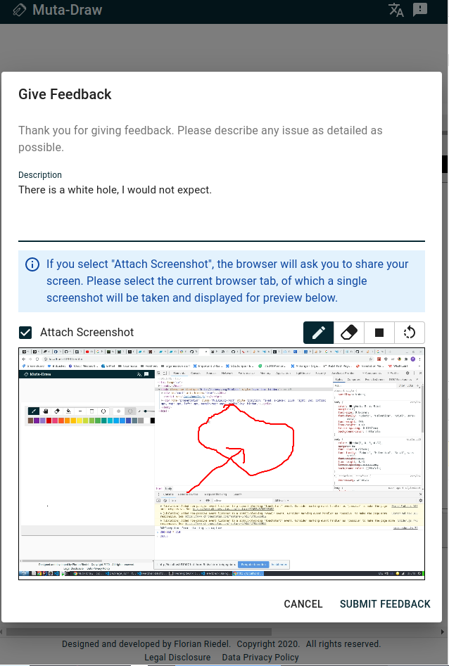
Screenshot
Demo
CodeSandbox - Demo


