Research
/Security News
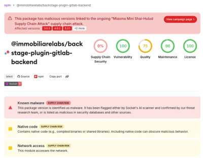
Miasma Mini Shai-Hulud Hits ImmobiliareLabs npm Packages
Miasma Mini Shai-Hulud hits @immobiliarelabs Backstage plugins, targeting GitLab and LDAP auth packages on npm.
By Socket Research Team - Jun 26, 2026
Reusable React component library for Najm applications. Provides themed UI primitives, hooks, and form components.
bun add najm-kit tailwindcss @tailwindcss/postcss
Peer dependencies: react >=18, react-dom >=18. Requires Tailwind CSS v4 in the host app.
Optional peer dependencies: recharts, @tanstack/react-table, react-hook-form, @tanstack/react-query.
najm-kit is a Tailwind v4, shadcn-compatible library. PostCSS config (postcss.config.mjs):
export default { plugins: { "@tailwindcss/postcss": {} } };
Your global stylesheet — two imports, that's it:
@import "tailwindcss";
@import "najm-kit/theme.css";
This gives you every najm-kit component styled, dark mode wired (the .dark class),
and a full token-backed palette you can use in your own markup too
(bg-background, bg-card, bg-primary, text-muted-foreground, border-border, …).
najm-kit uses the standard shadcn token names (no prefix), so you rebrand by overriding CSS variables — or paste a theme straight from tweakcn / the shadcn registry:
:root { --primary: oklch(0.55 0.2 290); --radius: 0.75rem; }
.dark { --primary: oklch(0.70 0.18 290); }
Add your own extra colors alongside najm-kit's:
@theme { --color-success: oklch(0.7 0.18 150); } /* → bg-success, text-success */
Dark mode: toggle the dark class on <html> (or any wrapper):
document.documentElement.classList.toggle("dark");
For scoped theming without writing CSS — useful for embedded surfaces. The provider
is opt-in: with no props it injects nothing and your :root/.dark CSS owns theming.
import { NajmThemeProvider } from 'najm-kit';

// preset:
<NajmThemeProvider preset="dark-blue">{children}</NajmThemeProvider>

// or mode + accent:
<NajmThemeProvider mode="dark" accent="emerald">{children}</NajmThemeProvider>

// shadcn-style global radius scale:
<NajmThemeProvider radius="0.75rem">{children}</NajmThemeProvider>

// exact same radius for cards, tables, buttons, inputs, dialogs, etc.:
<NajmThemeProvider radius="0.75rem" radiusScale="uniform">
  {children}
</NajmThemeProvider>
rounded-full and rounded-none remain explicit, so avatars, pills, switches,
and square variants keep their intended shape.
Store one theme object in a JSON file, local storage, or your settings API:
{
  "mode": "dark",
  "accent": "violet",
  "radius": "0.75rem",
  "radiusScale": "uniform",
  "appearance": { "borderWidth": "1px" },
  "tokens": {
    "primary": "oklch(0.62 0.2 290)",
    "primary-foreground": "oklch(1 0 0)",
    "sidebar": "oklch(0.18 0.02 290)",
    "chart-1": "oklch(0.70 0.20 40)"
  }
}
Load and apply it from the same settings state used by your theme editor:
import rawTheme from './theme.json';
import { NajmThemeProvider, parseNajmThemeConfig } from 'najm-kit';

const initialTheme = parseNajmThemeConfig(rawTheme);

function App() {
  const [theme, setTheme] = useState(initialTheme);

  return (
    <NajmThemeProvider config={theme}>
      <SettingsPage value={theme} onChange={setTheme} />
      {children}
    </NajmThemeProvider>
  );
}
Changing the state updates the complete theme immediately. Use
stringifyNajmThemeConfig(theme) when persisting it, and parse settings loaded
from an API or local storage with parseNajmThemeConfig before applying them.
Import from najm-kit:
import { NButton, buttonVariants } from 'najm-kit';
import { Input } from 'najm-kit';
import { Card, CardHeader, CardTitle, CardContent } from 'najm-kit';
import { Dialog, DialogContent, DialogTrigger } from 'najm-kit';
import { DataTable } from 'najm-kit';
import { Form, FormInput, useNForm } from 'najm-kit';
| Category | Components |
|---|---|
| Actions | NButton, IconButton, toggleVariants |
| Forms | Input, Textarea, Label, Select, Checkbox, RadioGroup, Switch, DateInput, FileInput |
| Feedback | Alert, Badge, Progress, Spinner, Toast |
| Layout | Card, Sheet, Dialog, Popover, DropdownMenu, Tabs |
| Data | Table (NTable), StatCard, DetailList |
| Overlays | Command palette, Tooltip, Toast |
import { useKeyboard } from 'najm-kit';
import { useDelayedLoading } from 'najm-kit';
import { useClickOutside } from 'najm-kit';
import { useDebouncedValue } from 'najm-kit';
import { useInfiniteScroll } from 'najm-kit';
import { useSelection } from 'najm-kit';
buttonVariants(), badgeVariants(), etc. with Tailwindnajm-kit/json only if neededFAQs
Reusable React UI component package for Najm framework
The npm package najm-kit receives a total of 1,295 weekly downloads. As such, najm-kit popularity was classified as popular.
We found that najm-kit demonstrated a healthy version release cadence and project activity because the last version was released less than a year ago. It has 1 open source maintainer collaborating on the project.
Did you know?

Socket for GitHub automatically highlights issues in each pull request and monitors the health of all your open source dependencies. Discover the contents of your packages and block harmful activity before you install or update your dependencies.
Research
/Security News
Miasma Mini Shai-Hulud hits @immobiliarelabs Backstage plugins, targeting GitLab and LDAP auth packages on npm.

Security News
Rolldown paused Rust React Compiler integration after a 5MB binary size increase raised concerns about shipping React-specific code to all Vite users.

Security News
/Research
Mini Shai-Hulud expands into the Go ecosystem after hitting LeoPlatform npm packages and targeting GitHub Actions workflows.