
Security News
Maven Central Adds Sigstore Signature Validation
Maven Central now validates Sigstore signatures, making it easier for developers to verify the provenance of Java packages.
By Sarah Gooding - Feb 06, 2025
ng-material-loading
Advanced tools
Angular directive to impose Angular Material based loading indicator on any content
Angular directive to impose Angular Material based loading indicator on any content. The loading indicator may be an indeterminate Angular Material progress spinner or a progress bar.

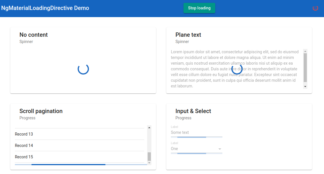 Also you can clone the repo and start the application locally to see ng-material-loading lib in action.
Install package
npm i ng-material-loading
Add import to your module
import { NgMaterialLoadingModule } from 'ng-material-loading';

@NgModule({
  imports: [
    ...
    NgMaterialLoadingModule.forRoot(),
    ],
  declarations: [],
  providers: []
})
Then in template:
  <mat-form-field [ngMatLoading]="loading$ | async" ngMatLoadingType="progress">
    <input matInput/>
  </mat-form-field>
or
  <mat-card>
    <mat-card-header>
      <mat-card-title>Plane text</mat-card-title>
      <mat-card-subtitle>Spinner</mat-card-subtitle>
    </mat-card-header>

    <mat-card-content [ngMatLoading]="loading$ | async">
      <p>Lorem ipsum dolor sit amet...</p>
    </mat-card-content>
  </mat-card>
| Option | Type | Default | Description |
|---|---|---|---|
| ngMatLoadingContentOpacity | number | 0.3 | Content opacity when the loading indicator is imposed |
| ngMatLoadingDiameter | number | 40 | Spinner diameter in pixels |
| ngMatLoadingColor | 'primary', 'warn', 'accent' | 'primary' | Loading indicator color |
| ngMatLoadingType | 'spinner', 'progress' | 'spinner' | Time to close after a user hovers over toast |
| ngMatLoadingAttacheTo | string | null | Selector of HTML element to which the loadinf indicator should be attached |
| ngMatLoadingFreeze | boolean | true | Whether to make content inactive while loading |
| ngMatLoadingPosition | 'absolute', 'relative', 'sticky' | Depends on loading indicator type | Loading indicator CSS position |
You can configure default ng-material-loading options:
NgMaterialLoadingModule.forRoot({
  opacity: 0.45,
  type: 'progress',
  ...
})
The configuration interface looks like this:
export interface NgMatLoadingConfig {
  opacity?: number; // Content opacity when the loading indicator is imposed
  diameter?: number; // Spinner diameter in pixels
  color?: 'primary' | 'warn' | 'accent'; //Loading indicator color
  type?: 'spinner' | 'progress'; // Loading indicator type
  attacheTo?: { [key: string]: string; } // host to target map (see below)
  freeze?: boolean; // Whether to make content inactive while loading
  position?: 'absolute' | 'relative' | 'sticky' // Loading indicator CSS position
}
In attacheTo object you can list selector to which loading indicator should be attached for some commonly encountered host elements.
The positionconfig option, if not set, depends on loading idicator type. For spinner position is absolute while for progress bar position is sticky by default.
You are more than welcome to improve this library or create issues on the GitHub issue tracker.
FAQs
Angular directive to impose Angular Material based loading indicator on any content
We found that ng-material-loading demonstrated a not healthy version release cadence and project activity because the last version was released a year ago. It has 1 open source maintainer collaborating on the project.
Did you know?

Socket for GitHub automatically highlights issues in each pull request and monitors the health of all your open source dependencies. Discover the contents of your packages and block harmful activity before you install or update your dependencies.
Security News
Maven Central now validates Sigstore signatures, making it easier for developers to verify the provenance of Java packages.

Security News
CISOs are racing to adopt AI for cybersecurity, but hurdles in budgets and governance may leave some falling behind in the fight against cyber threats.

Research
Security News
Socket researchers uncovered a backdoored typosquat of BoltDB in the Go ecosystem, exploiting Go Module Proxy caching to persist undetected for years.