


Security News
Research
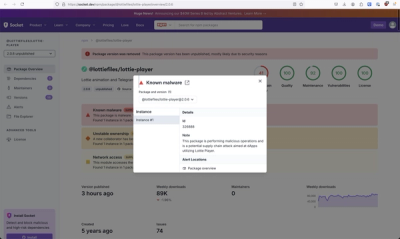
Massive npm Malware Campaign Leverages Ethereum Smart Contracts To Evade Detection and Maintain Control
An advanced npm supply chain attack is leveraging Ethereum smart contracts for decentralized, persistent malware control, evading traditional defenses.
By Kush Pandya, Philipp Burckhardt, Kirill Boychenko, Orlando Barrera - Oct 31, 2024