Security News
Opengrep Emerges as Open Source Alternative Amid Semgrep Licensing Controversy
Opengrep forks Semgrep to preserve open source SAST in response to controversial licensing changes.
pie-chart-react.js
Advanced tools
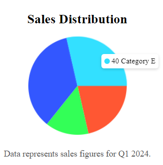
The React Pie Chart component is a highly customizable and interactive charting solution designed for visualizing data in a circular pie chart format. The component supports animated arcs, hover interactions, and tooltips, making it perfect for dashboards

The React Pie Chart component is a highly customizable and interactive charting solution designed for visualizing data in a circular pie chart format. The component supports animated arcs, hover interactions, and tooltips, making it perfect for dashboards, reports, and data visualization applications.
npm install pie-chart-react.js
# or
yarn add pie-chart-react.js
The TreeProps interface defines the properties for the Tree component. Below is a detailed description of each property.
| Property | Type | Description |
|---|---|---|
chartConfig | Array<Object> | An array of objects defining the data for each segment of the pie chart. Each object includes value, color, and label. |
size | number | Defines the size of the pie chart in pixels (defaults to 200px). |
header | string or JSX | (Optional) A class name to apply to each tree item. |
footer | string or JSX | (Optional) A class name to apply to each sub-tree container. |
import React from "react";
import { PieChart } from "pie-chart-react.js";

const chartConfig = [
  { value: 30, color: "#FF5733", label: "Category A" },
  { value: 20, color: "#33FF57", label: "Category B" },
  { value: 50, color: "#3357FF", label: "Category C" },
];

function App() {
  return (
    <div>
      <PieChart
        chartConfig={chartConfig}
        size={300}
        header={"Sales Distribution"}
        footer={"Data represents sales figures for Q1 2024."}
      />
    </div>
  );
}

export default App;
{
  value: number; // The numeric value that determines the size of the arc
  color: string; // The color of the arc
  label: string; // The label that appears in the tooltip when hovered
}
const chartConfig = [
  { value: 25, color: "#4CAF50", label: "Product A" },
  { value: 35, color: "#FF9800", label: "Product B" },
  { value: 40, color: "#2196F3", label: "Product C" },
];
<PieChart
  chartConfig={chartConfig}
  header={<h2 className="text-lg font-semibold">Product Sales</h2>}
  footer={<p className="text-sm text-gray-500">Data from Q1 2024</p>}
/>
This component is designed with accessibility in mind, supporting ARIA labels and roles. The chart’s container includes role="img" and aria-label attributes for screen readers, making it accessible for all users.
The React Pie Chart component provides an easy-to-use, flexible solution for displaying data in a visually appealing pie chart. It offers interactivity, customization, and performance, making it an excellent choice for data-driven React applications.
This project is licensed under the MIT License.
FAQs
The React Pie Chart component is a highly customizable and interactive charting solution designed for visualizing data in a circular pie chart format. The component supports animated arcs, hover interactions, and tooltips, making it perfect for dashboards
The npm package pie-chart-react.js receives a total of 4 weekly downloads. As such, pie-chart-react.js popularity was classified as not popular.
We found that pie-chart-react.js demonstrated a healthy version release cadence and project activity because the last version was released less than a year ago. It has 0 open source maintainers collaborating on the project.
Did you know?

Socket for GitHub automatically highlights issues in each pull request and monitors the health of all your open source dependencies. Discover the contents of your packages and block harmful activity before you install or update your dependencies.

Security News
Opengrep forks Semgrep to preserve open source SAST in response to controversial licensing changes.

Security News
Critics call the Node.js EOL CVE a misuse of the system, sparking debate over CVE standards and the growing noise in vulnerability databases.

Security News
cURL and Go security teams are publicly rejecting CVSS as flawed for assessing vulnerabilities and are calling for more accurate, context-aware approaches.