Research
/Security News
Intercom’s npm Package Compromised in Ongoing Mini Shai-Hulud Worm Attack
Compromised intercom-client@7.0.4 npm package is tied to the ongoing Mini Shai-Hulud worm attack targeting developer and CI/CD secrets.
PrimeNG is an open source UI library for Angular featuring a rich set of 80+ components, a theme designer, various theme alternatives such as Material, Bootstrap, Tailwind, premium templates and professional support. In addition, it integrates with PrimeB
PrimeNG is a rich set of open source UI Components for Angular. Visit the PrimeNG website for interactive demos, comprehensive documentation and additional resources.
NG-ZORRO is an Ant Design component library for Angular. It provides a wide range of high-quality components that are designed to be used in enterprise-level applications. Compared to PrimeNG, NG-ZORRO focuses more on providing a consistent design language and is based on the Ant Design system.
Angular Material is the official Material Design component library for Angular. It offers a set of reusable UI components based on Google's Material Design guidelines. While PrimeNG provides a broader range of components, Angular Material focuses on delivering a consistent and modern look and feel.
Clarity is a design system by VMware that includes a component library for Angular. It provides a set of well-designed, accessible, and customizable components. Clarity focuses on usability and accessibility, making it a good choice for enterprise applications. Compared to PrimeNG, Clarity has a more opinionated design system.
FAQs
PrimeNG is an open source UI library for Angular featuring a rich set of 80+ components, a theme designer, various theme alternatives such as Material, Bootstrap, Tailwind, premium templates and professional support. In addition, it integrates with PrimeB
The npm package primeng receives a total of 578,218 weekly downloads. As such, primeng popularity was classified as popular.
We found that primeng demonstrated a healthy version release cadence and project activity because the last version was released less than a year ago. It has 4 open source maintainers collaborating on the project.
Did you know?

Socket for GitHub automatically highlights issues in each pull request and monitors the health of all your open source dependencies. Discover the contents of your packages and block harmful activity before you install or update your dependencies.

Research
/Security News
Compromised intercom-client@7.0.4 npm package is tied to the ongoing Mini Shai-Hulud worm attack targeting developer and CI/CD secrets.

Research
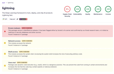
Socket detected a malicious supply chain attack on PyPI package lightning versions 2.6.2 and 2.6.3, which execute credential-stealing malware on import.

Research
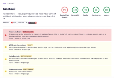
A brand-squatted TanStack npm package used postinstall scripts to steal .env files and exfiltrate developer secrets to an attacker-controlled endpoint.