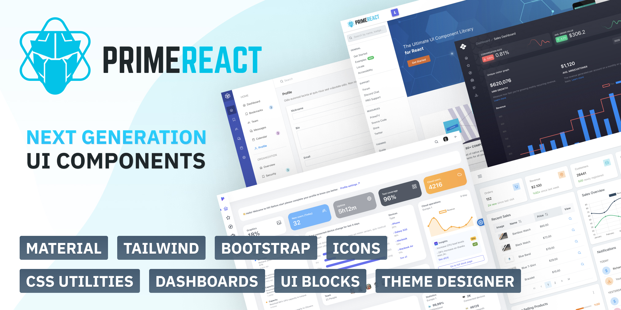
What is primereact?
PrimeReact is a comprehensive collection of rich UI components for React. It provides a wide range of components that are designed to be highly customizable and easy to use, making it suitable for building modern, responsive web applications.
What are primereact's main functionalities?
DataTable
The DataTable component is used to display data in a tabular format. It supports features like sorting, filtering, and pagination.
import React from 'react';
import { DataTable } from 'primereact/datatable';
import { Column } from 'primereact/column';
const MyDataTable = () => {
const data = [
{ id: 1, name: 'John', age: 30 },
{ id: 2, name: 'Jane', age: 25 }
];
return (
<DataTable value={data}>
<Column field="id" header="ID" />
<Column field="name" header="Name" />
<Column field="age" header="Age" />
</DataTable>
);
};
export default MyDataTable;
Dialog
The Dialog component is used to display content in a modal window. It can be customized with headers, footers, and various other options.
import React, { useState } from 'react';
import { Dialog } from 'primereact/dialog';
import { Button } from 'primereact/button';

const MyDialog = () => {
  const [visible, setVisible] = useState(false);

  return (
    <div>
      <Button label="Show" icon="pi pi-external-link" onClick={() => setVisible(true)} />
      <Dialog header="Header" visible={visible} style={{ width: '50vw' }} onHide={() => setVisible(false)}>
        <p>Content</p>
      </Dialog>
    </div>
  );
};

export default MyDialog;
Chart
The Chart component is used to create various types of charts, such as bar, line, and pie charts. It is built on top of the popular Chart.js library.
import React from 'react';
import { Chart } from 'primereact/chart';

const MyChart = () => {
  const data = {
    labels: ['January', 'February', 'March', 'April', 'May'],
    datasets: [
      {
        label: 'My First dataset',
        backgroundColor: '#42A5F5',
        borderColor: '#1E88E5',
        data: [65, 59, 80, 81, 56]
      }
    ]
  };

  return <Chart type="bar" data={data} />;
};

export default MyChart;
Other packages similar to primereact
material-ui
Material-UI is a popular React UI framework that implements Google's Material Design. It offers a wide range of components and customization options. Compared to PrimeReact, Material-UI has a more modern design aesthetic and is widely adopted in the React community.
ant-design
Ant Design is a comprehensive UI framework for React that provides a large set of high-quality components. It is known for its robust design system and extensive documentation. Ant Design is similar to PrimeReact in terms of the breadth of components offered but has a different design philosophy.
semantic-ui-react
Semantic UI React is the official React integration for Semantic UI. It provides a set of components that are easy to use and customize. While it offers fewer components compared to PrimeReact, it focuses on simplicity and ease of use.


PrimeReact
PrimeReact is available at npm.
Download
PrimeReact is available at npm, if you have an existing application run the following command to download it to your project.
// with npm
npm install primereact

// with yarn
yarn add primereact
Please note that react >= 17.0.0 and react-dom >= 17.0.0 are peer dependencies and some components have optional dependencies.
Styles
Theme and core are the necessary css files of the components, visit the Themes section for the complete list of available themes to choose from.
import 'primereact/resources/themes/lara-light-indigo/theme.css';
import 'primereact/resources/primereact.min.css';
Each PrimeReact theme has its own font family so it is suggested to apply it to your application for a unified look.
body {
    font-family: var(--font-family);
}
Usage
Each component can be imported individually so that you only bundle what you use. Import path is available in the documentation of the corresponding component.
Module
import { Dialog } from 'primereact/dialog';
import { Accordion, AccordionTab } from 'primereact/accordion';
QuickStart
Example applications based on create-react-app and Next.js are available at github.
Next.js
PrimeReact has first class support for SSR and Next.JS, in fact this website is also built with Next.js

CRA
Create-React-App is the official scaffolding project by Facebook

TypeScript
Typescript is fully supported as type definition files are provided in the npm package of PrimeReact. A sample typescript-primereact application is available as well at github.
Contributors


