Research
Security News
Malicious npm Packages Inject SSH Backdoors via Typosquatted Libraries
Socket’s threat research team has detected six malicious npm packages typosquatting popular libraries to insert SSH backdoors.
quo-react-native-slider
Advanced tools
A pure JavaScript <Slider> component for react-native. This is still very much a work
in progress, ideas and contributions are very welcome.


It is a drop-in replacement for Slider.
npm i --save react-native-slider
Note: I try to maintain backward compatibility of this component with previous versions of React Native, but due to the nature of the platform, and the existence of breaking changes between releases, it is possible that you need to use a specific version of this component to support the exact version of React Native you are using. See the following table:
| React Native version(s) | Supporting react-native-slider version(s) |
|---|---|
| <0.25.0 | <0.7.0 |
| v0.25.x | v0.7.x |
| v0.26.0+ | v0.8.x |
| v0.43.0+ | v0.10.x |
| v0.44.0+ | v0.11.x |
import React from "react";
import Slider from "react-native-slider";
import { AppRegistry, StyleSheet, View, Text } from "react-native";

class SliderExample extends React.Component {
  state = {
    value: 0.2
  };

  render() {
    return (
      <View style={styles.container}>
        <Slider
          value={this.state.value}
          onValueChange={value => this.setState({ value })}
        />
        <Text>
          Value: {this.state.value}
        </Text>
      </View>
    );
  }
}

const styles = StyleSheet.create({
  container: {
    flex: 1,
    marginLeft: 10,
    marginRight: 10,
    alignItems: "stretch",
    justifyContent: "center"
  }
});

AppRegistry.registerComponent("SliderExample", () => SliderExample);
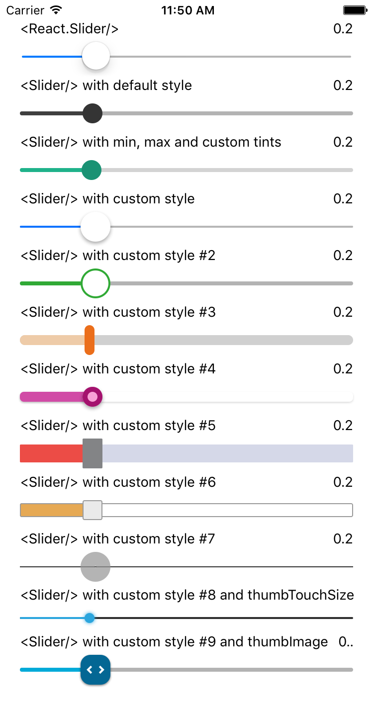
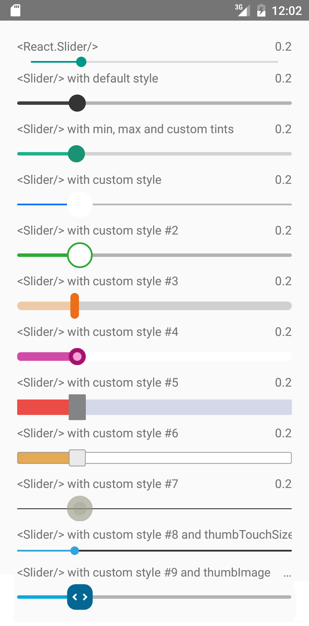
Try this example live on Expo Snack.
| Prop | Type | Optional | Default | Description |
|---|---|---|---|---|
| value | number | Yes | 0 | Initial value of the slider |
| disabled | bool | Yes | false | If true the user won't be able to move the slider |
| minimumValue | number | Yes | 0 | Initial minimum value of the slider |
| maximumValue | number | Yes | 1 | Initial maximum value of the slider |
| step | number | Yes | 0 | Step value of the slider. The value should be between 0 and maximumValue - minimumValue) |
| minimumTrackTintColor | string | Yes | '#3f3f3f' | The color used for the track to the left of the button |
| maximumTrackTintColor | string | Yes | '#b3b3b3' | The color used for the track to the right of the button |
| thumbTintColor | string | Yes | '#343434' | The color used for the thumb |
| thumbTouchSize | object | Yes | {width: 40, height: 40} | The size of the touch area that allows moving the thumb. The touch area has the same center as the visible thumb. This allows to have a visually small thumb while still allowing the user to move it easily. |
| onValueChange | function | Yes | Callback continuously called while the user is dragging the slider | |
| onSlidingStart | function | Yes | Callback called when the user starts changing the value (e.g. when the slider is pressed) | |
| onSlidingComplete | function | Yes | Callback called when the user finishes changing the value (e.g. when the slider is released) | |
| style | style | Yes | The style applied to the slider container | |
| trackStyle | style | Yes | The style applied to the track | |
| thumbStyle | style | Yes | The style applied to the thumb | |
| thumbImage | source | Yes | Sets an image for the thumb. | |
| debugTouchArea | bool | Yes | false | Set this to true to visually see the thumb touch rect in green. |
| animateTransitions | bool | Yes | false | Set to true if you want to use the default 'spring' animation |
| animationType | string | Yes | 'timing' | Set to 'spring' or 'timing' to use one of those two types of animations with the default animation properties. |
| animationConfig | object | Yes | undefined | Used to configure the animation parameters. These are the same parameters in the Animated library. |
MIT Licensed
FAQs
A pure JavaScript <Slider /> component for react-native
The npm package quo-react-native-slider receives a total of 1 weekly downloads. As such, quo-react-native-slider popularity was classified as not popular.
We found that quo-react-native-slider demonstrated a not healthy version release cadence and project activity because the last version was released a year ago. It has 1 open source maintainer collaborating on the project.
Did you know?

Socket for GitHub automatically highlights issues in each pull request and monitors the health of all your open source dependencies. Discover the contents of your packages and block harmful activity before you install or update your dependencies.

Research
Security News
Socket’s threat research team has detected six malicious npm packages typosquatting popular libraries to insert SSH backdoors.

Security News
MITRE's 2024 CWE Top 25 highlights critical software vulnerabilities like XSS, SQL Injection, and CSRF, reflecting shifts due to a refined ranking methodology.

Security News
In this segment of the Risky Business podcast, Feross Aboukhadijeh and Patrick Gray discuss the challenges of tracking malware discovered in open source softare.