Security News
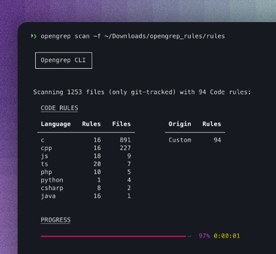
Opengrep Emerges as Open Source Alternative Amid Semgrep Licensing Controversy
Opengrep forks Semgrep to preserve open source SAST in response to controversial licensing changes.
raohai-gatsby-remark-images
Advanced tools
Processes images in markdown so they can be used in the production build.
Processes images in markdown so they can be used in the production build.
In the processing, it make images responsive by:
srcset and sizes of the img element so regardless of the width of the
device, the correct image is downloaded.npm install --save gatsby-remark-images gatsby-plugin-sharp
// In your gatsby-config.js
plugins: [
  `gatsby-plugin-sharp`,
  {
    resolve: `gatsby-transformer-remark`,
    options: {
      plugins: [
        {
          resolve: `gatsby-remark-images`,
          options: {
            // It's important to specify the maxWidth (in pixels) of
            // the content container as this plugin uses this as the
            // base for generating different widths of each image.
            maxWidth: 590,
          },
        },
      ],
    },
  },
]
| Name | Default | Description |
|---|---|---|
maxWidth | 650 | The maxWidth in pixels of the div where the markdown will be displayed. This value is used when deciding what the width of the various responsive thumbnails should be. |
linkImagesToOriginal | true | Add a link to each image to the original image. Sometimes people want to see a full-sized version of an image e.g. to see extra detail on a part of the image and this is a convenient and common pattern for enabling this. Set this option to false to disable this behavior. |
showCaptions | false | Add a caption to each image with the contents of the title attribute, when this is not empty. If the title attribute is empty but the alt attribute is not, it will be used instead. Set this option to true to enable this behavior. |
sizeByPixelDensity | false | Analyze images' pixel density to make decisions about target image size. This is what GitHub is doing when embedding images in tickets. This is a useful setting for documentation pages with a lot of screenshots. It can have unintended side effects on high pixel density artworks. Example: A screenshot made on a retina screen with a resolution of 144 (e.g. Macbook) and a width of 100px, will be rendered at 50px. |
wrapperStyle | Add custom styles to the div wrapping the responsive images. Use the syntax for the style attribute e.g. margin-bottom:10px; background: red; or a function returning a style string which receives the information about the image you can use to dynamically set styles based on the aspectRatio for example. | |
backgroundColor | white | Set the background color of the image to match the background image of your design. |
quality | 50 | The quality level of the generated files. |
withWebp | false | Additionally generate WebP versions alongside your chosen file format. They are added as a srcset with the appropriate mimetype and will be loaded in browsers that support the format. Pass true for default support, or an object of options to specifically override those for the WebP files. For example, pass { quality: 80 } to have the WebP images be at quality level 80. |
tracedSVG | false | Use traced SVGs for placeholder images instead of the "blur up" effect. Pass true for traced SVGs with the default settings (seen here), or an object of options to override the defaults. For example, pass { color: "#F00", turnPolicy: "TURNPOLICY_MAJORITY" } to change the color of the trace to red and the turn policy to TURNPOLICY_MAJORITY. See node-potrace parameter documentation for a full listing and explanation of the available options. |
{
  resolve: `gatsby-remark-images`,
  options: {
    maxWidth: 800,
    wrapperStyle: fluidResult => `flex:${_.round(fluidResult.aspectRatio, 2)};`,
  },
}
This plugin will support the following formats:
Since it uses Sharp for image processing, this plugin will not support GIFs or SVGs. If you would like to render these file types with the image markdown syntax, add the gatsby-remark-copy-linked-files plugin. Do note with this it will load in the images, but won't use the features of Sharp such as the elastic container or the blur-up enhancements.
FAQs
Processes images in markdown so they can be used in the production build.
The npm package raohai-gatsby-remark-images receives a total of 5 weekly downloads. As such, raohai-gatsby-remark-images popularity was classified as not popular.
We found that raohai-gatsby-remark-images demonstrated a not healthy version release cadence and project activity because the last version was released a year ago. It has 1 open source maintainer collaborating on the project.
Did you know?

Socket for GitHub automatically highlights issues in each pull request and monitors the health of all your open source dependencies. Discover the contents of your packages and block harmful activity before you install or update your dependencies.

Security News
Opengrep forks Semgrep to preserve open source SAST in response to controversial licensing changes.

Security News
Critics call the Node.js EOL CVE a misuse of the system, sparking debate over CVE standards and the growing noise in vulnerability databases.

Security News
cURL and Go security teams are publicly rejecting CVSS as flawed for assessing vulnerabilities and are calling for more accurate, context-aware approaches.