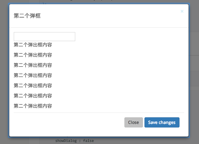
What is rc-dialog?
The rc-dialog package is a React component for creating and managing modals, dialogs, or popups in a React application. It provides a flexible and accessible way to generate dialog windows that can contain a wide range of content, from simple text to complex forms and interactive elements. The package offers various customization options, including animations, styles, and positioning, making it a versatile tool for UI development.
What are rc-dialog's main functionalities?
Basic Dialog Creation
This code sample demonstrates how to create a basic dialog with a title and some content. The dialog's visibility is controlled by a state variable.
import React from 'react';
import Dialog from 'rc-dialog';
const MyDialog = () => {
const [visible, setVisible] = React.useState(false);
return (
<>
<button onClick={() => setVisible(true)}>Open Dialog</button>
<Dialog
visible={visible}
onClose={() => setVisible(false)}
title='Dialog Title'
>
<p>This is a basic dialog example.</p>
</Dialog>
</>
);
};
export default MyDialog;
Customizing Styles
This example shows how to apply custom styles to the dialog, including its width and the padding of its body content.
import React from 'react';
import Dialog from 'rc-dialog';

const MyStyledDialog = () => {
  const [visible, setVisible] = React.useState(false);
  return (
    <>
      <button onClick={() => setVisible(true)}>Open Styled Dialog</button>
      <Dialog
        visible={visible}
        onClose={() => setVisible(false)}
        title='Styled Dialog'
        style={{ width: 600 }}
        bodyStyle={{ padding: 20 }}
      >
        <p>This dialog has customized styles.</p>
      </Dialog>
    </>
  );
};

export default MyStyledDialog;
Modal with Footer
This code snippet illustrates how to add a footer to the dialog, which in this case contains a button to close the modal.
import React from 'react';
import Dialog from 'rc-dialog';

const ModalWithFooter = () => {
  const [visible, setVisible] = React.useState(false);
  return (
    <>
      <button onClick={() => setVisible(true)}>Open Modal with Footer</button>
      <Dialog
        visible={visible}
        onClose={() => setVisible(false)}
        title='Modal Title'
        footer={<button onClick={() => setVisible(false)}>Close</button>}
      >
        <p>This modal includes a footer with a close button.</p>
      </Dialog>
    </>
  );
};

export default ModalWithFooter;
Other packages similar to rc-dialog
react-modal
react-modal is a popular package for creating accessible modals in React applications. It offers similar functionalities to rc-dialog, such as customizable styles and easy management of modal states. However, react-modal places a stronger emphasis on accessibility features.
material-ui
material-ui (specifically the Dialog component within it) provides a comprehensive solution for creating dialogs and modals in React applications that adhere to Material Design principles. Compared to rc-dialog, material-ui's Dialog component comes with a wider range of pre-designed styles and animations, making it a good choice for applications following Material Design guidelines.


