Security News
GitHub Removes Malicious Pull Requests Targeting Open Source Repositories
GitHub removed 27 malicious pull requests attempting to inject harmful code across multiple open source repositories, in another round of low-effort attacks.
rc-dropdown
Advanced tools
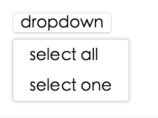
The rc-dropdown package is a React component that provides a flexible and customizable dropdown menu. It allows developers to create dropdown menus with various content, trigger behaviors, and alignment options.
Basic Dropdown
This code sample demonstrates how to create a basic dropdown menu with selectable options. When an option is selected, it triggers an alert with the selected key. The visibility of the dropdown is logged to the console when it changes.
{"import React from 'react';\nimport Dropdown from 'rc-dropdown';\nimport Menu, { Item as MenuItem } from 'rc-menu';\n\nfunction onSelect({ key }) {\n alert(`selected ${key}`);\n}\n\nfunction onVisibleChange(visible) {\n console.log(visible);\n}\n\nconst menu = (\n <Menu onSelect={onSelect}>\n <MenuItem key='1'>Option 1</MenuItem>\n <MenuItem key='2'>Option 2</MenuItem>\n <MenuItem key='3'>Option 3</MenuItem>\n </Menu>\n);\n\nconst App = () => (\n <Dropdown\n overlay={menu}\n onVisibleChange={onVisibleChange}\n trigger={['click']}\n >\n <a className='ant-dropdown-link' onClick={e => e.preventDefault()}>\n Click me\n </a>\n </Dropdown>\n);\n\nexport default App;"}Trigger Modes
This code sample shows how to create a dropdown that is triggered by hovering over the link instead of clicking. The menu appears when the user hovers over the 'Hover me' link.
{"import React from 'react';\nimport Dropdown from 'rc-dropdown';\nimport Menu, { Item as MenuItem } from 'rc-menu';\n\nconst menu = (\n <Menu>\n <MenuItem key='1'>Option 1</MenuItem>\n <MenuItem key='2'>Option 2</MenuItem>\n </Menu>\n);\n\nconst App = () => (\n <Dropdown\n overlay={menu}\n trigger={['hover']}\n >\n <a className='ant-dropdown-link' href='#'>\n Hover me\n </a>\n </Dropdown>\n);\n\nexport default App;"}Alignment
This code sample illustrates how to align the dropdown menu relative to the trigger element. The 'align' prop is used to specify the alignment points, offset, and overflow behavior.
{"import React from 'react';\nimport Dropdown from 'rc-dropdown';\nimport Menu, { Item as MenuItem } from 'rc-menu';\n\nconst menu = (\n <Menu>\n <MenuItem key='1'>Option 1</MenuItem>\n <MenuItem key='2'>Option 2</MenuItem>\n </Menu>\n);\n\nconst App = () => (\n <Dropdown\n overlay={menu}\n align={{\n points: ['tr', 'br'],\n offset: [0, 4],\n overflow: { adjustX: 1, adjustY: 1 }\n }}\n >\n <a className='ant-dropdown-link' href='#'>\n Align me\n </a>\n </Dropdown>\n);\n\nexport default App;"}This package provides dropdown components styled with Bootstrap. It is similar to rc-dropdown but integrates tightly with the Bootstrap framework for styling and components.
Downshift is a set of primitives to build simple, flexible, WAI-ARIA compliant React autocomplete, combobox or select dropdown components. It's more complex and provides more functionality compared to rc-dropdown, including autocomplete behavior.
React-select is a flexible and state-driven component for creating multi-select input fields. It offers a richer set of features compared to rc-dropdown, such as multi-select, async options loading, and more.
react dropdown component

online example: http://react-component.github.io/dropdown/examples/
var Dropdown = require('rc-dropdown');
// use dropdown
| name | type | default | description |
|---|---|---|---|
| overlayClassName | String | additional css class of root dom node | |
| openClassName | String | `${prefixCls}-open` | className of trigger when dropdown is opened |
| prefixCls | String | rc-dropdown | prefix class name |
| transitionName | String | dropdown menu's animation css class name | |
| animation | String | part of dropdown menu's animation css class name | |
| placement | String | bottomLeft | Position of menu item. There are: topLeft, topCenter, topRight, bottomLeft, bottomCenter, bottomRight |
| onVisibleChange | Function | call when visible is changed | |
| visible | boolean | whether tooltip is visible | |
| defaultVisible | boolean | whether tooltip is visible initially | |
| overlay | rc-menu | rc-menu element | |
| onOverlayClick | function(e) | call when overlay is clicked | |
| minOverlayWidthMatchTrigger | boolean | true (false when set alignPoint) | whether overlay's width must not be less than trigger's |
| getPopupContainer | Function(menuDOMNode): HTMLElement | () => document.body | Where to render the DOM node of dropdown |
Note: Additional props are passed into the underlying rc-trigger component. This can be useful for example, to display the dropdown in a separate portal-driven window via the getDocument() rc-trigger prop.
npm install
npm start
npm test
npm run chrome-test
npm run coverage
open coverage/ dir
rc-dropdown is released under the MIT license.
FAQs
dropdown ui component for react
The npm package rc-dropdown receives a total of 910,002 weekly downloads. As such, rc-dropdown popularity was classified as popular.
We found that rc-dropdown demonstrated a healthy version release cadence and project activity because the last version was released less than a year ago. It has 6 open source maintainers collaborating on the project.
Did you know?

Socket for GitHub automatically highlights issues in each pull request and monitors the health of all your open source dependencies. Discover the contents of your packages and block harmful activity before you install or update your dependencies.

Security News
GitHub removed 27 malicious pull requests attempting to inject harmful code across multiple open source repositories, in another round of low-effort attacks.

Security News
RubyGems.org has added a new "maintainer" role that allows for publishing new versions of gems. This new permission type is aimed at improving security for gem owners and the service overall.

Security News
Node.js will be enforcing stricter semver-major PR policies a month before major releases to enhance stability and ensure reliable release candidates.