

Security News
upm Launches as a Fast, Tiny Package Manager Written in TypeScript
upm uses Node.js to deliver fast npm installs in about 250 KB, with a JavaScript API and security defaults.
By Sarah Gooding - Sep 29, 2026
react menu component. port from https://github.com/kissyteam/menu





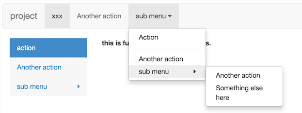
import Menu, {SubMenu, MenuItem} from 'rc-menu';
ReactDOM.render(<Menu>
<MenuItem>1</MenuItem>
<SubMenu title="2">
<MenuItem>2-1</MenuItem>
</SubMenu>
</Menu>, container);

| name | type | default | description |
|---|---|---|---|
| className | String | additional css class of root dom node | |
| mode | String | vertical | one of ["horizontal","inline","vertical-left","vertical-right"] |
| activeKey | Object | initial and current active menu item's key. | |
| defaultActiveFirst | Boolean | false | whether active first menu item when show if activeKey is not set or invalid |
| multiple | Boolean | false | whether allow multiple select |
| selectable | Boolean | true | allow selecting menu items |
| selectedKeys | String[] | [] | selected keys of items |
| defaultSelectedKeys | String[] | [] | initial selected keys of items |
| openKeys | String[] | [] | open keys of SubMenuItem |
| defaultOpenKeys | String[] | [] | initial open keys of SubMenuItem |
| onSelect | function({key:String, item:ReactComponent, domEvent:Event, selectedKeys:String[]}) | called when select a menu item | |
| onClick | function({key:String, item:ReactComponent, domEvent:Event, keyPath: String[]}) | called when click a menu item | |
| onOpenChange | (openKeys:String[]) => void | called when open/close sub menu | |
| onDeselect | function({key:String, item:ReactComponent, domEvent:Event, selectedKeys:String[]}) | called when deselect a menu item. only called when allow multiple | |
| triggerSubMenuAction | Enum { hover, click } | hover | which action can trigger submenu open/close |
| openAnimation | {enter:function,leave:function}|String | animate when sub menu open or close. see rc-animate for object type. | |
| openTransition | String | css transitionName when sub menu open or close | |
| subMenuOpenDelay | Number | 0 | delay time to show popup sub menu. unit: s |
| subMenuCloseDelay | Number | 0.1 | delay time to hide popup sub menu. unit: s |
| forceSubMenuRender | Boolean | false | whether to render submenu even if it is not visible |
| getPopupContainer | Function(menuDOMNode): HTMLElement | () => document.body | Where to render the DOM node of popup menu when the mode is horizontal or vertical |
| builtinPlacements | Object of alignConfigs for dom-align | see placements.jsx | Describes how the popup menus should be positioned |
| itemIcon | ReactNode | (props: MenuItemProps) => ReactNode | Specify the menu item icon. | |
| expandIcon | ReactNode | (props: SubMenuProps & { isSubMenu: boolean }) => ReactNode | Specify the menu item icon. |
| name | type | default | description |
|---|---|---|---|
| className | String | additional css class of root dom node | |
| disabled | Boolean | false | no effect for click or keydown for this item |
| key | Object | corresponding to activeKey | |
| onMouseEnter | Function({eventKey, domEvent}) | ||
| onMouseLeave | Function({eventKey, domEvent}) | ||
| itemIcon | ReactNode | (props: MenuItemProps) => ReactNode | Specify the menu item icon. |
| name | type | default | description |
|---|---|---|---|
| popupClassName | String | additional css class of root dom node | |
| title | String/ReactElement | sub menu's content | |
| overflowedIndicator | String/ReactElement | ··· | overflow indicator when menu overlows in horizontal mode |
| key | Object | corresponding to activeKey | |
| disabled | Boolean | false | no effect for click or keydown for this item |
| onMouseEnter | Function({eventKey, domEvent}) | ||
| onMouseLeave | Function({eventKey, domEvent}) | ||
| onTitleMouseEnter | Function({eventKey, domEvent}) | ||
| onTitleMouseLeave | Function({eventKey, domEvent}) | ||
| onTitleClick | Function({eventKey, domEvent}) | ||
| popupOffset | Array | The offset of the popup submenu, in an x, y coordinate array. e.g.: `[0,15]` | |
| expandIcon | ReactNode | (props: SubMenuProps) => ReactNode | Specify the menu item icon. | |
| itemIcon | ReactNode | (props: SubMenuProps & { isSubMenu: boolean }) => ReactNode | Specify the menu item icon. |
none
| name | type | default | description |
|---|---|---|---|
| title | String|React.Element | title of item group | |
| children | React.Element[] | MenuItems belonged to this group |
npm install
npm start
http://localhost:8001/examples/index.md
online example: http://react-component.github.io/menu/examples/
npm test
npm run chrome-test
npm run coverage
open coverage/ dir
rc-menu is released under the MIT license.
FAQs
Security News
upm uses Node.js to deliver fast npm installs in about 250 KB, with a JavaScript API and security defaults.

Company News
Socket is joining the OpenJS Security Stewardship Program to fund Node.js vulnerability research, maintainer remediation, and security releases.
Security News
Two compromised GitHub Actions were re-enabled with malicious tags intact, exposing thousands of downstream repositories to Mini Shai-Hulud.