
Security News
The Unpaid Backbone of Open Source: Solo Maintainers Face Increasing Security Demands
Solo open source maintainers face burnout and security challenges, with 60% unpaid and 60% considering quitting.
By Sarah Gooding - Sep 20, 2024
The rc-tabs package is a React component for creating and managing tabs in a web application. It provides a set of features that allow developers to create customizable and accessible tab interfaces with ease.
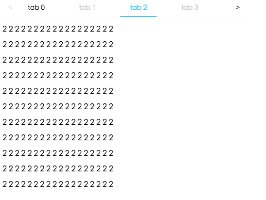
Basic Tabs
This feature allows you to create basic tabbed interfaces. Each TabPane component represents a tab panel with its own content.
import React from 'react';
import Tabs, { TabPane } from 'rc-tabs';
const Demo = () => (
<Tabs defaultActiveKey="1">
<TabPane tab="Tab 1" key="1">Content of Tab Pane 1</TabPane>
<TabPane tab="Tab 2" key="2">Content of Tab Pane 2</TabPane>
<TabPane tab="Tab 3" key="3">Content of Tab Pane 3</TabPane>
</Tabs>
);
export default Demo;Animated Tabs
This feature adds animations to the tab transitions, providing a more dynamic user experience.
import React from 'react';
import Tabs, { TabPane } from 'rc-tabs';
import 'rc-tabs/assets/index.css';

const Demo = () => (
  <Tabs defaultActiveKey="1" animated={{ inkBar: true, tabPane: true }}>
    <TabPane tab="Tab 1" key="1">Content of Tab Pane 1</TabPane>
    <TabPane tab="Tab 2" key="2">Content of Tab Pane 2</TabPane>
    <TabPane tab="Tab 3" key="3">Content of Tab Pane 3</TabPane>
  </Tabs>
);

export default Demo;
Vertical Tabs
This feature allows you to create vertical tabs, with the tab list displayed on the side rather than the top.
import React from 'react';
import Tabs, { TabPane } from 'rc-tabs';
import 'rc-tabs/assets/index.css';

const Demo = () => (
  <Tabs defaultActiveKey="1" tabPosition="left">
    <TabPane tab="Tab 1" key="1">Content of Tab Pane 1</TabPane>
    <TabPane tab="Tab 2" key="2">Content of Tab Pane 2</TabPane>
    <TabPane tab="Tab 3" key="3">Content of Tab Pane 3</TabPane>
  </Tabs>
);

export default Demo;
Customizable Tabs
This feature allows for customization of the tab bar, enabling the use of custom classes and styles.
import React from 'react';
import Tabs, { TabPane } from 'rc-tabs';
import 'rc-tabs/assets/index.css';

const renderTabBar = (props, DefaultTabBar) => (
  <DefaultTabBar {...props} className="my-custom-class" />
);

const Demo = () => (
  <Tabs defaultActiveKey="1" renderTabBar={renderTabBar}>
    <TabPane tab="Tab 1" key="1">Content of Tab Pane 1</TabPane>
    <TabPane tab="Tab 2" key="2">Content of Tab Pane 2</TabPane>
    <TabPane tab="Tab 3" key="3">Content of Tab Pane 3</TabPane>
  </Tabs>
);

export default Demo;react-tabs is a package that provides components for managing tabs in React. It is similar to rc-tabs but focuses on simplicity and accessibility, offering a more straightforward API with less customization options.
react-bootstrap-tabs is a component that integrates with the React-Bootstrap framework, providing tabs that are styled according to Bootstrap's design. It is suitable for those who are using Bootstrap for styling and want to maintain design consistency.
React Tabs component.


http://localhost:8000/examples
online example: https://tabs.react-component.now.sh/
import Tabs from 'rc-tabs';
import ReactDom from 'react-dom';

const callback = (key) => {
  console.log(key);
};

const items = [
  {
    key: '1',
    label: 'Google',
    children: (
      <div className="text-xl">
        <p>Lorem Ipsum is simply dummy text of the printing and typesetting</p>
      </div>
    ),
  },
  {
    key: '2',
    label: <p>Amazon</p>,
    children:
      'Neque porro quisquam est qui dolorem ipsum quia dolor sit amet, consectetur, adipisci velit...',
    disabled: true,
  },
  {
    key: '3',
    label: <p>Twitter</p>,
    children: (
      <div>
        "There is no one who loves pain itself, who seeks after it and wants to have it, simply
        because it is pain..."
      </div>
    ),
  },
];

ReactDom.render(
  <Tabs
    tabPosition="bottom"
    items={items}
    defaultActiveKey="1"
    className="md:w-[70%] w-full mx-auto p-2 border-0"
    onChange={callback}
    style={{ color: 'yellow' }}
  />,
  root,
);
| name | type | default | description |
|---|---|---|---|
| prefixCls | string | 'rc-tabs' | prefix class name, use to custom style |
| className | string | - | to define a class name for an element |
| style | CSS properties | - | object with css properties for styling |
| items | TabItem[] | [] | configure tab content |
| id | string | - | unique identifier |
| defaultActiveKey | string | - | initial active tabPanel's key if activeKey is absent |
| activeKey | string | - | current active tabPanel's key |
| direction | 'ltr' or 'rtl' | 'ltr' | Layout direction of tabs component |
| animated | boolean | { inkBar: boolean, tabPane: boolean } | { inkBar: true, tabPane: false } | config animation |
| renderTabBar | (props, TabBarComponent) => ReactElement | - | How to render tab bar |
| tabBarExtraContent | ReactNode | { left: ReactNode, right: ReactNode } | - | config extra content |
| tabBarGutter | number | 0 | config tab bar gutter |
| tabBarPosition | 'left' | 'right' | 'top' | 'bottom' | 'top' | tab nav 's position |
| tabBarStyle | style | - | tab nav style |
| tabPosition | 'left' or 'right' or 'top' or 'bottom' | 'top' | tab nav 's position |
| destroyInactiveTabPane | boolean | false | whether destroy inactive TabPane when change tab |
| onChange | (key) => void | - | called when tabPanel is changed |
| onTabClick | (key) => void | - | called when tab click |
| onTabScroll | ({ direction }) => void | - | called when tab scroll |
| editable | { onEdit(type: 'add' | 'remove', info: { key, event }), showAdd: boolean, removeIcon: ReactNode, addIcon: ReactNode } | - |
| locale | { dropdownAriaLabel: string, removeAriaLabel: string, addAriaLabel: string } | - | Accessibility locale help text |
| moreIcon | ReactNode | - | collapse icon |
| name | type | default | description |
|---|---|---|---|
| key | string | - | corresponding to activeKey, should be unique |
| label | string | - | TabPane's head display text |
| tab | ReactNode | - | current tab's title corresponding to current tabPane |
| className | string | - | to define a class name for an element |
| style | CSS properties | - | object with css properties for styling |
| disabled | boolean | false | set TabPane disabled |
| children | ReactNode | - | TabPane's head display content |
| forceRender | boolean | false | forced render of content in tabs, not lazy render after clicking on tabs |
| closable | boolean | false | closable feature of tab item |
| closeIcon | ReactNode | - | Config close icon |
| prefixCls | string | 'rc-tabs-tab' | prefix class name, use to custom style |
| id | string | - | unique identifier |
| animated | boolean | { inkBar: boolean, tabPane: boolean } | { inkBar: true, tabPane: false } | config animation |
| destroyInactiveTabPane | boolean | false | whether destroy inactive TabPane when change tab |
| active | boolean | false | active feature of tab item |
| tabKey | string | - | key linked to tab |
| name | type | default | description |
|---|---|---|---|
| destroyInactiveTabPane | boolean | false | whether destroy inactive TabPane when change tab |
| key | string | - | corresponding to activeKey, should be unique |
| forceRender | boolean | false | forced render of content in tabs, not lazy render after clicking on tabs |
| tab | ReactNode | - | current tab's title corresponding to current tabPane |
| closeIcon | ReactNode | - | Config close icon |
npm install
npm start
npm test
npm run chrome-test
npm run coverage
open coverage/ dir
rc-tabs is released under the MIT license.
There are 3 cases when handling responsive tabs:
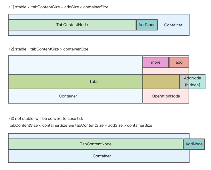
We get hidden tabs through useVisibleRange.ts.
If enconter the third case, in order to make tabs responsive, some tabs should be hidden.
So we minus addSize when calculating basicSize manully, even though there's no addNode in container.
In this way, case 3 turns to case 2, tabs become stable again.
FAQs
tabs ui component for react
The npm package rc-tabs receives a total of 1,086,785 weekly downloads. As such, rc-tabs popularity was classified as popular.
We found that rc-tabs demonstrated a healthy version release cadence and project activity because the last version was released less than a year ago. It has 7 open source maintainers collaborating on the project.
Did you know?

Socket for GitHub automatically highlights issues in each pull request and monitors the health of all your open source dependencies. Discover the contents of your packages and block harmful activity before you install or update your dependencies.
Security News
Solo open source maintainers face burnout and security challenges, with 60% unpaid and 60% considering quitting.

Security News
License exceptions modify the terms of open source licenses, impacting how software can be used, modified, and distributed. Developers should be aware of the legal implications of these exceptions.

Security News
A developer is accusing Tencent of violating the GPL by modifying a Python utility and changing its license to BSD, highlighting the importance of copyleft compliance.