react-auto-tooltip
Tooltip component for react


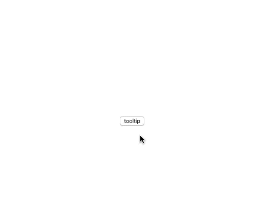
The position of the tooltip is calculated automatically.
Install
npm install --save react-auto-tooltip
Usage
import { Tooltip } from 'react-auto-tooltip';

<Tooltip message="Tooltip message">hello</Tooltip>;
Live Demo
props
| Name | Type | Default | Description |
|---|
| visible | boolean | | Whether the floating tooltip card is visible or not |
| message | ReactNode | | The text shown in the tooltip |
| clickMode | boolean | false | Tooltip trigger click mode |
| defaultVisible | boolean | false | Whether the floating tooltip is visible by default |
| zIndex | number | 1000 | Config z-index of Tooltip |
| backgroundColor | string | rgba(0, 0, 0, 0.9) | The background color |
| style | CSSProperties | | |
| className | string | | |
| onVisible | (visible: boolean) => void | | Callback executed when visibility of the tooltip card is changed |
| onClickMessage | () => void | | Set the handler to handle click tooltip message |
License
MIT © almond-bongbong