react-chat-elements
Reactjs chat elements
Components
- ChatItem
- MessageBox
- SystemMessage
- MessageList
- ChatList
- Input
- Button
- Popup
- SideBar
- Navbar
- Dropdown
ChatItem Component

import { ChatItem } from 'react-chat-elements'
<ChatItem
avatar={'https://facebook.github.io/react/img/logo.svg'}
alt={'Reactjs'}
title={'Facebook'}
subtitle={'What are you doing?'}
date={new Date()}
unread={0} />
ChatItem props
| prop | default | type | description |
|---|
| avatar | none | string | ChatItem avatar photo url |
| alt | none | string | ChatItem avatar photo alt text |
| title | none | string | ChatItem title |
| subtitle | none | string | ChatItem subtitle |
| date | none | date | ChatItem date |
| unread | 0 | int | ChatItem unread count |
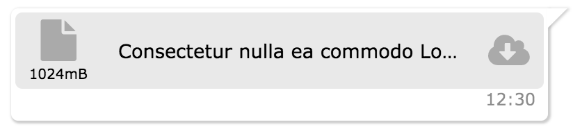
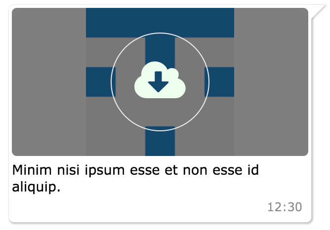
MessageBox Component
import { MessageBox } from 'react-chat-elements'

<MessageBox
    position={'left'}
    type={'photo'}
    text={'react.svg'}
    data={{
        uri: 'https://facebook.github.io/react/img/logo.svg',
        status: {
            click: false,
            loading: 0,
        }
    }}/>
MessageBox props
| prop | default | type | description |
|---|
| position | left | string | message box position |
| type | text | string | message type (text, photo, file) |
| text | none | string | message text |
| data | {} | object | message data |
SystemMessage Component
import { SystemMessage } from 'react-chat-elements'

<SystemMessage
    text={'End of conversation'}/>
SystemMessage props
| prop | default | type | description |
|---|
| text | none | string | message text |
MessageList Component
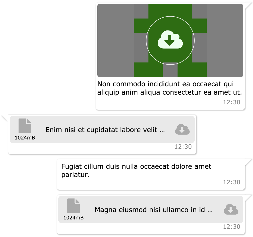
import { MessageList } from 'react-chat-elements'

<MessageList
    className='message-list'
    dataSource={[
        {
            position: 'right',
            type: 'text',
            text: 'Lorem ipsum dolor sit amet, consectetur adipisicing elit',
            date: new Date(),
        },
        .
        .
        .
    ]} />
MessageList props
| prop | default | type | description |
|---|
| className | none | string | optional message list className |
| dataSource | [] | array | message list array |
ChatList Component
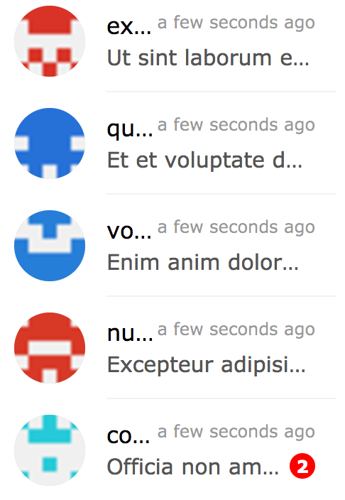
import { ChatList } from 'react-chat-elements'

<ChatList
    className='chat-list'
    dataSource={[
        {
            avatar: 'https://facebook.github.io/react/img/logo.svg',
            alt: 'Reactjs',
            title: 'Facebook',
            subtitle: 'What are you doing?',
            date: new Date(),
            unread: 0,
        },
        .
        .
        .
    ]} />
ChatList props
| prop | default | type | description |
|---|
| className | none | string | optional chat list className |
| dataSource | [] | array | chat list array |
Input Component
import { Input } from 'react-chat-elements'

<Input
    placeholder={'Type here...'} />
Input props
| prop | default | type | description |
|---|
| className | none | string | optional input className |
| placeholder | none | string | input placeholder text |
| defaultValue | none | string | input default value |
| onChange | none | object | input onChange function |
Button Component
import { Button } from 'react-chat-elements'

<Button
    text={'click me!'} />
Button props
| prop | default | type | description |
|---|
| type | none | string | button type (outlined, transparent) |
| disabled | none | string | button is disabled? |
| text | none | string | button text |
import { Popup } from 'react-chat-elements'

<Popup
    show={this.state.show}
    header='Lorem ipsum dolor sit amet.'
    headerButtons={[{
        type: 'transparent',
        color:'black',
        text: 'close',
        onClick: () => {
            this.setState({show: false})
        }
    }]}
    text='Lorem ipsum dolor sit amet, consectetur adipisicing elit. Voluptatem animi veniam voluptas eius!'
    footerButtons={[{
        color:'white',
        backgroundColor:'#ff5e3e',
        text:"Vazgeç",
    },{
        color:'white',
        backgroundColor:'lightgreen',
        text:"Tamam",
    }]}/>
| prop | default | type | description |
|---|
| show | false | bool | popup visible |
| header | none | string | popup title (header) message |
| headerButtons | none | array | popup title (header) buttons |
| text | none | string | popup content (center) message |
| color | #333 | string (color) | popup content message color |
| footerButtons | none | array | popup footer buttons |
| renderHeader | none | function (component) | render header function |
| renderContent | none | function (component) | render content function |
| renderFooter | none | function (component) | render footer function |
import { SideBar } from 'react-chat-elements'

<SideBar
    top={
        <div>'TOP' area</div>
    }
    center={
        <div>'CENTER' area</div>
    }
    bottom={
        <div>'BOTTOM' area</div>
    }/>
| prop | default | type | description |
|---|
| type | dark | string | popup visible |
| top | false | function (component) | popup top component |
| center | none | function (component) | popup center component |
| bottom | none | function (component) | popup bottom component |
Navbar Component
import { Navbar } from 'react-chat-elements'

<Navbar
    top={
        <div>'TOP' area</div>
    }
    center={
        <div>'CENTER' area</div>
    }
    bottom={
        <div>'BOTTOM' area</div>
    }/>
Navbar props
| prop | default | type | description |
|---|
| type | dark | string | popup visible |
| top | false | function (component) | popup top component |
| center | none | function (component) | popup center component |
| bottom | none | function (component) | popup bottom component |
Dropdown Component
import { Dropdown } from 'react-chat-elements'

<Dropdown
    target={{
        X: 400,
        Y: 100
    }}
    items={[
        'merhaba',
        'lorem',
        'ipsum',
        'dolor',
        'sit',
        'amet'
    ]}/>
Dropdown props
| prop | default | type | description |
|---|
| animationType | none | string | fade or default |
| animationPosition | nortwest | string | animation start position (nortwest, norteast, southwest, southeast) |
| items | none | array | dropdown items array |
| onSelect | none | function | item on select |
| target | { X: 0, Y: 0 } | object | dropdown target |