react-chat-elements
Reactjs chat elements
Install
npm install react-chat-elements --save
For React Native
Step 1: Install react-chat-elements
npm install react-chat-elements --save
If you have already installed react-native-vector-icons as a dependency for your project you can skip this step. Otherwise run the following command:
Step 2: Install react-native-vector-icons
npm i --save react-native-vector-icons
Link:
react-native link react-native-vector-icons
If you have any issues installing react-native-vector-icons, check out their installation guide here.
Imports
import 'react-chat-elements/dist/main.css';
import { MessageBox } from 'react-chat-elements';
React Native
import { MessageBox } from 'react-chat-elements/native';
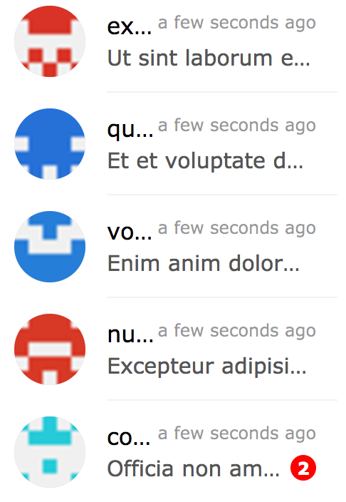
Components
- ChatItem
- MessageBox
- SystemMessage
- MessageList
- ChatList
- Input
- Button
- Popup
- SideBar
- Navbar
- Dropdown
- Avatar
- LocationMessage
- SpotifyMessage
ChatItem Component
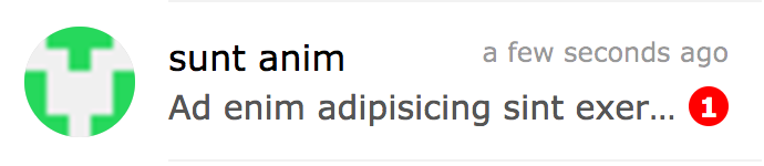
import { ChatItem } from 'react-chat-elements'

<ChatItem
    avatar={'https://facebook.github.io/react/img/logo.svg'}
    alt={'Reactjs'}
    title={'Facebook'}
    subtitle={'What are you doing?'}
    date={new Date()}
    unread={0} />
ChatItem props
| prop | default | type | description |
|---|
| avatar | none | string | ChatItem avatar photo url |
| avatarFlexible | false | boolean | flexible ChatItem avatar photo |
| alt | none | string | ChatItem avatar photo alt text |
| title | none | string | ChatItem title |
| subtitle | none | string | ChatItem subtitle |
| date | none | date | ChatItem date |
| dateString | none | string | ChatItem represents dateString or moment(date).fromNow() |
| unread | 0 | int | ChatItem unread count |
| onClick | none | function | ChatItem on click |
| onContextMenu | none | function | ChatItem on context menu |
| statusColor | none | color | ChatItem status color |
| statusText | none | color | ChatItem status text |
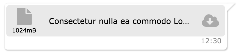
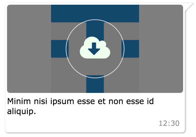
MessageBox Component
import { MessageBox } from 'react-chat-elements'

<MessageBox
    position={'left'}
    type={'photo'}
    text={'react.svg'}
    data={{
        uri: 'https://facebook.github.io/react/img/logo.svg',
        status: {
            click: false,
            loading: 0,
        }
    }}/>
MessageBox props
| prop | default | type | description |
|---|
| id | i (index) | string | message box id |
| position | left | string | message box position |
| type | text | string | message type (text, photo, file, location, spotify) |
| text | none | string | message text |
| title | none | string | message title |
| titleColor | none | string(color) | message title color |
| data | {} | object | message data |
| date | new Date() | Date | message date |
| dateString | none | string | message represents dateString or moment(date).fromNow() |
| onClick | none | function | message on click (message(object) is returned) |
| onOpen | none | function | message on open (file or photo) (message(object) is returned) |
| onDownload | none | function | message on download (file or photo) (message(object) is returned) |
| onLoad | none | function | message on load photo |
| onTitleClick | none | function | message title on click event |
| onForwardClick | none | function | message forward on click event |
| forwarded | none | boolean | message forward icon |
| status | none | string | message status info (waiting, sent, received, read) |
| notch | true | boolean | message box notch |
| avatar | none | url | message box avatar url |
| renderAddCmp | none | function (component) | adding custom components to message box |
| copiableDate | false | boolean | message box date text copiable |
SystemMessage Component
import { SystemMessage } from 'react-chat-elements'

<SystemMessage
    text={'End of conversation'}/>
SystemMessage props
| prop | default | type | description |
|---|
| text | none | string | message text |
MessageList Component
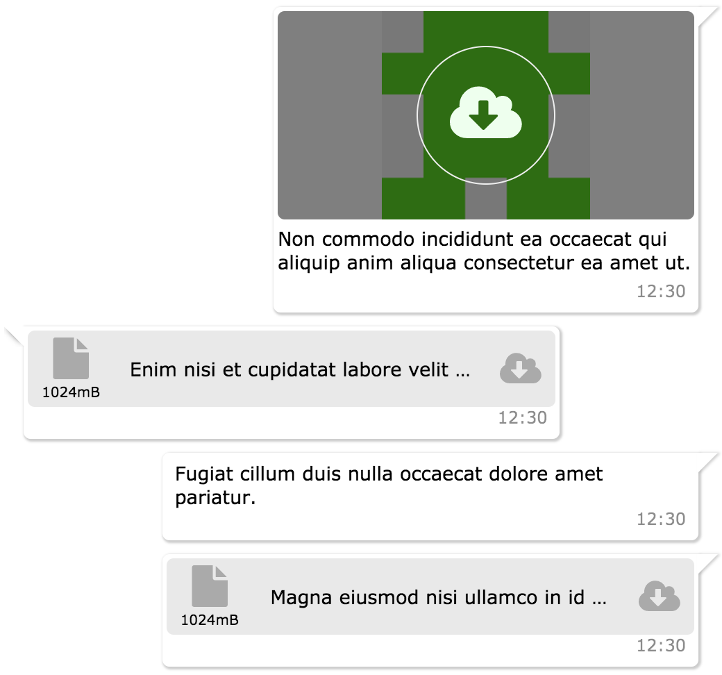
import { MessageList } from 'react-chat-elements'

<MessageList
    className='message-list'
    lockable={true}
    toBottomHeight={'100%'}
    dataSource={[
        {
            position: 'right',
            type: 'text',
            text: 'Lorem ipsum dolor sit amet, consectetur adipisicing elit',
            date: new Date(),
        },
        .
        .
        .
    ]} />
MessageList props
| prop | default | type | description |
|---|
| className | none | string | optional message list className |
| dataSource | [] | array | message list array |
| lockable | false | boolean | It locks to scroll position when the dataSource has been changed |
| toBottomHeight | 300 | int or string(only '100%') | If the toBottomHeight property's value higher than bottom value of the scrollbar when the data source has been changed Scrollbar goes to bottom at the end of the page. If the toBottomHeight property's value has been set '100%', scrollbar goes to bottom at the end of the page when the data source has been changed. |
| onClick | none | function | message list item on click (message(object) is returned) |
| onOpen | none | function | message list item on open (file or photo) (message(object) is returned) |
| onDownload | none | function | message list item on download (file or photo) (message(object) is returned) |
| onScroll | none | function | message list onScroll event |
| onForwardClick | none | function | message list item onForwardClick event |
| downButton | true | boolean | message list scroll to bottom button |
| downButtonBadge | none | boolean | message list downButton badge content |
| onDownButtonClick | none | function | message list onDownButtonClick |
ChatList Component
import { ChatList } from 'react-chat-elements'

<ChatList
    className='chat-list'
    dataSource={[
        {
            avatar: 'https://facebook.github.io/react/img/logo.svg',
            alt: 'Reactjs',
            title: 'Facebook',
            subtitle: 'What are you doing?',
            date: new Date(),
            unread: 0,
        },
        .
        .
        .
    ]} />
ChatList props
| prop | default | type | description |
|---|
| className | none | string | optional chat list className |
| dataSource | [] | array | chat list array |
| onClick | none | function | chat list item on click (chat(object) is returned) |
| onContextMenu | none | function | chat list item on context menu (chat(object) is returned) |
Input Component
import { Input } from 'react-chat-elements'
<Input
placeholder="Type here..."
multiline={true}
rightButtons={
<Button
color='white'
backgroundColor='black'
text='Send'/>
}/>
<Input
ref='input'
placeholder="Type here..."/>
this.refs.input.clear();
Input props
| prop | default | type | description |
|---|
| className | none | string | optional input className |
| placeholder | none | string | input placeholder text |
| defaultValue | none | string | input default value |
| onChange | none | function | input onChange function |
| multiline | false | bool | input is textarea |
| autoHeight | true | bool | input auto height |
| minHeight | 25 | int | input min height |
| maxHeight | 200 | int | input max height |
| inputStyle | none | object | inputStyle object |
| leftButtons | none | object(component) | left buttons component |
| rightButtons | none | object(component) | right buttons component |
| inputRef | none | function | input or textarea ref |
| maxlength | none | int | input or textarea maxlength |
| onMaxLengthExceed | none | function | called when max length exceed |
| autofocus | false | bool | input autofocus |
Button Component
import { Button } from 'react-chat-elements'

<Button
    text={'click me!'} />
Button props
| prop | default | type | description |
|---|
| type | none | string | button type (outlined, transparent) |
| disabled | none | string | button is disabled? |
| text | none | string | button text |
| buttonRef | none | function | button ref |
| title | none | string | button title |
import { Popup } from 'react-chat-elements'

<Popup
    show={this.state.show}
    header='Lorem ipsum dolor sit amet.'
    headerButtons={[{
        type: 'transparent',
        color:'black',
        text: 'close',
        onClick: () => {
            this.setState({show: false})
        }
    }]}
    text='Lorem ipsum dolor sit amet, consectetur adipisicing elit. Voluptatem animi veniam voluptas eius!'
    footerButtons={[{
        color:'white',
        backgroundColor:'#ff5e3e',
        text:"Vazgeç",
    },{
        color:'white',
        backgroundColor:'lightgreen',
        text:"Tamam",
    }]}/>
| prop | default | type | description |
|---|
| show | false | bool | popup visible |
| header | none | string | popup title (header) message |
| headerButtons | none | array | popup title (header) buttons |
| text | none | string | popup content (center) message |
| color | #333 | string (color) | popup content message color |
| footerButtons | none | array | popup footer buttons |
| renderHeader | none | function (component) | render header function |
| renderContent | none | function (component) | render content function |
| renderFooter | none | function (component) | render footer function |
import { SideBar } from 'react-chat-elements'

<SideBar
    top={
        <div>'TOP' area</div>
    }
    center={
        <div>'CENTER' area</div>
    }
    bottom={
        <div>'BOTTOM' area</div>
    }/>
| prop | default | type | description |
|---|
| type | light | string | sidebar style type (eg: light, dark) |
| top | none | component | sidebar top component |
| center | none | component | sidebar center component |
| bottom | none | component | sidebar bottom component |
Navbar Component
import { Navbar } from 'react-chat-elements'

<Navbar
    left={
        <div>'LEFT' area</div>
    }
    center={
        <div>'CENTER' area</div>
    }
    right={
        <div>'RIGHT' area</div>
    }/>
Navbar props
| prop | default | type | description |
|---|
| type | light | string | navbar style type (eg: light, dark) |
| left | none | component | navbar left component |
| center | none | component | navbar center component |
| right | none | component | navbar right component |
Dropdown Component
import { Dropdown } from 'react-chat-elements'

<Dropdown
    buttonProps={{
        text: 'Dropdown',
    }}
    items={[
        'merhaba',
        'lorem',
        'ipsum',
        'dolor',
        'sit',
        'amet',
    ]}/>
Dropdown props
| prop | default | type | description |
|---|
| animationType | none | string | fade or default |
| animationPosition | nortwest | string | animation start position (nortwest, norteast, southwest, southeast) |
| items | none | array | dropdown items array |
| onSelect | none | function | item on select |
| buttonProps | none | object | button properties |
Avatar Component
import { Avatar } from 'react-chat-elements'

<Avatar
    src={'https://facebook.github.io/react/img/logo.svg'}
    alt={'logo'}
    size="large"
    type="circle flexible"/>
Avatar props
| prop | default | type | description |
|---|
| src | none | image | image src |
| alt | none | string | image alt description |
| size | default | string | image size. default (25px), xsmall(30px), small(35px), medium(40px), large(45px), xlarge (55px) |
| type | default | string | types: default, circle, rounded(border radius 5px), flexible |
| sideElement | none | component | avatar side element |
LocationMessage Component
import { LocationMessage } from 'react-chat-elements'

<LocationMessage
    data={{
        latitude: '37.773972',
        longitude: '-122.431297',
    }}/>
LocationMessage props
| prop | default | type | description |
|---|
| src | none | image | image src |
| apiKey | none | string | google staticmap api key |
| zoom | 14 | int | google staticmap zoom level |
| markerColor | red | string | google staticmap marker color |
| data | {} | object | message data |
| target | _blank | string | image a tag target prop |
| onOpen | none | function | image on open |
SpotifyMessage Component
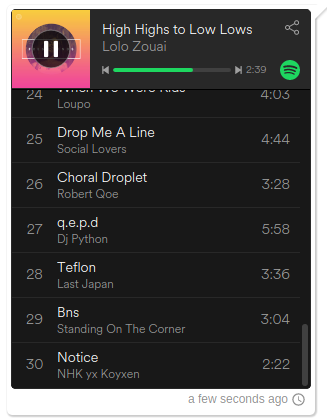
import { SpotifyMessage } from 'react-chat-elements'

<SpotifyMessage
    theme='white'
    view='coverart'
    uri={'spotify:user:spotify:playlist:3rgsDhGHZxZ9sB9DQWQfuf'}/>
SpotifyMessage props
| prop | default | type | description |
|---|
| uri | none | uri | spotify uri |
| theme | black | string | spotify theme color (black or white) |
| view | list | string | spotify view type (list or coverart) |
| data | {} | object | message data |
| width | 300 | int | spotify embed width |
| height | 380 | int | spotify embed height |