
Security News
The Code You Didn't Write Is Still Yours to Defend
AI agents are pulling packages into environments no scanner is watching, creating exposure before security teams can see it.
By Brad Arkin - Jun 23, 2026
react-component-panel
Advanced tools


$ npm i react-component-panel --save
import {Panel,CollapsiblePanel} from 'react-component-panel'
Extends PureComponent
CollapsiblePanel
Parameters
propsExamples
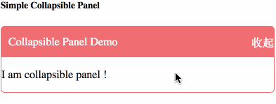
class CollapsiblePanelDemo extends Component {
render() {
	return (
		<CollapsiblePanel title="Collapsible Panel Demo">
			<p>I am collapsible panel !</p>
		</CollapsiblePanel>
	);
}
}
Properties
contentStyle Object?contentClassName String?expand Boolean? [ true ] - 是否展开renderExpand Function? [ expand=> {return expand ? "收起" : "展开";} ] - 展开/收起的UI样式onChange Function? 当expand发生变化时调用Extends PureComponent
Panel
Examples
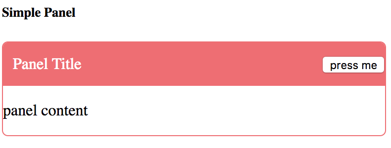
Simple Panel Demo
class PanelDemo extends Component{
render(){
	return (
		<Panel title="Panel Title" renderRight={()=>{
			return (
				<button type="button" onClick={()=>{
					alert('pressed');
				}}>press me</button>
			);
		}}>
			<p>panel content</p>
		</Panel>
	);
}
}
Properties
title (String | ReactNode | HtmlElement) 标题renderRight Function? [ ()=>null ] - 右侧按钮style Object? 样式className String? class styleFAQs
<!-- badge -->
The npm package react-component-panel receives a total of 3 weekly downloads. As such, react-component-panel popularity was classified as not popular.
We found that react-component-panel demonstrated a not healthy version release cadence and project activity because the last version was released a year ago. It has 1 open source maintainer collaborating on the project.
Did you know?

Socket for GitHub automatically highlights issues in each pull request and monitors the health of all your open source dependencies. Discover the contents of your packages and block harmful activity before you install or update your dependencies.
Security News
AI agents are pulling packages into environments no scanner is watching, creating exposure before security teams can see it.

Security News
GitHub Actions checkout now blocks risky pull_request_target checkouts by default to help prevent pwn request supply chain attacks.

Product
Socket now supports Custom Roles and Repository Access Permissions so organizations can control who can access specific repositories and actions.