Security News
Input Validation Vulnerabilities Dominate MITRE's 2024 CWE Top 25 List
MITRE's 2024 CWE Top 25 highlights critical software vulnerabilities like XSS, SQL Injection, and CSRF, reflecting shifts due to a refined ranking methodology.
react-countdown-circle-timer
Advanced tools
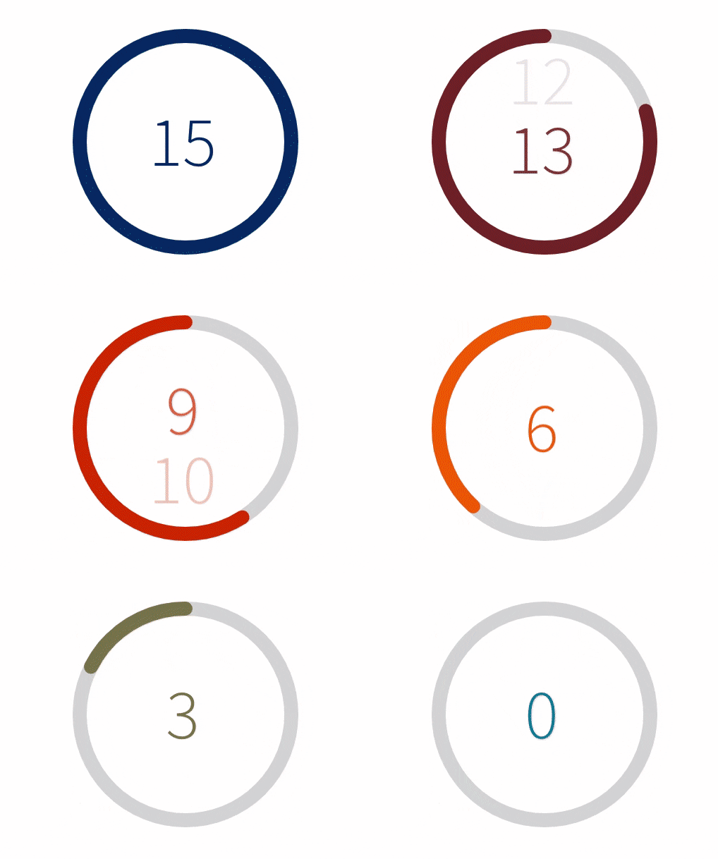
Lightweight React countdown timer component with color and progress animation based on SVG


React countdown timer component in a circle shape with color and progress animation to urge with pleasure your users.


requestAnimationFrame loop to animate color and progress (no setInterval used)a11y supportyarn add react-countdown-circle-timer
or
npm install react-countdown-circle-timer
Check the demo on CodeSandbox to get started
import { CountdownCircleTimer } from 'react-countdown-circle-timer';

const UrgeWithPleasureComponent = () => (
    <CountdownCircleTimer
        isPlaying
        durationSeconds={10}
        colors={[
            ['#004777', .33],
            ['#F7B801', .33],
            ['#A30000']
        ]}
    />
);
| Prop Name | Type | Default | Description |
|---|---|---|---|
| durationSeconds | number | required | Countdown duration in seconds |
| colors | Array<[color HEX: string, transition duration: float number between 0 and 1]> | required | Array of tuples: 1st param - color in HEX format; 2nd param - time to transition to next color represented as a fraction of the total duration |
| startAt | number | 0 | Set the start time to a different value than 0 |
| size | number | 180 | Width and height of the SVG element |
| strokeWidth | number | 12 | Path stroke width |
| strokeLinecap | Enum{ 'round', 'square' } | round | Path stroke line cap |
| trailColor | string | #d9d9d9 | Circle trail color - takes any valid color format (HEX, rgb, rgba, etc.) |
| isPlaying | boolean | false | Play and pause animation |
| * isLinearGradient | boolean | false | * Apples linear gradient on top of the circle. The gradient doesn't follow the circle path. Works best with two colors. |
| gradientUniqueKey | string | - | Unique ID for the linearGradient element. It takes random ID if it's not provided. |
| renderTime | function(remainingTime: number, elapsedTime: number, isPlaying: boolean): number|string|ReactNode | - | Render prop function to customize the content in the center of the circle. The content is centered using flexbox. |
| onComplete | function(): undefined | [shouldRepeat: boolean, delay: number] | - | On complete handler. It can be used to repeat the countdown by returning an array where the first element shouldRepeat indicates if the loop should start over and second element delay specifies the delay before looping again in milliseconds. |
| ariaLabel | string | Countdown timer | Aria label for the whole component |
| renderAriaTime | function(remainingTime: number, elapsedTime: number, isPlaying: boolean): string | - | Render prop function to customize the text message that will be read by the screen reader during the countdown. |
Pass a key prop to CountdownCircleTimer and change the key when the timer should be restarted.
Return an array from onComplete handler, which indicates if the animation should be repeated. Example:
const UrgeWithPleasureComponent = () => (
    <CountdownCircleTimer
        onComplete={() => {
            // do your stuff here
            return [true, 1500]; // repeat animation in 1.5 seconds
        }}
        isPlaying
        durationSeconds={10}
        colors={[['#A30000']]}
    />
);
Pass the initial start time to startAt prop. Example:
const UrgeWithPleasureComponent = () => (
    <CountdownCircleTimer
        isPlaying
        durationSeconds={60}
        startAt={20}
        colors={[['#A30000']]}
    />
);
In the example above, the countdown will start at 20 seconds and it will animate for the rest of the time (40 seconds) until it reaches the duration of 60 seconds.
1.0.5 (December 22nd, 2019)
Implemented enhancements:
FAQs
Lightweight React countdown timer component with color and progress animation based on SVG
The npm package react-countdown-circle-timer receives a total of 30,041 weekly downloads. As such, react-countdown-circle-timer popularity was classified as popular.
We found that react-countdown-circle-timer demonstrated a not healthy version release cadence and project activity because the last version was released a year ago. It has 1 open source maintainer collaborating on the project.
Did you know?

Socket for GitHub automatically highlights issues in each pull request and monitors the health of all your open source dependencies. Discover the contents of your packages and block harmful activity before you install or update your dependencies.

Security News
MITRE's 2024 CWE Top 25 highlights critical software vulnerabilities like XSS, SQL Injection, and CSRF, reflecting shifts due to a refined ranking methodology.

Security News
In this segment of the Risky Business podcast, Feross Aboukhadijeh and Patrick Gray discuss the challenges of tracking malware discovered in open source softare.

Research
Security News
A threat actor's playbook for exploiting the npm ecosystem was exposed on the dark web, detailing how to build a blockchain-powered botnet.