
Security News
Oracle Drags Its Feet in the JavaScript Trademark Dispute
Oracle seeks to dismiss fraud claims in the JavaScript trademark dispute, delaying the case and avoiding questions about its right to the name.
By Sarah Gooding - Feb 07, 2025
react-customizable-progressbar
Advanced tools
Customizable circular SVG progress bar component for React
Customizable circular SVG progress bar component for React
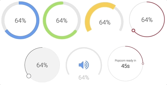
Check examples or generator to play around with all props
npm install --save react-customizable-progressbar
or
yarn add react-customizable-progressbar
import ProgressBar from 'react-customizable-progressbar';

<ProgressBar progress={60} radius={100} />;
| Name | Type | Default | Description |
|---|---|---|---|
radius (required) | number | 100 | Progress bar radius |
progress (required) | number | 0 | Progress value (out of steps) |
steps | number | 100 | Total steps |
cut | number | 0 | Angle of the circle sector |
rotate | number | -90 | Progress rotation |
strokeWidth | number | 20 | Stroke width |
strokeColor | string | 'indianred' | Stroke color |
strokeLinecap | string | 'round' | Stroke line cap |
transition | string | '0.3s ease' | Transition |
trackStrokeWidth | number | 20 | Track stroke width |
trackStrokeColor | string | '#e6e6e6' | Track stroke color |
trackStrokeLinecap | string | 'round' | Track stroke line cap |
trackTransition | string | '1s ease' | Track transition |
pointerRadius | number | 0 | Pointer radius |
pointerStrokeWidth | number | 20 | Pointer stroke width |
pointerStrokeColor | string | 'indianred' | Pointer stroke color |
pointerFillColor | string | 'white' | Pointer fill color |
initialAnimation | bool | false | Initial animation |
initialAnimationDelay | number | 0 | Initial animation delay |
inverse | bool | false | Inverse |
counterClockwise | bool | false | Counter-clockwise |
children | node | null | Children - pass anything to show inside progress bar |
className | string | '' | Progress bar class name |
.RCP {
}
.RCP__track {
}
.RCP__progress {
}
.RCP__pointer {
}
You can use these default indicator styles to center it both horizontally and vertically:
.your-indicator {
  display: flex;
  justify-content: center;
  text-align: center;
  position: absolute;
  top: 0;
  width: 100%;
  height: 100%;
  margin: 0 auto;
  user-select: none;
}
npm install
npm run dev
[2.0.1] - 2024-10-26
FAQs
Customizable circular SVG progress bar component for React
The npm package react-customizable-progressbar receives a total of 3,406 weekly downloads. As such, react-customizable-progressbar popularity was classified as popular.
We found that react-customizable-progressbar demonstrated a healthy version release cadence and project activity because the last version was released less than a year ago. It has 0 open source maintainers collaborating on the project.
Did you know?

Socket for GitHub automatically highlights issues in each pull request and monitors the health of all your open source dependencies. Discover the contents of your packages and block harmful activity before you install or update your dependencies.
Security News
Oracle seeks to dismiss fraud claims in the JavaScript trademark dispute, delaying the case and avoiding questions about its right to the name.

Security News
The Linux Foundation is warning open source developers that compliance with global sanctions is mandatory, highlighting legal risks and restrictions on contributions.

Security News
Maven Central now validates Sigstore signatures, making it easier for developers to verify the provenance of Java packages.