Security News
PyPI’s New Archival Feature Closes a Major Security Gap
PyPI now allows maintainers to archive projects, improving security and helping users make informed decisions about their dependencies.
react-flop-card
Advanced tools
Yet another React flip card component. Animation was done with React-Motion instead of CSS transition.
import { FlipCard } from 'react-flop-card';
// in your render
<FlipCard
flipped={ true } onClick={ onClick }
onMouseOut={ onMouseOut } onMouseOver={ onMouseOver }
frontChild={ frontChild } backChild={ backChild }
width={ 100 } height={ 100 }
style={ { frontStyle, backStyle, wrapperStyle } }/>
npm install --save react-flop-card
http://pckhoi.github.io/react-flop-card-demo.html
Code from the above demo:
import React, { Component } from 'react';

import { FlipCard } from 'react-flop-card';


export default class Demo extends Component {
  constructor(props) {
    super(props);
    this.state = {
      flippedKey: null
    };
    this.cards = Array.apply(null, {length: 64}).map((val, ind) => ({
      key: String(ind),
      style: {
        front: this.getFrontStyle(ind),
        back: backStyle,
        wrapper: wrapperStyle
      },
      frontChild: (<noscript/>),
      backChild: (<p style={ letterStyle }>{ randomLetter() }</p>),
      onMouseOver: () => { this.setState({ flippedKey: String(ind) }); },
      onMouseOut: () => { this.setState({ flippedKey: null }); }
    }));
  }

  getFrontStyle(ind) {
    const y = (ind - ind % 8) / 8 * -104;
    const x = ind % 8 * -104 -300;
    const backgroundStyle = `url("img/food-dinner-lemon-rice.jpg") ${x}px ${y}px/auto`;
    return {
      background: backgroundStyle,
      borderRadius: '20px'
    };
  }

  render() {
    return (
      <div style={ containerStyle }>
        { this.cards.map(({
          key, frontChild, backChild, onMouseOver, onMouseOut, style
        }) => (

          <FlipCard
            key={ key }
            flipped={ this.state.flippedKey === key }
            onMouseOut={ onMouseOut } onMouseOver={ onMouseOver }
            frontChild={ frontChild } backChild={ backChild }
            width={ 100 } height={ 100 } style={ style }/>

        )) }
      </div>
    );
  }
}

const backStyle = {
  backgroundColor: 'green',
  borderRadius: '20px'
};

const letterStyle = {
  color: 'white',
  fontSize: '40px',
  margin: '28px 0',
  textAlign: 'center',
  fontFamily: 'sans-serif'
};

const containerStyle = {
  fontSize: 0,
  width: '832px',
  margin: '0 auto'
};

const wrapperStyle = {
  display: 'inline-block',
  margin: '2px'
};

function randomLetter() {
  const possible = 'ABCDEFGHIJKLMNOPQRSTUVWXYZ';
  return possible.charAt(
    Math.floor(Math.random() * possible.length)
  );
}
exports
FlipCardRotateCard<FlipCard
flipped={ true } onClick={ onClick }
onMouseOut={ onMouseOut } onMouseOver={ onMouseOver }
frontChild={ frontChild } backChild={ backChild }
width={ 100 } height={ 100 }
style={ { front, back, wrapper } }/>
All props are optional.
Control whether the card will show (or animate toward) front side or back side.
Trigger when clicked on.
Trigger when no longer hovered.
Trigger when hovered.
The element to display in the front of card.
The element to display in the back of card.
If width is given as number, it will be automatically converted to px. If you want to use units other than px, supply a string instead. If not given then width will not be set (no default value).
Same as width.
frontChild.backChild.This is a low level component with no animation. The plus side is that you can easily control it's rotate angle with degree prop.
<RotateCard
  degree={ 180 } onClick={ onClick }
  onMouseOut={ onMouseOut } onMouseOver={ onMouseOver }
  frontChild={ frontChild } backChild={ backChild }
  width={ 100 } height={ 100 }
  style={ { front, back, wrapper } }/>
Same as FlipCard except it doesn't have flipped prop. Instead it has degree prop.
degree={ 0 } is the same as flipped={ false } whereas degree={ 180 } is the same as flipped={ true }.MIT
FAQs
Card component with flip animation implement in React Motion
We found that react-flop-card demonstrated a not healthy version release cadence and project activity because the last version was released a year ago. It has 1 open source maintainer collaborating on the project.
Did you know?

Socket for GitHub automatically highlights issues in each pull request and monitors the health of all your open source dependencies. Discover the contents of your packages and block harmful activity before you install or update your dependencies.

Security News
PyPI now allows maintainers to archive projects, improving security and helping users make informed decisions about their dependencies.

Research
Security News
Malicious npm package postcss-optimizer delivers BeaverTail malware, targeting developer systems; similarities to past campaigns suggest a North Korean connection.

Security News
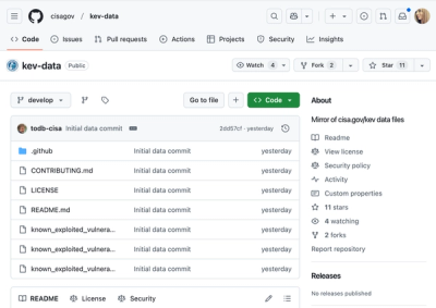
CISA's KEV data is now on GitHub, offering easier access, API integration, commit history tracking, and automated updates for security teams and researchers.