Security News
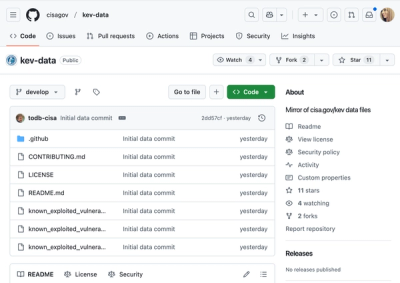
CISA Brings KEV Data to GitHub
CISA's KEV data is now on GitHub, offering easier access, API integration, commit history tracking, and automated updates for security teams and researchers.
react-insect
Advanced tools
$ yarn add react-insect
// Import Insect component
import { Insect } from 'react-insect';

// Use it in your code like so
export const MyComponent = () => {
  return (
    <>
      <Insect
        name="username"
        type="text"
        placeholder="Choose a username"
      />
    </>
  );
};
Insect can be either an input field, a single select field or a multi select field. The props passed in determines what Insect is. Here's a table of all available props for input and for select.
| Prop | Description | Type | default |
|---|---|---|---|
| name | Sets the name of the input field. | string | |
| type | Sets type of input field | text | textarea | number | password | email | select | text |
| label | Adds a label to the top of insect component. | string | |
| placeholder | Sets the placeholder for insect component. | string | Input or select an option |
| prefixIcon | Adds an icon at the left of insect field | string | React.ReactNode | null | |
| suffixIcon | Adds an icon at the right of insect field | string | React.ReactNode | null | |
| className | Custom classname for main insect container | string | |
| labelClass | Custom classname for insect label | string | |
| inputWrapperClass | Custom classname for the input field wrapper div | string | |
| inputClass | Custom classname for the main input field | string | |
| iconsClass | Custom classname for all icons | string | |
| onFocus | Function to trigger when input field is focused on. | (e: React.FocusEvent<HTMLInputElement>) => void | |
| onBlur | Function to trigger when input field goes out of focus. | (e: React.FocusEvent<HTMLInputElement>) => void |
| Prop | Description | Type | default |
|---|---|---|---|
| value | Sets the value of the input field. | string | |
| rows | Sets the number of rows for textarea | number | |
| onChange | Sets the placeholder for insect component. | (e: React.FormEvent<HTMLInputElement>) => void |
| Prop | Description | Type | default |
|---|---|---|---|
| allowMultiple | Enables multi select by setting the number of selectable items | number | |
| search | Toggles option search | boolean | (false) |
| options | A list of options for the select field | { title: string; value: string; }[] | [ ] |
| onSelect | Funtion to trigger when an item is selected. It returns the field name and then returns a single string for single select and an array of strings for multi select | (value: string | string[] | null, name: string) => void | |
| dropdownIcon | Custom icon for dropdown caret | string | React.ReactNode | null | |
| checkmarkIcon | Custom selected item indicator icon | string | React.ReactNode | null | |
| dropdownClass | Custom classname for the dropdown container div. This div wraps the ul tag which in turn wraps the individual li tags | string | |
| checkerClass | Custom classname for the selected items indicator icon | string | |
| closeOnBlur | Determines if the dropdown should close when outside is clicked or not | boolean | true |
Sometimes, you may want to set the default rem unit to 10rem/1px (or any value at all) by adding font-size: 10px (or some kind of viewport based value) to the html tag in order to simplify rem/px unit conversion. This will cause a lot of problems with third party components but don't worry, insect got you!
Just add the following css variable to your main stylesheet and insect will adapt to your new unit.
:root {
  --insect-rem: 10 !important;
}
Insect is an opensource project and public contribution is very welcome. You can check Issues for bugs to fix or features to add.
yarn to install dependencies.yarn build to compile a build into the dist folder.yarn link in your local insect root folder.yarn link 'insect'.npm link ../path-to-test-project/node_modules/react. This will make insect use the copy of react from your local test project. Now you can test your changes.MIT (c) Collins Enebeli.
FAQs
Highly customisable, minimalistic input x select field for React.
The npm package react-insect receives a total of 42 weekly downloads. As such, react-insect popularity was classified as not popular.
We found that react-insect demonstrated a not healthy version release cadence and project activity because the last version was released a year ago. It has 1 open source maintainer collaborating on the project.
Did you know?

Socket for GitHub automatically highlights issues in each pull request and monitors the health of all your open source dependencies. Discover the contents of your packages and block harmful activity before you install or update your dependencies.

Security News
CISA's KEV data is now on GitHub, offering easier access, API integration, commit history tracking, and automated updates for security teams and researchers.

Security News
Opengrep forks Semgrep to preserve open source SAST in response to controversial licensing changes.

Security News
Critics call the Node.js EOL CVE a misuse of the system, sparking debate over CVE standards and the growing noise in vulnerability databases.