Security News
Maven Central Adds Sigstore Signature Validation
Maven Central now validates Sigstore signatures, making it easier for developers to verify the provenance of Java packages.
react-js-pager
Advanced tools
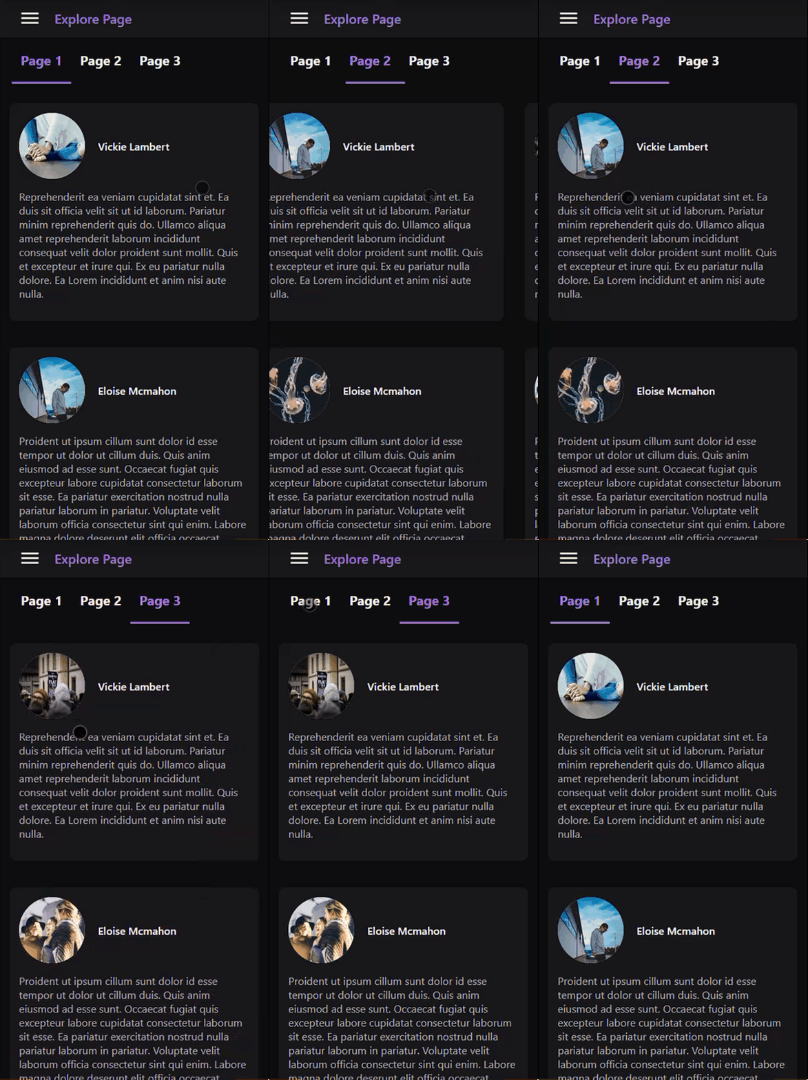
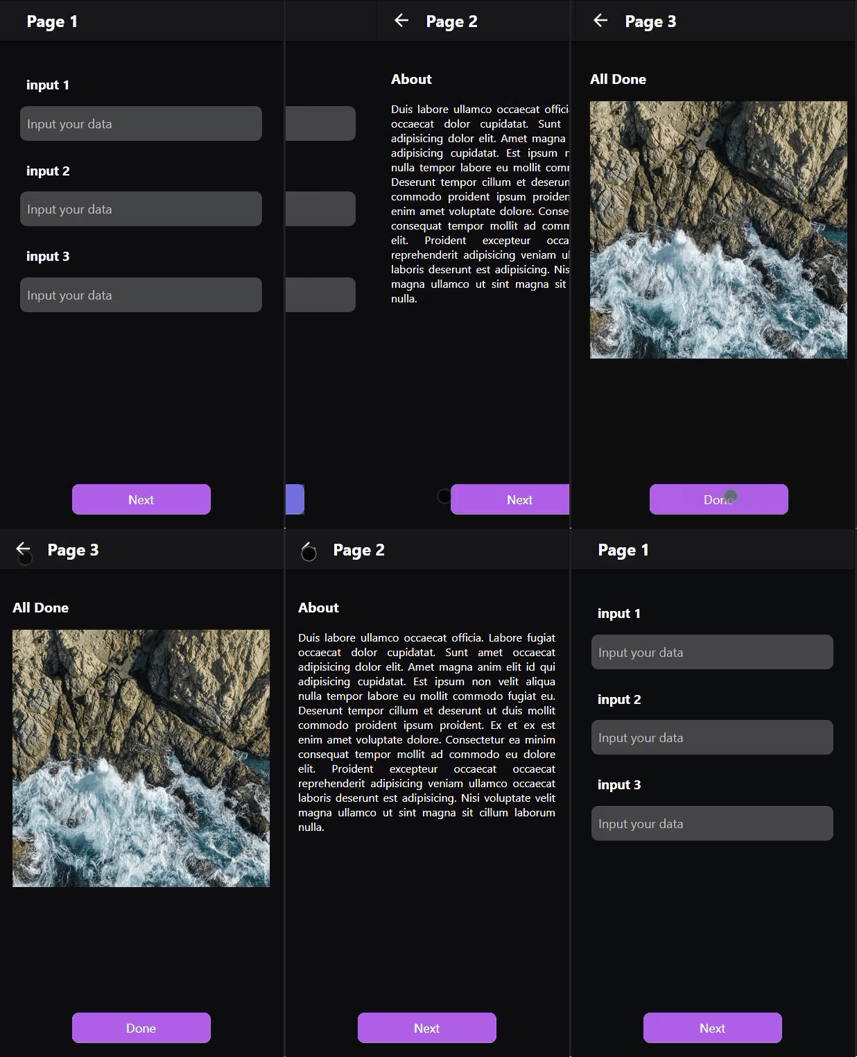
React library to alows users to navigate through pages of data.


npm install react-js-pager
height: 100% and overflow: auto to make sure that the scrollbar will show on the pages not on the pager wrapper element.//...
import Pager from 'react-js-pager';
export default function App() {
let pagerMethods = null;
const next_page_handle = () => {
if (pagerMethods !== null) pagerMethods.next();
};
const previous_page_handle = () => {
if (pagerMethods !== null) pagerMethods.previous();
};
const set_page_handle = pageIndex => {
if (pagerMethods !== null) pagerMethods.setPage(pageIndex);
};
return (
<>
<div id='pager'>
<Pager
ref={node => (pagerMethods = node)}
orientation='horizontal'
animationStyle='scroll'
wrapperStyle={{ width: '300px' }}
>
{/* Page with index (0) */}
<div className='pageContainer'>...Page0 Content</div>
{/* Page with index (1) */}
<div className='pageContainer'>...Page1 Content</div>
{/* Page with index (2) */}
<div className='pageContainer'>...Page2 Content</div>
</Pager>
</div>
</>
);
}
horizontal or vertical pages arrangement orientation.vertical make sure to provide a height value in wrapperStyle prop otherwise it will be set to 50vh by
default.horizontal0falsetrueid or className attributes to add style from CSS StyleSheet.truetruehorizontal orientation and on the left for vertical orientation.falsescroll animation style.scrollrotateX and rotateY animation style.1000300easeOutExpofunction easeInQuad(x) {
return x * x;
}
| Event props | Description | Type |
|---|---|---|
animationPercentage | Animation progress percentage, a value between (0 - 1). | Number |
selectedPageIndex | The page index that will be navigated to. | Number |
previousPageIndex | The page index that will be navigated from. | Number |
touchSwipe | Whether the animation is coming from a touch swipe or not. | Boolean |
| Params | Description | Type |
|---|---|---|
selectedPageIndex | The page index that will be navigated to. | Number |
previousPageIndex | The page index that will be navigated from. | Number |
| Params | Description | Type |
|---|---|---|
selectedPageIndex | The page index that navigated to. | Number |
previousPageIndex | The page index that navigated from. | Number |
| Event props | Description | Type |
|---|---|---|
percentageX | Pager scrolled length percentage on the X axis, a value between (0 - 1). | Number |
percentageY | Pager scrolled length percentage on the Y axis, a value between (0 - 1). | Number |
scrollX | Pager current scrolling position on the X axis. | Number |
scrollY | Pager current scrolling position on the Y axis. | Number |
scrollWidth | Pager scroll width in px. | Number |
scrollHeight | Pager scroll height in px. | Number |
pagerWidth | Pager computed width in px. | Number |
pagerHeight | Pager computed height in px. | Number |
event | Pager onscroll native event. | Object |
FAQs
React library to alows users to navigate through pages of data.
We found that react-js-pager demonstrated a not healthy version release cadence and project activity because the last version was released a year ago. It has 1 open source maintainer collaborating on the project.
Did you know?

Socket for GitHub automatically highlights issues in each pull request and monitors the health of all your open source dependencies. Discover the contents of your packages and block harmful activity before you install or update your dependencies.

Security News
Maven Central now validates Sigstore signatures, making it easier for developers to verify the provenance of Java packages.

Security News
CISOs are racing to adopt AI for cybersecurity, but hurdles in budgets and governance may leave some falling behind in the fight against cyber threats.

Research
Security News
Socket researchers uncovered a backdoored typosquat of BoltDB in the Go ecosystem, exploiting Go Module Proxy caching to persist undetected for years.