What is react-loading-skeleton?
The react-loading-skeleton package is a React component that allows developers to easily create skeleton loading screens. These skeleton screens are used to indicate that content is loading, providing a better user experience by showing placeholders instead of empty spaces.
What are react-loading-skeleton's main functionalities?
Basic Skeleton
This feature allows you to create a basic skeleton placeholder. It is useful for indicating that a simple piece of content, such as text or an image, is loading.
<Skeleton />
Skeleton with Custom Width and Height
This feature allows you to customize the width and height of the skeleton placeholder. It is useful for creating placeholders that match the dimensions of the content being loaded.
<Skeleton width={200} height={100} />
Skeleton with Count
This feature allows you to create multiple skeleton placeholders in a row. It is useful for indicating that a list of items is loading.
<Skeleton count={5} />
Circle Skeleton
This feature allows you to create a circular skeleton placeholder. It is useful for indicating that a circular piece of content, such as a profile picture, is loading.
<Skeleton circle={true} height={50} width={50} />
Skeleton with Custom Colors
This feature allows you to customize the base and highlight colors of the skeleton placeholder. It is useful for matching the skeleton to the color scheme of your application.
<Skeleton baseColor="#202020" highlightColor="#444" />
Other packages similar to react-loading-skeleton
react-content-loader
react-content-loader is a package that allows you to create SVG-based loading placeholders. It offers more customization options compared to react-loading-skeleton, including the ability to create complex shapes and animations. However, it may require more effort to set up and customize.
react-placeholder
react-placeholder is another package for creating loading placeholders. It provides a variety of built-in placeholder types, such as text, media, and custom shapes. It is similar to react-loading-skeleton in terms of ease of use but offers more predefined placeholder types.
react-spinners
react-spinners is a package that provides a collection of loading spinner components. While it does not offer skeleton loading screens, it is useful for indicating loading states with animated spinners. It can be used in conjunction with react-loading-skeleton for a more comprehensive loading experience.
react-loading-skeleton
Make beautiful, animated loading skeletons that automatically adapt to your app.
Basic usage
Install by npm/yarn with react-loading-skeleton.
import Skeleton from 'react-loading-skeleton';
<Skeleton/>
<Skeleton count={5}/>
Principles
Adapts to the styles you have defined
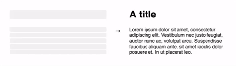
The <Skeleton> component is designed to be used directly in your components,
in place of content while it's still loading.
Unlike other libraries, rather than meticulously crafting a skeleton screen to
match the font-size, line-height or margins your content takes on,
use a <Skeleton> component to have it automatically fill the correct dimensions.
For example:
class Blogpost extends Component {
  render() {
    return (
      <div style={{ fontSize: 20, lineHeight: 2 }}>
        <h1>{this.props.title || <Skeleton />}</h1>
        {this.props.body || <Skeleton count={10} />}
      </div>
    );
  }
}
...will produce the correctly-sized skeletons for the heading and body sections
without any further configuration of the <Skeleton> component.
This ensures the loading state remains up-to-date with any changes
to your layout or typography.
Don't make dedicated skeleton screens
Instead, make components with built-in skeleton states.
In addition to keeping the styling in-sync, here are some other reasons to do this:
- Components represent all possible states it can be in - loading included.
- It allows for more flexible loading patterns - in the
Blogpost example, it's possible to have the title load first, and then the body, while having both pieces of content show loading skeletons at the right time.
Theming
Using a <SkeletonTheme> component, you can easily change the colors of all
skeleton components below it in the React hierarchy:
import Skeleton, { SkeletonTheme } from "react-loading-skeleton";

<SkeletonTheme color="#202020" highlightColor="#444">
  <p>
    <Skeleton count={3} />
  </p>
</SkeletonTheme>;
Duration
<Skeleton duration={2} />
duration: Number, defaults to 1.2
Duration is how long it takes do one cycle of the skeleton animation.
Delay
<Skeleton delay={1} />
duration: Number, defaults to 0
Waits delay seconds before looping the animation.
Width
width: Number | String | null, defaults to null
<Skeleton width={100} />
Width of the skeleton. Useful when the skeleton is inside an inline element with
no width of its own.
Height
Height: Number | String | null, defaults to null
<Skeleton height={100} />
Height of the skeleton. Useful when you don't want to adapt the skeleton to a text element but for instance
a card. Also needed for the prop circle (see below).
Circle
Circle: Boolean | false, defaults to false
<Skeleton circle={true} height={50} width={50} />
Prop for making the skeleton look like a circle, for when you are creating a user card with a profile picture for instance.


