
Security News
Oracle Drags Its Feet in the JavaScript Trademark Dispute
Oracle seeks to dismiss fraud claims in the JavaScript trademark dispute, delaying the case and avoiding questions about its right to the name.
By Sarah Gooding - Feb 07, 2025
react-material-touch-keyboard
Advanced tools
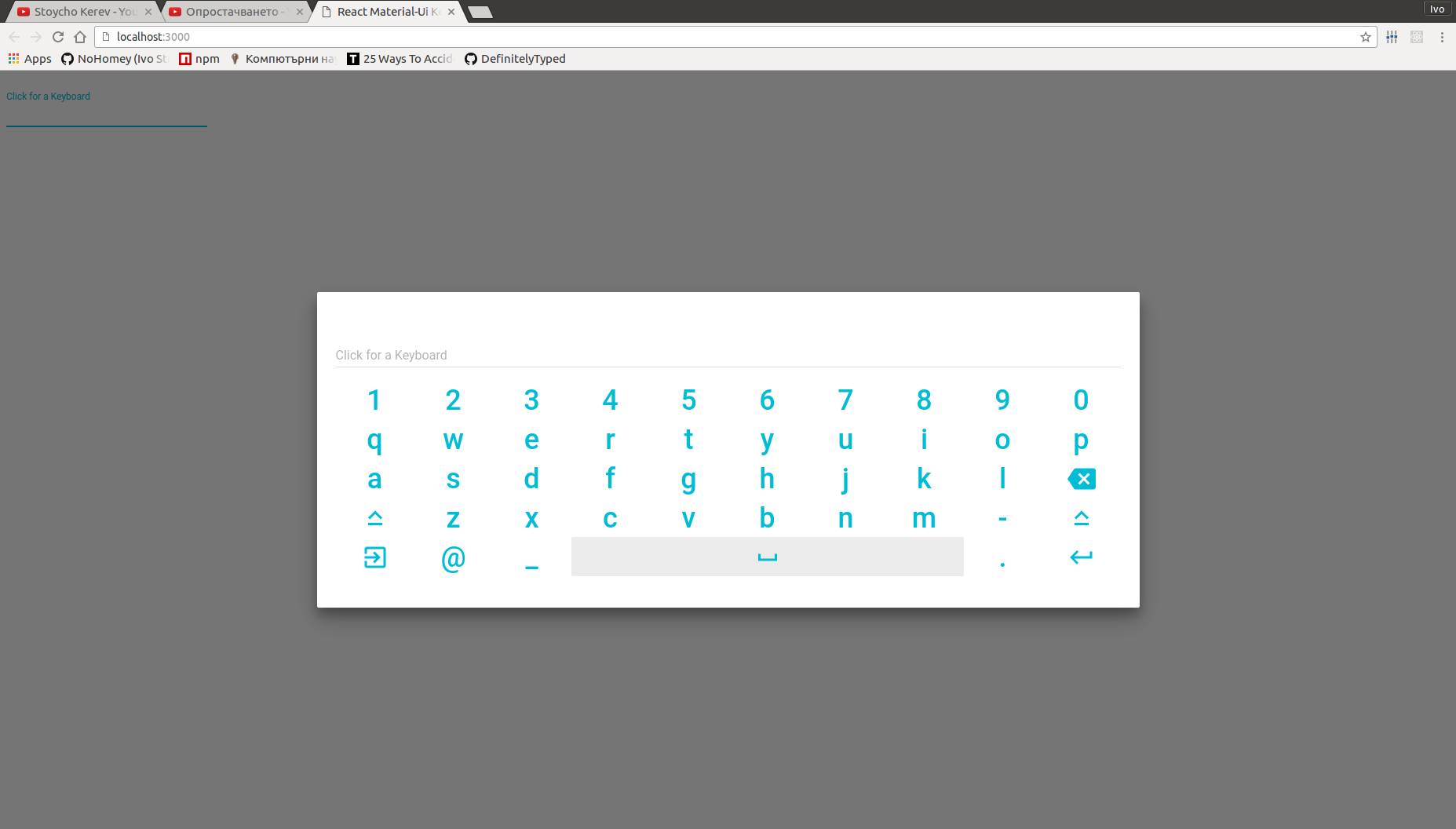
Virtual keyboard for TextFeild when needed. (Modified)
Virtual keyboard for TextFeild when needed.
This is an extended project from https://github.com/NoHomey/react-material-ui-keyboard. I modified it as the way I need. Big thank to @NoHomey for building it.
Install with npm:
$ npm install react-material-touch-keyboard
| Name | Type | Default | Description |
|---|---|---|---|
| automatic | bool | If true, keyboard will automaticlly: open when textField gets focused and close instead of firing onRequestClose. | |
| disableEffects | bool | If true, disables all effects (ripples, focus, hover) on all keyboardKeys | |
| open | bool | Controls whether the Keyboard is opened or not. | |
| layouts* | string[][][] | Keybaord layouts that can be changed when user clicks on 'Keyboard' key. | |
| keyboardKeyWidth | number | this.context.muiThemet.button.minWidth | Override keyboard key's max width. |
| keyboardKeyHeight | number | this.context.muiThemet.button.height | Override keyboard key's max height. |
| keyboardKeySymbolSize | number | this.context.muiThemet.flatButton.fontSize | Override keyboard key's max symbol size. |
| textField* | element | Input field used when keyboard is closed and cloned when it's opened. | |
| onRequestClose | function | Fired when keyboard recives 'Enter' or 'Escape' eighter from onKeyDown listener or keyboard key touch/click event. | |
| onInput | function | Fired when keyboard recives 'Enter' Signature: function(input: string) => void. | |
| onInputValueChange | function | Fired when keyboard's input chages value Signature: function(input: string) => void. | |
| correctorName | string | Name of the cloned textField prop to which to bind corrector. | |
| corrector** | function | Function which is bound to the the cloned textField at correctorName prop. this is bound to the Keyboard, public method makeCorrection can be used to apply a correction to the keyboard input. | |
| className | string | '' | Add class for Dialog. |
| style | object | {} | Override the inline-styles of the root element. |
| contentStyle | object | {} | Overrides the inline-styles of the content container. |
Props marked with * are required.
** corrector is required when correctorName is provided.
textField must be a controlled inputtextField Prop must support the following props:value* of type stringreadOnly* of type boolProps marked with * must be passed down to the native input element.
react-material-ui-keyboard is implemented using the followong Material-Ui Elements
and uses React.cloneElement to clone textFiled for the kyboard input field.
The used Dialog is modal which guaranties that only one keyboard can be opened which allows memory and performance optimizations.
Keyboard Compoment uses MuiTheme, props, window.innerWidth and window.innerHeight information to calculate it's size and keyboard keys size (width x height) to ensure it always fits best on screen chech GALLERY.
For supported keys read KEYSUPPORT
The following keyboard layouts are exported from 'react-material-ui-keyboard/layouts'
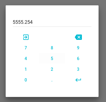
const numericKeyboard = [
    ['Escape', '-', 'Backspace'],
    ['7',      '8',         '9'],
    ['4',      '5',         '6'],
    ['1',      '2',         '3'],
    ['0',      '.',     'Enter']
];
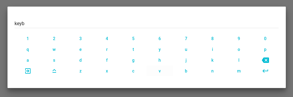
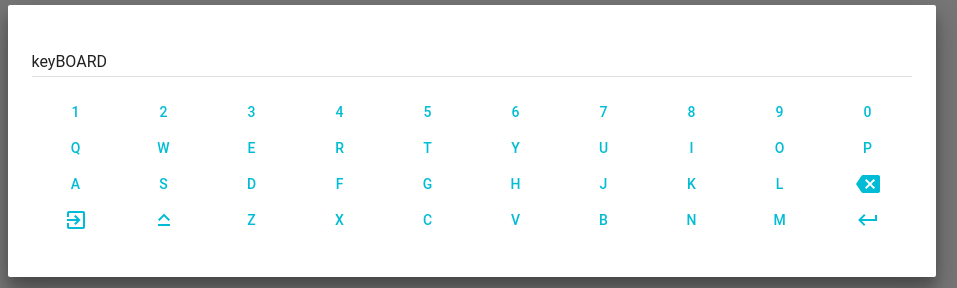
const alphaNumericKeyboard = [
    ['1',      '2',        '3', '4', '5', '6', '7', '8', '9',         '0'],
    ['q',      'w',        'e', 'r', 't', 'y', 'u', 'i', 'o',         'p'],
    ['a',      's',        'd', 'f', 'g', 'h', 'j', 'k', 'l', 'Backspace'],
    ['Escape', 'CapsLock', 'z', 'x', 'c', 'v', 'b', 'n', 'm',     'Enter']
];
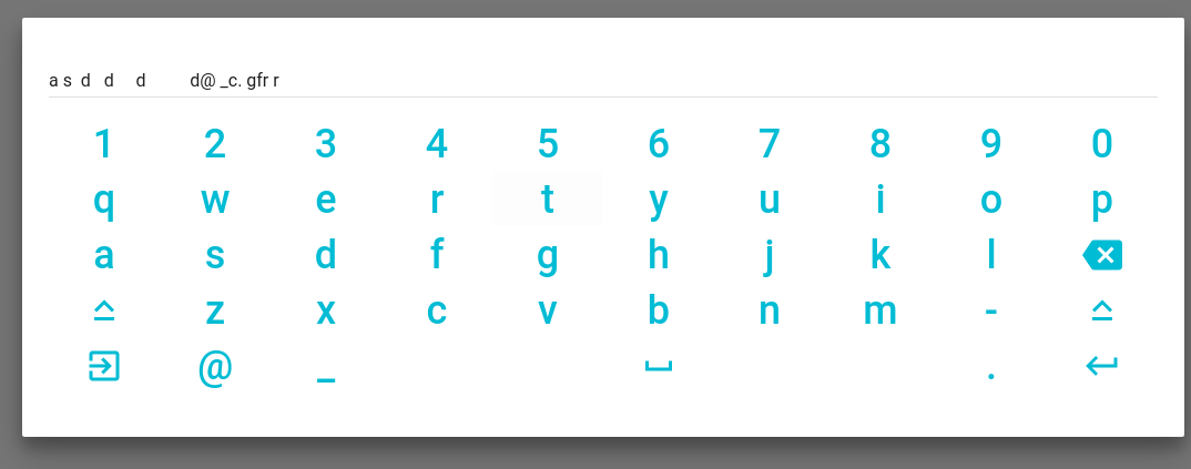
const extendedKeyboard = [
    ['1',        '2', '3', '4', '5', '6', '7', '8', '9',         '0'],
    ['q',        'w', 'e', 'r', 't', 'y', 'u', 'i', 'o',         'p'],
    ['a',        's', 'd', 'f', 'g', 'h', 'j', 'k', 'l', 'Backspace'],
    ['CapsLock', 'z', 'x', 'c', 'v', 'b', 'n', 'm', '-',  'CapsLock'],
    ['Escape',   '@', '#',         '     ',         '.',     'Enter']
];
KeyboardEvent.key names for all [Special keys] (https://developer.mozilla.org/en-US/docs/Web/API/KeyboardEvent/key)'Keyboard' for key with which user can change keyboard layoutAll spacial keys (none Symbol will have an Icon and support at some point)*
Check supported keys!
If a key you want to use is not supported open an Issue.
Keyboard exposes public method makeCorrection which can be used to apply keyboard input value corrections when keyboard is opened or within correction handller.
Keyboard has one public static member which is designed to be overwritten: automaitcOpenPredicate it's signature is function() => boolean. It is called when automatic is true and the attached onFocus handler on textField gets fired to determinate should keyboard open and disable the native virtual keyboard by assigning readOnly at textField in the render. Default automaitcOpenPredicate behaviour is to always return true. You can override it to change when to automaticlly open keyboard onFocus.
import * as React from 'react';
import TextField from 'material-ui/TextField';
import Keyboard from 'react-material-ui-keyboard';
import { extendedKeyboard } from 'react-material-ui-keyboard/layouts';

class Demo extends React.Component {
    constructor(props) {
        super(props);
        this.state = {
            open: false,
            value: ''
        };
        this.onInput = this.handleInput.bind(this);
    }

    handleInput(input) {
        this.setState({ value: input });
    }

    render() {
      <Keyboard
        textField={
          <TextField
            id="text"
            value={this.state.value}
          />
        }
        automatic
        onInput={this.onInput}
        layouts={[extendedKeyboard]}
      />;
    }
};
import * as React from 'react';
import NumberInput from 'material-ui-number-input';
import Keyboard from 'react-material-ui-keyboard';
import { numericKeyboard } from 'react-material-ui-keyboard/layouts';

function corrector(value) {
    console.log(`correction ${value}`);
    this.makeCorrection(value);
}

class Demo extends React.Component {
    constructor(props) {
        super(props);
        this.state = { open: false, value: '2' };
        this.onFocus = this.handleFocus.bind(this);
        this.onChange = this.handleChange.bind(this);
        this.onRequestClose = this.handleRequestClose.bind(this);
        this.onInput = this.handleInput.bind(this);
        this.onError = this.handleError.bind(this);
        this.onValid = this.handleValid.bind(this);
    }

    canOpenKeyboard() {
        return (this.state.value.length % 2) === 0;
    }

    handleFocus(event) {
        if(this.canOpenKeyboard()) {
            this.setState({ open: true });
        }
    }

    handleChange(event, value) {
        console.log(value);
        this.setState({ value: value });
    }

    handleRequestClose() {
        this.setState({ open: false });
    }

    handleInput(input) {
        console.log(input);
        this.setState({ value: input });
    }

    handleError(error) {
        let errorText;
        switch (error) {
            case 'required':
                errorText = 'This field is required';
                break;
            case 'invalidSymbol':
                errorText = 'You are tring to enter none number symbol';
                break;
            case 'incompleteNumber':
                errorText = 'Number is incomplete';
                break;
            case 'singleMinus':
                errorText = 'Minus can be use only for negativity';
                break;
            case 'singleFloatingPoint':
                errorText = 'There is already a floating point';
                break;
            case 'singleZero':
                errorText = 'Floating point is expected';
                break;
            case 'min':
                errorText = 'You are tring to enter number less than -10';
                break;
            case 'max':
                errorText = 'You are tring to enter number greater than 12';
                break;
        }
        this.setState({ errorText: errorText });
    }

    handleValid(value) {
        console.debug(`valid ${value}`);
    }

    componentDidMount() {
        setTimeout(() => this.setState({ value: '89' }), 1000);
    }

    render() {
        const { state, onFocus, onChange, onError, onValid, onInput } = this;
        const { value, errorText } = state;
        const textField = (
            <NumberInput
                id="num"
                required
                value={value}
                min={-10}
                max={12}
                strategy="warn"
                errorText={errorText}
                onFocus={onFocus}
                onChange={onChange}
                onError={onError}
                onValid={onValid}
                floatingLabelText="Click for a Keyboard" />
        );

        return (
            <Keyboard
                textField={textField}
                open={this.state.open}
                onRequestClose={this.onRequestClose}
                onInput={onInput}
                correctorName="onRequestValue"
                corrector={corrector}
                layouts={[numericKeyboard]}
                keyboardKeyHeight={50}
                keyboardKeyWidth={100}
                keyboardKeySymbolSize={36}
            />
        );
    }
}
If you need to change theme eg. gutter, spacing, colors or any other option you need to wrapp <Keyboard ... /> in MuiThemeProvider or to manually provide a muiTheme to parent's context.
npm install
npm test
npm install
Make changes
If necessary add some tests to __tests__
npm test
Make a Pull Request
FAQs
Virtual keyboard for TextFeild when needed. (Modified)
We found that react-material-touch-keyboard demonstrated a not healthy version release cadence and project activity because the last version was released a year ago. It has 1 open source maintainer collaborating on the project.
Did you know?

Socket for GitHub automatically highlights issues in each pull request and monitors the health of all your open source dependencies. Discover the contents of your packages and block harmful activity before you install or update your dependencies.
Security News
Oracle seeks to dismiss fraud claims in the JavaScript trademark dispute, delaying the case and avoiding questions about its right to the name.

Security News
The Linux Foundation is warning open source developers that compliance with global sanctions is mandatory, highlighting legal risks and restrictions on contributions.

Security News
Maven Central now validates Sigstore signatures, making it easier for developers to verify the provenance of Java packages.