Research
Security News
Malicious npm Packages Inject SSH Backdoors via Typosquatted Libraries
Socket’s threat research team has detected six malicious npm packages typosquatting popular libraries to insert SSH backdoors.
react-message-block
Advanced tools
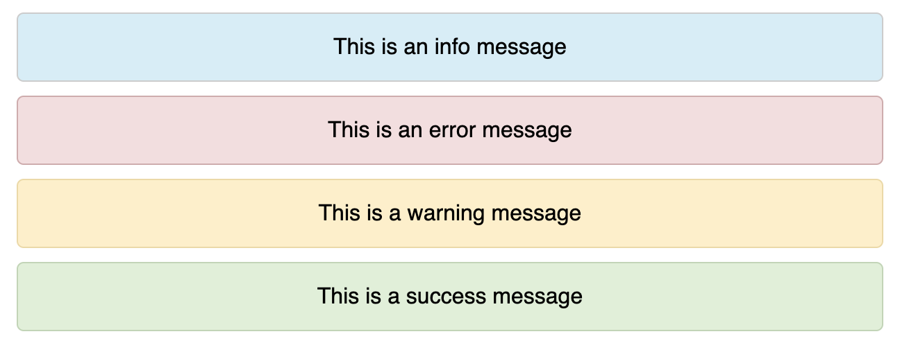
An easy to use, simple multi-purpose react messages. Ability to show success, error, warn and info messages by default. Custom Message Styling supported
Doing a React POC or building a production application? react-message-block is an easy to use package for showing success/error/warn/info/custom message blocks.

With Yarn
yarn add react-message-block
With npm
npm i --save react-message-block
You could view the documentation in Github Page as well.
react-message-block is compatible with both Class and Functional React Components.
import Message from 'react-message-block';
const App = () => {
    return (
        <div>
            <Message text = {'Congrats! You have installed this plugin'} />
        </div>
    )
}
By default, react-message-block comes up with the following properties. You could use the following to customize your message block out of the box.
| Prop | Optional | Default | Possible Values | Description |
|---|---|---|---|---|
| text | Yes | Any String | Display Message | |
| type | Yes | info | plain | info | success | error | warn | To show Loading Message |
| onClose | Yes | Callback func | Callback function to close the message block. Close Icon will appear along with the message block | |
| style | Yes | Custom Style Object | To apply user defined styles | |
| align | Yes | center | center | left | right | To align message text |
Not happy with the one line message? You could always pass children within the Message component to display your custom message layout.
<Message type = 'info'>
    <h4>Message Heading</h4>
    <p>This is the message body</h4>
</Message>
<Message type = 'error'>
    <h4>Please check the following fields</h4>
    <ul>
      <li>Email is not valid</li>
      <li>Password and Confirm Password does not match</li>
      <li>Phone Number is already registered</li>
    </ul>
</Message>
Many times, you would want to provide the feasibility of dismissing a message block. You could achieve it by passing onClose callback function as prop to the component.
<Message
  text = 'Something went wrong'
  type = 'error'
  onClose = {handleClose}
>
Want to show just the message without a background? Use type="plain
In most projects, you would want to use this while showing "No Content Messages"
<Message
  text = 'No Content Available'
  type = 'plain'
  onClose = {handleClose}
>
Nijin Vinodan
FAQs
An easy to use, simple multi-purpose react messages. Ability to show success, error, warn and info messages by default. Custom Message Styling supported
We found that react-message-block demonstrated a not healthy version release cadence and project activity because the last version was released a year ago. It has 1 open source maintainer collaborating on the project.
Did you know?

Socket for GitHub automatically highlights issues in each pull request and monitors the health of all your open source dependencies. Discover the contents of your packages and block harmful activity before you install or update your dependencies.

Research
Security News
Socket’s threat research team has detected six malicious npm packages typosquatting popular libraries to insert SSH backdoors.

Security News
MITRE's 2024 CWE Top 25 highlights critical software vulnerabilities like XSS, SQL Injection, and CSRF, reflecting shifts due to a refined ranking methodology.

Security News
In this segment of the Risky Business podcast, Feross Aboukhadijeh and Patrick Gray discuss the challenges of tracking malware discovered in open source softare.