

Security News
Happy Birthday, Shai-Hulud
It has been one year since Shai-Hulud made its first appearance on npm.
By Sarah Gooding - Sep 18, 2026
react-mockframe
Advanced tools
React device mockup components for landing pages and product showcases. Display your app in iPhone, Android, iPad, and MacBook frames.
Device mockups for React. Showcase your apps in realistic phone, tablet, and laptop frames. Perfect for SaaS landing pages, product demos, and marketing websites.



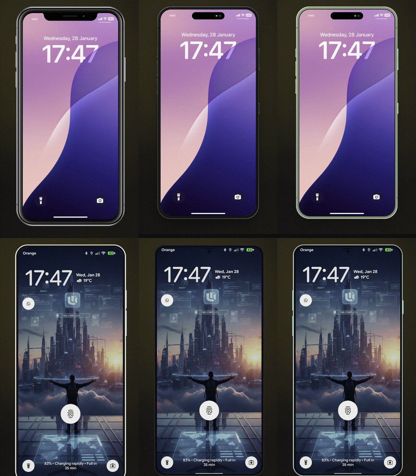
CustomMockFrame| Device | Colors | Landscape | Notch/Island |
|---|---|---|---|
| iPhone X | - | Yes | Notch |
| iPhone 8 | black, silver, gold | Yes | - |
| iPhone 8 Plus | black, silver, gold | Yes | - |
| iPhone 17 | black, white, mist-blue, sage, lavender, cosmic-orange, deep-blue | Yes | Dynamic Island |
| Pixel 10 | obsidian, porcelain, mint, rose | Yes | - |
| Galaxy S25 | phantom-black, icy-blue, navy, silver, mint | Yes | - |
| iPad Mini | black, silver | Yes | - |
| iPad Pro | space-gray, silver | Yes | - |
| MacBook Pro 2020 | - | - | - |
| MacBook Pro | space-gray, silver | - | Notch |
npm install react-mockframe
# or
pnpm add react-mockframe
# or
yarn add react-mockframe
import { MockFrame } from 'react-mockframe'
import 'react-mockframe/styles/mockframe.css'

export default function App() {
  return (
    <MockFrame device="iPhone 17" color="mist-blue">
      <YourAppContent />
    </MockFrame>
  )
}
<MockFrame device="iPhone X">
  <img src="screenshot.png" alt="App screenshot" />
</MockFrame>
<MockFrame device="iPhone 17" color="lavender">
  <YourApp />
</MockFrame>
<MockFrame device="iPad Pro" color="space-gray" landscape>
  <YourTabletApp />
</MockFrame>
// Hide notch on iPhone X
<MockFrame device="iPhone X" hideNotch>
  <YourApp />
</MockFrame>

// Hide Dynamic Island on iPhone 17
<MockFrame device="iPhone 17" color="black" hideNotch>
  <YourApp />
</MockFrame>

// Hide notch on MacBook Pro
<MockFrame device="MacBook Pro" color="space-gray" hideNotch>
  <YourDesktopApp />
</MockFrame>
<MockFrame
  device="Pixel 10"
  color="mint"
  width={360}
  height={800}
  zoom={0.8}
>
  <YourApp />
</MockFrame>
<MockFrame
  device="Galaxy S25"
  color="icy-blue"
  zoom={zoomLevel}
  animated
>
  <YourApp />
</MockFrame>
<section className="grid md:grid-cols-2 gap-10 items-center px-6 py-20">
  <div>
    <h1 className="text-4xl font-bold mb-4">Your product headline</h1>
    <p className="text-lg text-gray-600 mb-6">
      Describe your product value proposition here.
    </p>
    <button className="bg-blue-600 text-white px-6 py-3 rounded-lg">
      Get Started
    </button>
  </div>

  <MockFrame device="iPhone 17" color="black">
    <img src="/app-screenshot.png" alt="App preview" />
  </MockFrame>
</section>
<div className="flex justify-center py-16">
  <MockFrame device="MacBook Pro" color="space-gray">
    <img src="/dashboard-screenshot.png" alt="Dashboard preview" />
  </MockFrame>
</div>
| Prop | Type | Description |
|---|---|---|
device | DeviceName | Required. The device model to render |
color | string | Device color variant (required for devices with colors) |
landscape | boolean | Rotate to landscape orientation (phones/tablets only) |
hideNotch | boolean | Hide the notch or dynamic island |
width | number | Override screen content width in pixels |
height | number | Override screen content height in pixels |
zoom | number | Scale the entire device frame (e.g., 0.75 for 75%) |
animated | boolean | Enable smooth transitions for zoom changes |
children | ReactNode | Content to render inside the device screen |
The color prop is type-safe - TypeScript only allows valid colors for each device:
// Valid - iPhone 17 supports 'lavender'
<MockFrame device="iPhone 17" color="lavender" />

// TypeScript error - iPhone X has no color variants
<MockFrame device="iPhone X" color="black" />

// TypeScript error - 'pink' is not a valid iPhone 17 color
<MockFrame device="iPhone 17" color="pink" />
Create your own device frames with CustomMockFrame:
import { CustomMockFrame } from 'react-mockframe'

<CustomMockFrame
  width={375}
  height={812}
  bezelWidth={12}
  borderRadius={44}
  screenBorderRadius={40}
  bezelColor="#1a1a1a"
  zoom={0.8}
  animated
>
  <YourContent />
</CustomMockFrame>
| Prop | Type | Default | Description |
|---|---|---|---|
width | number | Required | Screen content width in pixels |
height | number | Required | Screen content height in pixels |
bezelWidth | number | object | 12 | Bezel thickness (uniform or per-side) |
borderRadius | number | 44 | Outer frame corner radius |
screenBorderRadius | number | auto | Screen corner radius |
bezelColor | string | #1a1a1a | Bezel background color |
zoom | number | - | Scale factor for the frame |
animated | boolean | - | Enable smooth transitions |
landscape | boolean | - | Display in landscape orientation |
frameClassName | string | - | CSS class for the outer frame |
screenClassName | string | - | CSS class for the screen area |
Per-side bezel example:
<CustomMockFrame
  width={375}
  height={812}
  bezelWidth={{ top: 60, right: 12, bottom: 60, left: 12 }}
>
  <YourContent />
</CustomMockFrame>
Import only the device families you need to reduce bundle size:
Sizes below are minified (gzipped in parentheses).
// Full bundle - all devices (~44KB min / ~6.5KB gzip)
import 'react-mockframe/styles/mockframe.css'

// iPhones only (~26KB min / ~4KB gzip)
import 'react-mockframe/styles/mockframe-iphones.css'

// Android only (~7KB min / ~1.5KB gzip)
import 'react-mockframe/styles/mockframe-android.css'

// Tablets only (~7KB min / ~1.6KB gzip)
import 'react-mockframe/styles/mockframe-tablets.css'

// Laptops only (~6KB min / ~1.5KB gzip)
import 'react-mockframe/styles/mockframe-laptops.css'
The library exports helpful types:
import type {
  DeviceName,           // Union of all device names
  MockFrameProps,  // Full props with type safety
  DeviceConfig,         // Get config for a specific device
  DeviceColor,          // Get available colors for a device
  DeviceHasLandscape,   // Check if device supports landscape
  CustomMockFrameProps,
} from 'react-mockframe'

// Get available colors for a specific device
type iPhone17Colors = DeviceColor<'iPhone 17'>
// => 'black' | 'white' | 'mist-blue' | 'sage' | 'lavender' | 'cosmic-orange' | 'deep-blue'

// Check if a device supports landscape
type CanRotate = DeviceHasLandscape<'iPad Pro'>
// => true
Access device data programmatically:
import { DeviceNames, DeviceOptions } from 'react-mockframe'

// Array of all device names
console.log(DeviceNames)
// ['iPhone X', 'iPhone 8', 'iPhone 8 Plus', 'iPhone 17', ...]

// Access device configuration
const config = DeviceOptions['iPhone 17']
console.log(config.colors)  // ['black', 'white', 'mist-blue', ...]
console.log(config.width)   // 393
console.log(config.height)  // 852
The interactive demo website includes:
Device frame styles are adapted from Marvel devices.css (MIT © 2014 Marvelapp). Newer device frames (iPhone 17, Pixel 10, Galaxy S25, iPad Pro, MacBook Pro) and all React/TypeScript code are original to this project.
Mohammed Banani — @mbdev3
Contributions are welcome! Please open an issue or submit a pull request.
MIT License — see LICENSE for details.
FAQs
React device mockup components for landing pages and product showcases. Display your app in iPhone, Android, iPad, and MacBook frames.
The npm package react-mockframe receives a total of 347 weekly downloads. As such, react-mockframe popularity was classified as not popular.
We found that react-mockframe demonstrated a healthy version release cadence and project activity because the last version was released less than a year ago. It has 1 open source maintainer collaborating on the project.
Security News
It has been one year since Shai-Hulud made its first appearance on npm.

Research
/Security News
Operators behind PolinRider used a compromised GitHub account to plant malware in four development versions of a Packagist package with 700,000+ downloads.

Security News
GitHub Actions now supports cache-mode, a least-privilege control on the Actions cache aimed at the cache poisoning technique behind recent compromises.